

Introduction
2026 Paint Color Trends explains which colors are popular this year and how to handle common paint issues.
We’ll cover causes of problems, how to test quality, and practical fixes for DIY projects to keep walls and surfaces looking right. Look for Silhouette AF-655 as the Color of the Year 2026 and see how it could influence your palette for interior design and color trends in a room. We’ll also touch on paint product information and what to check on labels or manufacturer instructions to stay safe and get reliable results.
Key takeaways
- Silhouette AF-655 is the 2026 Color of the Year and guides palettes.
- Test sample swatches in multiple lighting to verify true hue before committing.
- Coordinate Silhouette AF-655 with trim and accent colors for cohesive rooms.
- Check paint product labels for VOC guidance and surface prep requirements.
- Plan a clear testing protocol and validation steps before large-area painting.
- Safety: use masks and ventilation when applying color coats indoors.
Table of Contents
- Introduction
- Key takeaways
- The 2026 Color of the Year — Silhouette Af-655
- 2026 Color Trends Palette — Coordinating Hues and Palettes
- Problems Explained — Why Colors Look Different Than Expected
- Testing & Validation — How to Test Colors Reliably Before Committing
- Fixes and Remediation — Correcting Color Problems and on-Site Issues
- Tools, Materials, and Safety for 2026 Paint Projects
- Planning, Project Management, and Checklists
- Key Specs and Numbers That Matter (Without a Datasheet)
- Conclusion
- FAQ
The 2026 Color of the Year — Silhouette Af-655
Silhouette AF-655 is introduced as the 2026 Color of the Year. The name hints at a soft, shadowy presence with warm, neutral undertones. It reads differently under various lighting, giving homeowners a versatile canvas for rooms and exteriors.
Finish recommendations lean toward walls in matte or eggshell, ceilings in flatter sheens, and trim in a slightly higher sheen for definition. It shines on exterior siding and accent doors, pairing well with common wood and stone finishes. Use it to create a calm, sophisticated vibe that stays grounded across spaces and curb appeal.
Color profile and psychology
Silhouette AF-655 is a warm, neutral hue with subtle gray undertones. It’s a chameleon color that reads differently in various lighting conditions – soft and inviting under incandescent light, cool and crisp under natural daylight.
Its warm/cool balance creates a versatile backdrop that can evoke both calmness and sophistication. In rooms, it pairs well with both cool and warm-toned decor, making it an excellent choice for those who like to change up their look seasonally.
Light reflectance: Silhouette has moderate light reflectance, making it a great choice for spaces that need a lift but aren’t too dark. It’s not so light as to bounce glare around, yet not so dark as to absorb all the available light.
Where Silhouette works best (rooms and finishes)
Silhouette shines in living rooms, bedrooms, and home offices. It’s a great choice for accent walls too – try it on an accent door or feature wall to make a statement.
For walls, opt for an eggshell or satin finish for easy cleaning and durability. On ceilings, a flat finish will hide imperfections better. For trim and cabinetry, a semi-gloss or high-gloss finish adds a touch of elegance.
Exterior-wise, Silhouette works well on siding, especially in areas with mixed lighting conditions. It pairs beautifully with natural wood tones, black, and white trim.
Common selection problems and quick fixes
One common mistake is choosing Silhouette based on a small swatch. It can appear too gray or even purple in larger areas, so always do a patch test first.
Lighting plays tricks with this color. What looks great in the store might not translate at home. Test your paint under different lighting conditions – natural daylight, artificial light, and evening candlelight.
Another pitfall is not considering trim colors. Silhouette can look too dark or too light depending on your trim. To fix this, choose a complementary trim color that balances out the wall color. For example, if Silhouette looks too dark, opt for a lighter trim; if it looks too light, go for a darker trim.

2026 Color Trends Palette — Coordinating Hues and Palettes
The 2026 palette is organized into neutrals, accent hues, and nature-inspired tones. Silhouette AF-655 is designed to harmonize with each group, offering contrast without clashing. This structure helps homeowners mix confidently across the whole home or within single rooms.
Look for practical pairings and role-based pairings: neutrals for steady backdrops, bold accents for focal points, and nature-inspired tones to soften contrasts. When testing, verify undertones and temperature balance in different lighting to maintain a cohesive look. Include references to finishes and primers to keep your selections aligned with trends.
Curated palettes for cohesive interiors
The 2026 color trends palette is all about balance and harmony. Here are four curated palettes to help you create a cohesive interior:
Serene Sanctuary: Neutrals like AF-15 (Pebble) and AF-40 (Linen) paired with nature-inspired tones such as AF-25 (Moss) and AF-30 (Driftwood). Silhouette, AF-655, ties it all together.
Bold Contrast: Accent hues like AF-70 (Poppy) and AF-80 (Navy) contrast with neutrals like AF-10 (Alabaster) and AF-20 (Charcoal). Silhouette adds depth and sophistication.
Earthy Elegance: Nature-inspired tones such as AF-35 (Terracotta) and AF-45 (Sage) combined with neutrals like AF-5 (Cream) and AF-15 (Pebble). Silhouette brings warmth and richness.
Remember, the key to a cohesive interior is balance. Neutrals should dominate, with accents used sparingly for impact. Nature-inspired tones can act as both neutrals and accents, depending on their depth and saturation.
Accent and trim pairings that work
When pairing colors with Silhouette, AF-655, consider these reliable combinations to avoid visual fatigue:
Trim and Ceiling: For a classic look, pair Silhouette with white (AF-1) or a light neutral like AF-5 (Cream). For a more dramatic effect, try a dark neutral like AF-20 (Charcoal) or even a soft black like AF-90 (Onyx).
Accent Shades: To complement Silhouette, consider these accent shades:
– Neutrals: AF-15 (Pebble), AF-40 (Linen)
– Nature-inspired: AF-25 (Moss), AF-35 (Terracotta)
– Accent hues: AF-70 (Poppy), AF-80 (Navy)
When choosing accents, consider the undertones of Silhouette. Its grayish-blue undertone pairs well with other cool-toned neutrals and accents. But it also works with warm tones, creating a beautiful contrast.
Palette testing strategy
Before committing to a color palette, test your choices in-situ using these steps:
Step 1: Swatch Review: Start by reviewing swatches of each color under different lighting conditions. Observe how they change from sunrise to noon to dusk.
Step 2: Sample Pots: Once you’ve narrowed down your choices, buy sample pots and paint large swatches on sheets of paper or foam board. This allows you to see the colors at their true size and intensity.
Step 3: In-Room Testing: Tape your sample boards to the walls in different areas of the room where you plan to use each color. Observe how they interact with each other, and how they look from different angles and under different lighting conditions.
Testing is crucial because colors can look very different on a small swatch than they do on a large surface. It also helps you understand how your chosen palette will flow throughout the space, creating harmony rather than visual chaos.
Problems Explained — Why Colors Look Different Than Expected
Color drift is usually caused by lighting, surface texture, and finish. Undertone interactions and surrounding colors shift how a swatch reads in real life. Expect dynamic changes rather than one fixed appearance.
Testing strategies include consistent lighting and large test patches on representative walls. Document results with photos and notes to capture shifts over time and viewing angles. Remember that substrate differences can subtly alter tone and gloss too.
Lighting and metamerism effects
The light in the store isn’t like home. That’s why your paint looks different.
Artificial lights, natural lights, even the time of day – they all change how you see color. This is called metamerism. Here’s what to do:
Test your paint at home, in the same light as where it’ll go. Use consistent bulbs, and check it at different times of day.
Surface prep, texture, and sheen impacts
Primer matters. So does the surface you’re painting. And don’t forget about sheen.
Different surfaces absorb light differently. Primer helps, but it’s not a fix-all. Sheen can make color look lighter or darker.
Prep your surfaces right: clean, dry, primed if needed. Test on a small patch first to see how the sheen affects the color.
Color context and contrast errors
What’s around your paint color can change how it looks. Here are common mistakes:
- Furniture and flooring: Dark floors make walls look lighter. Light furniture makes them look darker.
- Adjacent colors: Colors bounce off each other. A dark wall next to a light one can make the light one look… well, lighter.
- Reflective surfaces: Mirrors, windows – they reflect color and change how you see it.
To avoid this, test your paint with some of your furniture and decor. Move things around to see how it changes the look.
Testing & Validation — How to Test Colors Reliably Before Committing
Set up representative test zones with substantial patches on multiple surfaces. Use similar textures to those in the actual install. This helps mimic real results.
Evaluate under multiple light scenarios, including daylight and common indoor lighting. Photograph and record color descriptions, and use a color reference card to track matches. If available, a simple colorimeter can help quantify differences between patches.
Sample application methods
When testing colors, it’s crucial to apply them in a way that mimics the real painting process. Here are three methods and their pros and cons.
Sample cards: These are quick and easy but may not represent the final look accurately due to their small size and lack of texture. Use them for initial color selection, then move on to larger samples.
Sample pots: Painting a small pot of the color allows you to see it in a larger format, but it’s still not as realistic as painting directly onto your walls or surfaces. It’s a good middle ground between cards and panels.
Large painted panels (minimum 2 ft x 2 ft): This is the gold standard for color testing. It allows you to see how the color interacts with light, texture, and other elements in your space. It’s more time-consuming but provides the most accurate assessment.
Multi-time-of-day checklist
To get a true sense of how a color will look, you need to observe it at different times of day and under various lighting conditions. Use this checklist to ensure you’re checking all the right boxes.
- Morning: Check for cool undertones and how the color interacts with soft, diffused light.
- Noon: Observe how the color holds up under direct sunlight and bright, harsh light.
- Golden hour: See if the color shifts towards warmer tones as the sun begins to set.
- Incandescent lighting: Check how the color looks under warm, yellowish light.
- LED lighting: Observe the color’s behavior under cool, white light.
- Fluorescent lighting: See if the color appears different or dull under harsh, artificial fluorescent light.
- Immediate after painting: Check for any initial color shifts due to wet paint.
- 24 hours later: Re-evaluate the color once it has dried but before it’s fully cured.
- 7 days later: Make your final assessment once the color is fully cured and any sheen has leveled off.
Quick rule: If you’re skipping any of these checks, you might miss crucial information about how the color behaves under different conditions.
Visual checkpoints and decision triggers
As you go through your testing process, use these visual cues to help you make informed decisions about whether a color is right for your space.
- Color shifts: If the color appears significantly different under various lighting conditions or times of day, consider adjusting the undertone or choosing an alternative.
- Harsh contrast: If the color creates too much contrast with adjacent surfaces or trim, it might not be the best fit for your space.
- Dull appearance: If the color looks dull under certain lighting conditions, consider a different shade or sheen level.
- Unexpected undertones: If the color has unexpected undertones that clash with your desired aesthetic, move on to another option.
- Discomfort: Trust your instincts. If a color makes you feel uncomfortable or unhappy, it’s not the right choice for your space.
Quick rule: Don’t be afraid to adjust your testing process based on what you’re seeing. If something isn’t working, change it up until you find the perfect fit.
Fixes and Remediation — Correcting Color Problems and on-Site Issues
Common problems include streaking, uneven shade, and bleed or fading. Separate on-site issues from pigment or primer deficiencies to target the fix. This speeds up getting the color back on track.
Develop a pre-repaint plan with small test patches and controlled lighting. Use undertone correction techniques and align trim and ceiling colors for a cohesive result. Glazing or layering can add depth when appropriate for the surface.
When to adjust undertones vs. change color
If your paint looks too yellow, blue, or pink, you might need to tweak the undertone. This is cheaper than changing colors entirely.
Undertones are hidden hues that affect how a color appears under different lights. Adjusting them can warm up or cool down a shade.
Example: If your gray looks too purple, try a gray with a green undertone instead of switching to a whole new color.
Repairing application mistakes (banding, streaks, pooling)
Mistakes happen. Here’s how to fix common application issues.
- Banding: Caused by uneven rolling or brushing. Sand lightly, re-prime, and recoat.
- Streaking: Thick paint or improper tool use. Sand, thin the paint, and reapply.
- Pooling: Too much paint in one spot. Wipe off excess, sand, and repaint.
Remember: Prevention is better. Use even strokes, don’t overload your tools, and maintain a ‘wet edge’.
Fast cosmetic fixes for rental or temporary spaces
Don’t want to commit to a full repaint? Here are some quick, reversible fixes.
Removable wallpaper: Adds instant color and pattern. Just peel off when you’re done.
Temporary accents: Paint one wall or use removable decals. They won’t damage the surface and can be easily removed.
Targeted repainting: Touch up problem areas only. It’s quick, easy, and doesn’t require a full job.
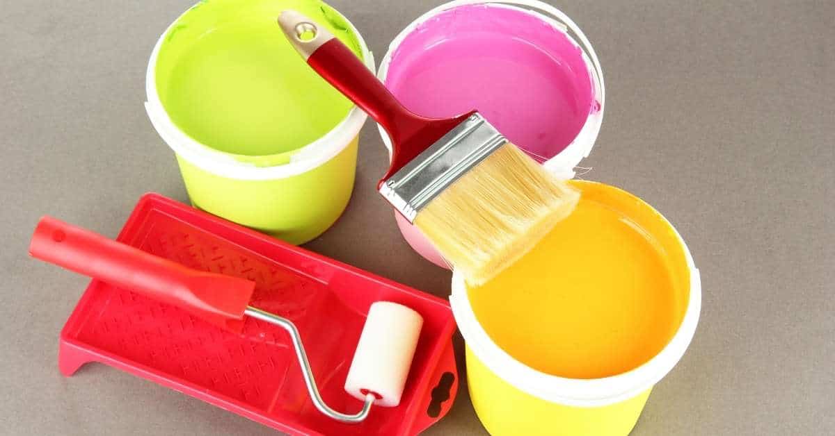
Tools, Materials, and Safety for 2026 Paint Projects
Cover surface assessment, tool sets, paint types, primers, and PPE. Provide budget-friendly and pro-grade options to fit different budgets and skill levels. This keeps prep practical without compromising performance.
Prioritize ventilation, respirators, eye and skin protection, and proper disposal. Document substrate prep steps, moisture blockers, and VOC considerations specific to the 2026 trends. Adhere to manufacturer guidelines during application.
Materials checklist and specs explained
Before you start painting, use this checklist to ensure you have the right materials for your project. Check each item off as you verify it.
- Sample Pot Size: Typically, a quart covers about 400 sq ft (small rooms), a gallon around 800-1200 sq ft (medium to large rooms). Check your room’s square footage and buy accordingly.
- Primer Type: For new drywall, use a PVA primer. For previously painted surfaces, an acrylic primer works best. Always prime bare surfaces for better paint adhesion.
- Paint Finish: Flat or matte finishes are great for ceilings and low-traffic areas. Semi-gloss is durable and washable, ideal for trim and high-traffic zones. Eggshell falls in between.
- Paint Sheen: Higher sheens mean better durability and easier cleaning but show imperfections more. Lower sheens hide imperfections better but are harder to clean.
- Paint Quality: Check the label for coverage (higher is better), hiding power, and durability. Cheap paint often requires multiple coats and doesn’t last as long.
- Dry Time: Look for dry times suitable for your project. Faster drying paints allow quicker recoating but may not be ideal for all surfaces.
- VOC Levels: Check the label for VOC (volatile organic compounds) levels. Lower VOCs mean less smell and fewer harmful emissions, especially important in enclosed spaces.
- Color Matching: If you’re using multiple paint cans, ensure they match by checking the color codes or getting a sample pot first.
Quick rule: Always buy more paint than you think you’ll need. It’s better to have extra and return it unused than to run out mid-project.
Safety and ventilation guidance
When it comes to painting, safety’s not something you can cut corners on. Here’s what you need to know:
Ventilation is key. Paint fumes can be nasty, especially with solvent-based paints. Keep windows open, use fans, or rent a ventilation system if you’re painting indoors. Check your paint can label for specific safety guidelines.
If you’re using low-VOC (Volatile Organic Compounds) paints, that’s great! They’re kinder to your lungs. But remember, even they need proper ventilation. And always keep pets and kids away from freshly painted areas until the fumes have cleared.
Protective gear is a must. Wear a good quality paint mask or respirator, safety glasses, and gloves. Don’t skimp on these – your health’s worth more than a few bucks.
When you’re done, dispose of leftover paint and materials responsibly. Check local rules for proper disposal methods. Never pour paint down the drain!
Cost considerations and budgeting tips
First off, don’t skimp on paint quality. Cheap paint means more coats and quicker wear. Check the label for coverage rate – it’s usually in square feet per gallon.
Estimate paint quantity: Measure your walls’ height and length, then multiply to get square footage. Divide by the coverage rate on the paint can. Don’t forget to add 10-15% for waste and touch-ups.
Primer’s a must if you’re painting new drywall or changing colors drastically. It seals the surface and helps paint adhere better, reducing coats needed. So, budget for it.
Reduce costs without sacrificing quality: Use a paint sprayer for large areas – it uses less paint than rolling. Reuse paint trays and liners. And don’t forget to check for sales or leftover paint at hardware stores.
Planning, Project Management, and Checklists
Outline a planning roadmap with a clear scope, budget, and timeline. Include a printable, fillable checklist that covers prep, testing, execution, and final inspection. This helps keep the project organized and low-stress.
Focus on site prep, material planning, testing protocols, and a logical execution sequence. Include a mid-project quality control pass and a final sign-off to document completion and accountability. Prepare for weather and humidity contingencies with practical steps.
Room-by-room planning tips
Use this checklist to prioritize tasks and minimize disruption in your home.
- High-impact areas first: Start with rooms you use most, like living room and kitchen.
- Coordinated trim/ceiling choices: Plan colors for trims and ceilings before painting walls to ensure a cohesive look.
- Schedule tasks wisely: Paint bedrooms last to avoid odors at night. Bathrooms first thing in the morning.
- Minimize downtime: Group similar tasks together (e.g., all prep work, then all painting).
- Avoid strong odors near sleeping areas: Ventilate well and use low-VOC paints where possible.
- Kitchen and bathrooms: Check for moisture issues before painting. Fix any problems first.
- Flooring protection: Cover floors with drop cloths, especially in high-traffic areas.
- Trim and ceiling heights: Consider these when planning your paint scheme. Dark colors can make ceilings feel lower.
Quick rule: Prioritize tasks to keep your home functional and comfortable during the project.
Time, labor, and staging checklist
Use this timeline to plan your painting project efficiently.
- Prep time: Allow 1-2 days for prep work like cleaning, sanding, and taping. Skipping prep leads to poor paint adhesion.
- Prime time: Apply primer in the morning when temperatures are cooler. Let it dry at least 4 hours before painting.
- Paint application: Allow 2-3 days for each coat, including drying time. Rushing can cause streaks and missed spots.
- Curing time: Wait at least 24 hours after the final coat before touching surfaces.
- Staging furniture: Move large pieces to the center of the room, cover with plastic, then tape off edges.
- Flooring protection: Use drop cloths and runners to protect floors from paint drips and foot traffic.
- Weather considerations: Avoid painting in direct sunlight or high humidity. These conditions can affect drying time and paint quality.
- Clean-up time: Allocate 1-2 hours at the end of each day for cleaning brushes, rollers, and trays.
Quick rule: Plan your time wisely to ensure a smooth, efficient painting process.
Final inspection and touch-up guide
Use this checklist to ensure a high-quality finish and document any issues for remediation.
- Uniform sheen: Check that the paint has dried evenly. Uneven drying can cause variations in sheen.
- Edges and corners: Ensure edges are clean and sharp. Touch up as needed.
- Drips and runs: Inspect for drips, especially around windows and doors. Sand and repaint if necessary.
- Coverage: Check that all areas are fully covered with no missed spots. Missed spots can lead to uneven color.
- Trim and ceiling lines: Ensure these are straight and even. Touch up as needed.
- Walls and ceilings: Check for any bubbles, cracks, or other defects. Document these for repair.
- Document issues: Take photos of any problems and note them in your project log.
- Sign-off sheet: Use a printable sign-off sheet to document completion and ensure all parties are satisfied with the work.
Quick rule: A thorough final inspection ensures a high-quality, long-lasting paint job.
Key Specs and Numbers That Matter (Without a Datasheet)
Share practical, real-world references for coverage and coats without quoting exact datasheet figures. Encourage readers to verify specifics with product labels and manufacturer instructions. This keeps expectations aligned with the actual product in use.
Provide guidance on testing steps, moisture considerations, and substrate compatibility. Include links to downloadable resources and example stories to illustrate Silhouette in different styles, while reminding readers to check local rules and material certifications before purchasing.
Short case studies — real transformations
The challenge: A modern, concrete-floored loft needed a fresh look. The test: We tried Silhouette’s ‘Dusk’, a deep gray with warm undertones.
After moisture testing and adhesion tests, we applied two coats. Result? A stunning, dramatic transformation that doubled the space’s perceived size.
The lesson: Dark colors can work wonders in small spaces with proper prep and testing.
The challenge: An old, porous concrete basement needed a facelift. The test: We tried Silhouette’s ‘Mist’, a soft white with cool undertones.
After prepping the surface and applying three coats, we had a bright, clean space ready for furniture. The lesson: Porous surfaces need more coats and proper prep to avoid uneven absorption.
The challenge: A traditional home with concrete floors needed a timeless look. The test: We tried Silhouette’s ‘Timber’, a warm, earthy brown.
After testing for moisture and pH tolerance, we applied two coats. Result? A classic, inviting space that blended seamlessly with the home’s architecture. The lesson: Neutral colors can create harmony in traditional spaces when chosen carefully.
Brochure, swatch pack, and planner downloads
Before you shop, download these resources to make your paint project a breeze:
Color Trends 2026 Brochure: Get inspired with before/after stories, color palettes, and expert tips.
Printable Testing Sheet: Test colors on-site before committing. Mark drying times, check adhesion, and note any issues.
Shopping List & Prep Guide: Print this checklist to ensure you’ve got everything needed for prep work and application. It includes surface prep tips, tool requirements, and safety guidelines.
Pro tip: Print these resources at home before visiting the store. They’ll save you time and help you make informed decisions.
How to work with pros — brief hiring checklist
Hiring a pro? Use this checklist before signing any contracts. It’ll save you time and money in the long run.
- Experience with color matching: Ask about their process for matching colors to samples. Inconsistencies can lead to disappointing results.
- Surface prep expertise: Ensure they understand how to prep concrete surfaces. Improper prep causes uneven absorption and adhesion issues.
- Warranty and guarantees: Check if their work is covered by a warranty or guarantee. This protects you from poor workmanship.
- References and past projects: Ask for references and photos of past concrete paint jobs. This shows their track record and skill level.
- Estimate breakdown: Ensure the estimate includes labor, materials, prep work, and disposal fees. Hidden costs can add up quickly.
- Cleanup policy: Ask about their cleanup process. A thorough cleanup ensures your space is ready for use as soon as possible.
- Safety protocols: Inquire about their safety procedures and certifications. This protects both you and the workers.
- Timeline and scheduling: Discuss the timeline and scheduling for the project. Delays can cause inconvenience and additional costs.
Quick rule: Never hire based on price alone. Quality workmanship and attention to detail are worth investing in.
Conclusion
Make the right choice now by locking in a tested plan that protects your investment and your space, using the Silhouette Af-655 and the 2026 palette as anchors but confirming every shade in the room before you commit. The key is to test, validate, and proceed with a clear plan to avoid costly rework and color surprises.
In practical terms, check the room quickly in order: sample the color on a small patch in the actual lighting, compare it to nearby swatches under different light, confirm you have the right base and finish, test the whole feaure area with a as-close-as-possible mini coat, and then roll out the plan with your checklist and time frame before buying large quantities, all while following safety steps and proper surface prep.
Common mistakes to avoid include assuming a sample will read the same on every wall, skipping light and finish checks, and rushing coats or cleanup. Always follow safety rules: wear eye protection and gloves, ventilate well, and test small areas first to catch problems early before you lay down a full coat or use strong cleaners. If you see hints of streaking, blotching, or mismatched undertones, pause and reassess rather than pushing through.
If the project starts to push beyond your comfort zone—significant surface repairs, large color shifts, or difficult textures—consider bringing in a pro. When in doubt about prep, coating, or safety, stop and consult a qualified painter or contractor. Stay methodical, stay safe, and you’ll finish with a durable, true-to-tone result you can be proud of.
FAQ
What makes Silhouette AF-655 the Color of the Year for 2026?
It’s chosen by the color team and used as a trend anchor. Look at the manufacturer’s notes for the exact rationale and how it’s meant to work in spaces. Check the label or datasheet for application guidance and any room-specific tips.
How can I use the 2026 Color Trends palette in my home?
Start with a main wall color and pick two coordinating hues for accents and trim. Test swatches in the actual room light and note how the colors look at different times of day. For specifics, follow the manufacturer instructions on color matching and finishing in your space.
Where can I download official Color Trends 2026 resources?
Visit the official brand site or your local paint retailer’s site for downloadable guides and color chips. Look for PDFs, printable swatch sheets, and project sheets. If in doubt, verify the file’s source and any usage rights in the terms.
Is Silhouette AF-655 a cost-effective choice for a whole project?
Check the price per unit and compare it with other options you’re considering. Read the product label for coverage guidance and expected coats. Do the math with your room size and consult the datasheet for any limits or recommendations on finishes.