

Introduction
This guide explains how to fix bedroom paint color choices that designers dislike in 2026. You’ll learn quick fixes, practical steps, and stop rules to avoid repeating the same mistakes. It keeps the process hands-on and focused on what you can do this weekend.
Common bedroom color trends for 2026 lean toward warm neutrals, muted tones, and contrast accents. We cover how to correct bad color picks with prep, paint layering, and edge care, plus what tools and materials you’ll need. Always check the product label, manufacturer instructions, and local rules for curing times and ventilation.
Key takeaways
- Assess current color against 2026 trends; pick toned-down palette if overwhelmed.
- Test patches on sample board; evaluate light, mood, and furniture harmony.
- Use primers and stain-blocking sealers to prevent bleed-through and uneven finishes.
- Choose matte to low-satin finishes for smoother walls and easier touch-ups.
- Plan safety: ventilate, wear mask, protect floors; keep children away.
- Allow adequate drying time between coats per label; label instructions override.
Table of Contents
- Introduction
- Key takeaways
- Why 2026 Paint Color Trends Matter for Your Bedroom
- Diagnose: How to Tell If Your Bedroom Paint Needs Fixing
- Color Psychology and Choosing a Better Bedroom Palette
- DIY Steps to Repaint and Correct Problem Colors
- Choosing the Right Paint Finish and Material Specs
- Coordination: Furnishings, Decor, and Lighting with New Colors
- Cost-Effective Tips, Time Estimates, and Safety Stop Rules
- Troubleshooting Common Post-Paint Problems
- Conclusion
- FAQ
Why 2026 Paint Color Trends Matter for Your Bedroom
In 2026, certain color directions are shaping how bedrooms feel and function. Expect muted earth tones, warm neutrals, soft greens and blues, and tactile neutrals to lead the conversation. These hues are chosen for their calming, rested mood and versatile pairing with wood tones and textiles.
Understanding these trends helps you plan updates that improve comfort, perceived space, and resale appeal. A quick comparison of your current palette to trend directions can reveal the most impactful updates, such as a focal wall, ceiling highlight, or coordinated neutrals. Use practical tactics like layering color with textiles and furnishings while avoiding oversaturation and mismatched lighting. Before you start, confirm lighting conditions, fabric swatches, and a simple mood board on a wall or board to guide decisions.
Top 2026 Color Trends to Know
In 2026, expect a shift towards soothing, nature-inspired hues in the bedroom. Neutrals are here to stay but with a twist – think ‘tactile neutrals’ like warm beiges and greys with subtle texture.
Earth tones are making a comeback, but they’re muted this time around. Expect soft terracottas, sage greens, and dusty blues that promote calm and rest.
Warm whites are also trending, providing a cozy contrast to the other colors. Accent colors like deep jewel tones or bold black can be used sparingly for impact.
Why Designers Avoid Certain Colors in 2026
Certain colors can make your bedroom feel dated or uncomfortable. Here are some trends to steer clear of:
- Overly bright whites: They can make the room feel cold and clinical.
- Saturated brights: Too much vibrant color can be overstimulating in a bedroom.
- Dull, dark neutrals: They absorb light, making the room feel small and gloomy.
- Clashing undertones: For instance, cool blues with warm yellow undertones can clash.
- Trendy colors that age quickly: Like neon or pastel shades that were popular a decade ago.
Instead, opt for hues that create a sense of tranquility and harmony in your space.

Diagnose: How to Tell If Your Bedroom Paint Needs Fixing
Begin with a quick visual audit to spot dull, muddy, or chalky tones, sheen inconsistencies, staining, or peeling that signals deeper issues. Note any color drift across walls and surfaces. This first pass tells you where to focus your fixes.
Next, run lighting tests under natural, incandescent, and LED sources to reveal undertones and true color. Assess room context with furniture, flooring, and window treatments to see if contrast is off. Add large swatches or patch tests and check finish type and coverage. Use a simple red-flag list to decide whether to repaint, retone, or add accents and repairs as needed.
Visual checkpoints and quick tests
Use this checklist when you suspect your bedroom paint isn’t quite right, but aren’t sure where to start.
- Morning/Evening Check: Observe how color shifts in different natural light. If it looks too pink or yellow at certain times, undertones might be off.
- White Card Test: Hold a white card against the wall. If the color appears different (too blue, green, etc.), undertones are showing through.
- Flash Photo Test: Take a photo with flash. If colors appear too bright or dull, it’s a sign of lighting issues.
- Chalkiness: Rub your hand on the wall. If it feels chalky, paint is likely old or poor quality.
- Sheen Mismatch: Check if sheen varies across walls. This could indicate touch-ups or different paint batches.
- Staining/Peeling: These signs point to deeper issues like moisture, mold, or poor prep.
- Dull/Muddy Tones: If colors appear flat and lifeless, they might be too dark for the room size or have wrong undertones.
- Color Bleeding: Check if color bleeds onto adjacent surfaces. This suggests poor prep or wrong primer.
- Poor Prep: Skipping prep leads to uneven absorption, causing patchy or streaky finishes. Always clean, sand, and prime surfaces.
- Wrong Primer: Using the wrong primer can cause color issues. For example, using a stain-blocking primer when not needed can darken colors.
- Wrong Sheen: Choosing the wrong sheen (matte, eggshell, satin) affects how light reflects and shows color. Test first to ensure it complements your room’s lighting.
- Small-Swatch Decisions: Relying on small paint swatches can lead to poor color choices. Always test larger swatches or patches in the room.
- Inadequate Stirring: Not stirring paint properly can cause uneven color distribution, leading to streaks and inconsistencies.
Quick rule: Don’t skip these tests. They help pinpoint issues before you start repainting.
Common DIY painting errors that cause color problems
These are common mistakes to avoid when choosing and applying bedroom paint.
Mistakes happen, but learning from them helps ensure a better final result. Always prep well, test colors thoroughly, and follow manufacturer guidelines for best results.
Color Psychology and Choosing a Better Bedroom Palette
Color can influence sleep patterns and morning energy. Warmer, muted tones tend to feel sleep-friendly, while cooler tones can signal alertness. Brightness and contrast also shape restfulness and comfort.
Calm palettes reduce perceived tension, while more stimulating schemes raise alertness. Consider saturation, value, undertones, and lighting direction to find harmony. Use a repeatable workflow to test palettes under natural and artificial light, and build swatch boards or digital mockups before painting.
Which colors promote rest vs. energy
In your bedroom, you want colors that promote relaxation and sleep. Warmer hues like blues, purples, and greens are generally more soothing.
Muted saturations of these colors can help create a calm atmosphere. For example, a soft blue–green like ‘Whispering Meadows’ can be very sleep-friendly.
On the other hand, brighter, more vibrant hues and higher saturations can stimulate energy and alertness. A bold red-orange like ‘Fiery Sunset’ might not be your best bet for a restful night’s sleep.
Matching color to room function and lighting
The way your bedroom is lit can greatly influence how colors look and make you feel. Consider the natural light in your room:
North-facing rooms tend to have cooler, softer light. Here, warmer hues like yellows or oranges can help balance this out.
South-facing rooms get plenty of bright, warm sunlight. Cooler hues like blues and greens work well here to keep the space from feeling too hot.
Artificial lighting also plays a role. Bulbs with cooler color temperatures (like ‘daylight’ bulbs) can make you feel more alert, while warmer ones (like incandescent or ‘soft white’ LED bulbs) can promote relaxation.
DIY Steps to Repaint and Correct Problem Colors
Start with a quick diagnostic to identify problem colors, underlying causes, and whether surfaces need patching or replacement. Identify if peeling, fading, or sheen mismatch are due to prep or material issues. This keeps the project focused.
Plan a color strategy with a durable, mood-appropriate finish. Create sample boards or digital swatches and map them to room lighting and furniture to prevent future misreads. Then follow a prep workflow with cleaning, repairs, masking, priming, and controlled painting to avoid common failures.
Tools and materials checklist
Before you start, make sure you have the right tools and materials. This list will help you gather everything you need.
- Paint: Choose a durable, washable finish in your selected color.
- Primer: Get stain-blocking or bonding primer for best results.
- Safety gear: Include safety glasses, gloves, and a respirator to protect yourself.
- Sandpaper: 120-grit sandpaper for smoothing surfaces.
- Putty knife: For filling cracks and holes.
- Paint brushes/rollers: High-quality, medium-sized brushes and rollers for even application.
- Tape measure: To ensure accurate cutting and placement of materials.
- Painter’s tape: For protecting trim, floors, and hardware.
- Drop cloths: To protect your floor from paint spills.
Quick rule: Always check your tools and materials before starting to avoid mid-project trips to the store.
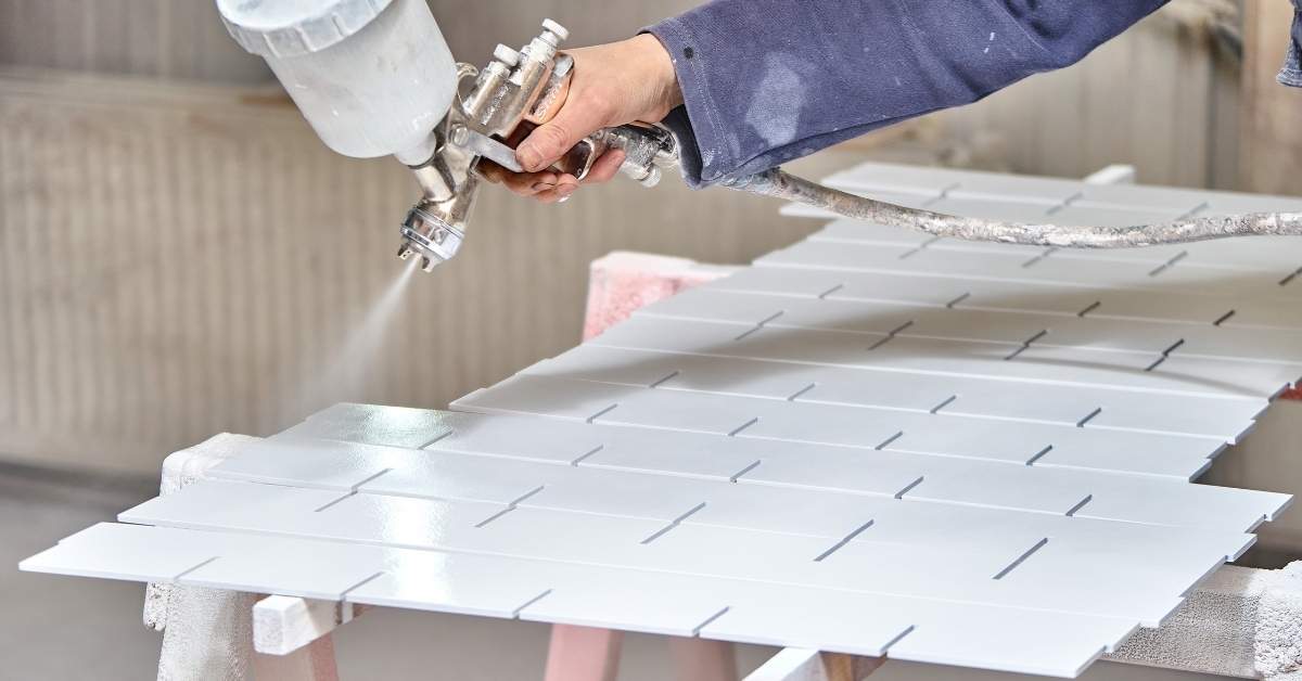
Step-by-step painting process
Follow this step-by-step sequence for a smooth, professional-looking paint job.
- Clear and protect: Clean surfaces, remove hardware, and tape off areas not to be painted. This ensures a neat, mess-free workspace.
- Sand and patch: Sand down any rough spots or imperfections. Use putty knife to fill cracks and holes, then sand smooth again. This gives you a smooth surface for painting.
- Prime: Apply primer to seal the surface and help paint adhere better. Use a roller or brush depending on your surface type.
- Apply base coats: Start with a thin coat, letting it dry according to manufacturer’s instructions. Then apply 2-3 more coats, allowing drying time between each. This ensures even coverage and color.
- Glazes/accents (optional): If you’re using glazes or accents, apply them now, following the same drying process as base coats.
- Final inspection: Once everything is dry, check for any missed spots or areas that need touch-ups. Make sure your paint job meets your standards before moving on to the next step.
Quick fixes: tone down or warm up an existing color
If you’re not ready for a full repaint but want to change the feel of your room, try these quick fix techniques.
Washing with tinted primer: Mix a small amount of your new color into a primer. Apply this to your walls. It will subtly change the perceived color without needing to paint over it completely.
Applying transparent glazes: Use clear glaze mixed with a small amount of your new color. Apply this over your existing paint for a subtle shift in hue and tone.
Adding trim contrast: Paint your trim a complementary or contrasting color to change the perceived color of your walls. This works especially well if your walls are a neutral shade.
Choosing the Right Paint Finish and Material Specs
Finish choice matters for how a bedroom reads under lighting and with textures. Use a quick decision map that connects room use to finish selection. Consider how sheen affects perceived depth and easy maintenance.
Compare finishes by use-case: matte for walls with imperfections, eggshell for general walls, satin for trim, and semi-gloss for doors or moisture-prone spots. Look at VOC options, durability, and cleanability, then pair finishes with primers and substrate prep for longevity.
Finish Selection by Surface and Wear
In a bedroom, different surfaces need different finishes to handle wear and reflect light. Here’s what works best:
Walls: Matte or eggshell finishes are great for walls. Matte hides imperfections but shows dirt. Eggshell gives a subtle sheen, making cleaning easier.
Trim: Satin finish is ideal for trim. It’s durable, easy to clean, and reflects just enough light to define the space.
Doors & Drawers: Semi-gloss is moisture-resistant and scrubbable, perfect for high-traffic areas like doors and drawers.
Environmental and Health Considerations
Choosing paint with low or zero VOCs (volatile organic compounds) is crucial for a healthy bedroom. Here’s what to look for:
VOC Levels: Opt for paints with low or zero VOC emissions. These are usually water-based or 100% acrylic.
Certifications: Look for certifications like GREENGUARD, ECOLOGO, or GREENSEAL to ensure the paint meets strict environmental standards.
Cleanup & Disposal: Always follow manufacturer’s guidelines for safe cleanup and disposal. Use non-toxic cleaners when possible.
Coordination: Furnishings, Decor, and Lighting with New Colors
Inventory existing furnishings and textiles to identify dominant colors and finishes. Decide what can stay and what should update to support the new palette. Create harmonious swatches that connect with the overall color story.
Align scale, style, and material mix so furniture and decor anchor the room without overpowering color. Test color perception with lighting plans, noting how natural and artificial light shift hues. Build a swatch and decor timeline to reinforce the palette with near-future updates and document a practical layout plan.
Simple furniture and decor swaps to complement paint
Start by assessing your existing furniture and textiles. Identify dominant colors, finishes, and patterns that can be worked with or replaced.
For a quick update, swap out throw pillows, curtains, and area rugs. Opt for solid colors or subtle patterns in hues that complement your new paint scheme. This is an affordable way to freshen up the room without breaking the bank.
Consider adding artwork or decorative accents in the new color palette. A few well-placed pieces can tie the whole room together and reinforce the updated look.
Lighting tweaks for true color appearance
Lighting plays a significant role in how colors are perceived. Start by evaluating your current lighting fixtures and bulbs.
Bulb Color Temperature: Incandescent bulbs cast a warm glow, while fluorescent or LED bulbs can have a cooler, bluer light. Choose bulbs with a color temperature that matches the mood you want to create in your room.
Layering Light: Use a mix of ambient (general), task, and accent lighting to create depth and dimension. This will help your paint colors look their best at different times of day and night.
Fixture Placement: Position fixtures to highlight specific areas or features in the room. For example, place a floor lamp near a seating area to draw attention to that space, or use a table lamp to cast a warm glow on a piece of art.
Cost-Effective Tips, Time Estimates, and Safety Stop Rules
Offer realistic ranges for a bedroom repaint by item, with notes on regional price variation and the impact of room size. Break down costs for paint, primer, supplies, tools, and any professional help. Use a simple itemized approach to keep budgets clear.
Provide time estimates for prep, priming, painting, drying, and cleanup, plus buffers for weather and ventilation. Share cost-saving strategies that preserve results, like multipurpose primers and bulk buying. Define safety stop rules for ventilation, PPE, ladder safety, lead concerns, and proper disposal to prevent regrets.
Budget hacks and time-saving shortcuts
Repainting a bedroom doesn’t have to break the bank. Here are some budget-friendly tips:
Paint calculators help you buy just the right amount, saving money and reducing waste.
Consider partial repaints. If your walls are in good shape, painting only the top half can refresh a room while saving time and paint.
Before committing to a color, use large sample swatches. They’re cheap and help you avoid costly mistakes. Time-wise, expect:
– Prep: 2-4 hours
– Priming: 1 hour per coat (1-2 coats)
– Painting: 3-4 hours per coat (2 coats)
– Drying/Curing: 4-8 hours between coats, 24 hours final
– Clean-up: 1 hour
Add buffers for weather delays and weekend schedules.
Stop rules and when to call a pro
There are times when it’s best to step back and reassess, or even call in a professional. Here are some ‘stop’ rules:
Major structural issues, like cracks or holes larger than a nickel, need attention before painting.
If you spot mold, stop immediately. It needs to be treated and the source of moisture addressed.
Complex color matching can be tricky. If you’re struggling, consider getting help from a paint store or hiring a pro.
Safety is paramount. If you’re uncomfortable with heights, ladder safety, or dealing with lead paint in older homes, it’s time to call a professional.
Troubleshooting Common Post-Paint Problems
Define common post-paint issues such as streaks, uneven sheen, color shift, and show-through. Include quick diagnostic tests like light angles, swatch comparisons, and touch tests to identify root causes. This helps you act fast with targeted fixes.
Provide a step-by-step remediation plan for each issue, including cleaning, light sanding, deglossing if needed, spot-priming, color/finish patch testing, and careful repainting. Use a test-patch workflow to document results under different lighting, and finish with preventive strategies and a finish-check checklist to avoid future problems.
Fixes for visible mistakes
Mistakes happen. Here’s how to fix them.
- Sanding and spot-priming: Lightly sand, clean, then apply a stain-blocking primer to cover up spots or stains before repainting.
- Additional coats: Apply extra coats to even out color and coverage. Use thin layers for best results.
- Feathering edges: When cutting in, feather the edge with your roller to blend it into the wall for a seamless look.
- Blending techniques: For hard-to-match areas, use a small brush or sponge to dab and blend paint onto the surface.
Remember, patience is key. Take your time and test patches before committing to the whole area.
Long-term maintenance and touch-up tips
Proper care keeps your paint job looking fresh. Here’s how:
Store leftover paint properly: Keep unused paint in a cool, dry place. Seal the can tightly between uses.
Prepare simple touch-up kits: Label and store small amounts of each color used in your room. Include a small roller or brush for easy touch-ups.
Regularly clean walls with mild detergent to remove dirt and grime. Touch up any nicks or scratches as soon as they appear to keep your paint job looking its best.

Conclusion
Fixing bedroom colors today matters for long term durability, safe living spaces, and a calmer look that actually works with your lighting. You can get a solid, lasting result without wasting time or money if you stay focused on testing first and protecting the room.
Start with a simple, practical check: test a small patch, prep the wall correctly, repair any flaws, prime where needed, choose the right finish, apply evenly with clean edges, apply the correct number of coats, and let each coat cure before you judge the color in the room’s light. Move step by step, in a steady sequence, and verify lighting, furniture, and decor work with the new palette before final touchups.
Two common mistakes to avoid are skipping patch tests and primer, which invites lifted paint and uneven color, and using the wrong finish or too much sheen in a small room, which can amplify flaws and glare. Always ventilate, wear a mask, keep solvents away from kids and pets, and follow product directions for safe drying times and cleanup—these simple safety rules keep you on solid ground and prevent costly fixes.
If the job drags on, or you hit complex surfaces, stubborn stains, or ventilation limits you can’t beat, call a pro instead of forcing it. When in doubt, prioritize a safe setup and a test patch, then push forward with confidence—you’ve got this, and the new colors will transform the room without wrecking the space.
FAQ
What are some common bedroom paint color trends for 2026 I should know about?
Look for calmer neutrals with warm undertones mixed with accent hues like soft greens or muted blues. Designers are favoring low-saturation colors that feel cozy, not loud. Avoid colors that look washed out in your room’s natural light unless you have ample daylight bulbs to compensate.
How can I fix a poor paint color choice without starting from scratch?
First, test a smaller area with a color glaze or tinted primer to shift the mood without a full repaint. Then apply a mid-tone overcoat to adjust the balance toward the new palette. If you’re unsure, check the product label and manufacturer instructions for layering and drying times.
What tools and materials do I need for a clean, smooth repaint?
Grab a quality angled sash brush for edges, a short-n nap roller for walls, a paint tray, painter’s tape, drop cloths, and a good primer if you’re covering a strong color. Have a small sanding block and clean rags ready for prep and touch-ups. Always follow the manufacturer’s instructions on each product label.
What are some practical, safety-focused tips for repainting a bedroom?
Ventilate the room well and wear a respirator or mask when sanding or using new products. Protect furniture with plastic or drop cloths and keep ladders stable on a flat surface. If you see peeling, mold, or excessive dust, stop and address it before continuing.