

Introduction
The main issue is choosing paint colors that look good in swatches but fail in real rooms. Wrong lighting, undertones, and sheen can make a color feel totally different once it’s on walls. In this article I’ll break down causes, quick checks, and simple fixes you can try.
To prevent regrets, test colors in your actual space under different lights before committing. Paint small test patches on wall-sized boards and observe for a few days, in morning and evening light. If a color reads too warm, cool, or off with the sheen, try a safer neutral or a lighter/duller version and check the label or manufacturer guidance.
Key takeaways
- Learn why designers regret certain colors based on under/over-saturation and context.
- Test color samples under actual room lighting before committing to big areas.
- Use large swatches on multiple walls to reveal shift in perception.
- Document prep and application steps to prevent future color failures.
- Safety: ventilate, wear masks, and follow label directions during testing.
- Visual checkpoints help match design intent across lighting changes.
Table of Contents
- Introduction
- Key takeaways
- Why Designers Regret Certain Paint Colors
- Common Paint Colors That Trigger Regret (and Why)
- How Lighting Changes Color Perception
- Testing Paint Safely and Effectively
- Causes Behind Color Failures (Materials, Prep, and Application)
- Fixes and Remediation Strategies
- Visual Checkpoints and Design Compatibility
- Tools and Materials Checklist for Testing and Fixing
- Conclusion
- FAQ
Why Designers Regret Certain Paint Colors
Color choices can feel right in a sample but look different once applied over walls and in daily life. Designers regret colors when the hue shifts with light, or when the mood clashes with the room’s purpose. Practical drawbacks like maintenance, touchups, and resale perception also weigh in.
The stakes include time, cost, and mood impact, all of which influence how a space performs for years. Visual balance with architectural features, materials, and furnishings matters as much as the color itself. When a color misreads or limits future options, the regret is immediate and personal for the project team and homeowner.
Aesthetic and Lighting Mismatches
Light makes color. So, it’s no surprise that designers regret choosing colors that clash with a room’s lighting situation.
Natural light changes throughout the day. North-facing rooms are cool; south-facing, warm. Consider this when picking your paint.
Glossy finishes reflect light, making colors look brighter. Matte absorbs it, toning down hues. Choose wisely based on your room’s lighting.
Psychological and Functional Misfits
Color affects mood. Designers regret picking colors that don’t fit a room’s purpose.
Cool blues and greens calm, but they can feel cold in bedrooms or dining rooms. Warm yellows and reds energize, but might be too stimulating for relaxing spaces.
Consider the room’s function when choosing colors. A home office needs focus, not distraction. A bedroom needs rest, not excitement.
Maintenance and Wear Issues
Some colors show dirt and scuffs more than others. Designers regret choosing high-maintenance hues.
Light colors reveal every mark, while dark ones hide them. But dark colors can feel heavy in small spaces or low-light rooms.
Fading is another issue. Direct sunlight fades colors over time. Consider this when picking paints for sunlit areas.
Common Paint Colors That Trigger Regret (and Why)
Very bright whites can feel cold or show flaws under certain lighting or textures. Beiges and greiges may drift warm or cool and clash with trim or natural tones. Bold or highly saturated colors often look great on swatches but can overwhelm or fade with time.
Saturated reds, blues, and greens can shift with daylight and artificial lighting, changing the room’s perceived temperature. Pale pastels might wash out in strong sun or compete with furnishings. Understanding context helps readers avoid these pitfalls and pick safer defaults while preserving flexibility.
Ultra-Deep and Pure Blacks
Black paint can be a bold choice, but it comes with its own set of challenges. First off, it absorbs light like a black hole. That means your room will feel darker, even if you’ve got plenty of windows.
Dust and fingerprints show up like a sore thumb on black walls. You’ll be constantly wiping them down to keep that sleek look.
Lastly, black can make spaces feel cave-like. It’s great for creating drama in small doses, but too much of it can make your room feel closed-in and depressing.
Lime and Neon Greens/Yellows
High-chroma, fluorescent hues like lime greens and neon yellows can be harsh on the eyes. They’re great for accent walls or small pops of color, but not so much for entire rooms.
These colors can also create an unwanted color cast on your skin under certain lighting conditions. You might look like you’ve got a perpetual tan… or jaundice.
Clashing with furnishings is another issue. These bold hues can make your furniture and decor look drab in comparison, unless you’re going for a specific retro or eclectic vibe.
Pale, Cool Whites and Washed-Out Greiges
Pale whites and washed-out greiges can look beautiful in the right light. But under certain conditions, they can turn blue or gray. It’s all about how your lighting plays with these cool-toned hues.
Another issue is that they can make your space feel sterile. These colors don’t have much warmth to them, so they can make a room feel cold and lifeless.
Lastly, they can highlight imperfections in your walls. Every crack, dent, or uneven patch will be visible on these light-colored surfaces.
How Lighting Changes Color Perception
Color appearance shifts with time of day due to changing daylight color temperature and brightness. The room’s orientation and window placement determine how much glare or shadow affects the hue. Bulb temperature and finish also alter perception, making a shade cooler or warmer than intended.
Surface finish, from matte to glossy, multiplies these effects by reflecting light differently. In short, the same color can read multiple ways from morning to evening and across different wall textures. Anticipating these changes helps prevent surprises during real-life use.
Natural Light Types and Their Effects
The sun’s position changes throughout the day, casting different types of light into your room. Understand these to manage color perception.
North light is cool and soft. It brings out blues and greens but can make reds appear dull. Expect colors to shift slightly cooler as the day goes on.
South light is warm and bright. It intensifies colors, making them look richer. Be prepared for colors to change dramatically from morning to afternoon.
East light starts cool but warms up quickly. Colors shift from cool to warm throughout the day. West light does the opposite, starting warm and cooling down. It’s best to test your paint in these conditions at different times of day.
Artificial Light and Bulb Temperatures
Bulbs come in warm and cool temperatures. Choose wisely to get the color you want.
Warm bulbs (2700K-3000K) have a yellowish hue. They bring out reds, oranges, and yellows but can make blues and greens look dull. Use them for cozy spaces like bedrooms and living rooms.
Cool bulbs (5000K-6500K) have a bluish hue. They intensify blues and greens but can wash out warm colors. Ideal for task lighting in kitchens, bathrooms, and workspaces.
Color Rendering Index (CRI) matters too. High CRI bulbs (80-100) show colors accurately. Low CRI bulbs (50-79) can make colors look dull or distorted. Always choose high CRI for best color accuracy.
Finish and Sheen Impact
The way a paint finish reflects light affects how we see the color. Here’s what to expect:
Matte and eggshell finishes absorb most of the light, making colors look richer but less vibrant. They hide imperfections well but can look dull in bright rooms.
Satin and semi-gloss finishes reflect some light, giving colors a slight boost in vibrancy. They’re good for high-traffic areas as they’re easy to clean.
Gloss finishes reflect the most light, making colors look bright and vibrant. They highlight imperfections but are great for highlighting architectural details.
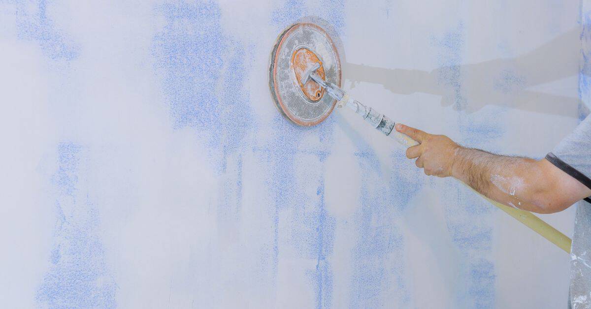
Testing Paint Safely and Effectively
Start by selecting representative test patches on the actual walls to compare with adjacent finishes. Observe the patches under morning and afternoon light and with the room’s usual lighting. Note how the color reads at different distances and angles.
Document each patch with a quick note on lighting, perceived warmth, and any contrast with trim or furniture. Allow testers to cure fully and re-check at multiple times before committing. Use the manufacturer’s instructions and product label as the baseline for testing expectations.
Sample Size and Placement Strategy
When testing paint colors, you want to see them in action. That means applying large samples, not just swatches.
I recommend painting 2×2 ft panels directly onto the walls you’re considering. This gives you a true sense of how the color will look in that specific space.
Key areas to test: north-facing walls (cool light), south-facing (warm light), east/west (changing light). Also, test near windows and away from them to see how light affects the color.
Time-Based Observation Checklist
Once your samples are up, observe them at different times of day and under various lighting conditions. This helps you understand how the color behaves in your space.
- Morning: See how the color looks in natural daylight as it changes from soft to bright.
- Afternoon: Check if the color washes out or becomes too intense under direct sunlight.
- Evening: Observe how artificial light affects the color’s appearance.
- Nighttime: See if the color feels too dark or not dark enough when it’s the only source of light in the room.
- Cloudy days: Test how the color looks on a day with flat, diffused light.
- Rainy days: Check if the color appears different when it’s wet outside (reflection).
- With lights off: See if the color feels too dark or not dark enough in the evening.
- With lights on: Observe how artificial light changes the color’s appearance.
Quick rule: If you can’t observe a sample at all times of day, try to get someone else’s opinion during the hours you miss.
Digital Tools vs. Physical Samples
While apps and photos can give you an idea, they’re no substitute for real samples. But they can help guide your choices before you start painting.
- Photos: Use them to get a general feel for the color in a similar space. Tip: Adjust exposure/brightness to mimic different lighting conditions.
- Color apps: They let you ‘try on’ colors virtually. Key settings: adjust brightness, contrast, and saturation. Warning: Results may vary based on your device’s screen calibration.
- Virtual reality (VR) tools: Some paint brands offer VR experiences. These can give a more accurate sense of how the color will look in your space. Price: Often free or included with paint purchase.
- Color scanners: Rentable devices that scan colors and suggest matching paints. Price: Around $50-$100 to rent.

Causes Behind Color Failures (Materials, Prep, and Application)
Wrong or incompatible primer can tint or dull the topcoat, altering the final color. Substrate undertones and existing finishes may bleed through if not properly addressed. Poor surface preparation often leads to uneven color and visible brush or roller marks.
Insufficient number of coats, inconsistent application, and using low-quality tools can produce color misreads and patchiness. Always verify that you follow the product data sheet and local guidelines for primers, seals, and topcoats before painting.
Underlying Surface and Primer Issues
The surface you’re painting on can throw a curveball at your color. Here’s why:
Stains, old sheens, or unsealed substrates can bleed through, changing the final appearance of your paint. This is especially true with light colors.
Solution: Inspect your surface. If it’s stained or has an old sheen, use a primer to seal it. It’ll save you time and money in the long run.
Paint Quality, Pigment Load, and Batch Variance
The quality of your paint, its pigment load, and batch consistency can all affect color depth and uniformity.
Low-quality paints might not cover well or could fade quickly. Different pigment strengths mean some tints may look off compared to others in the same color family.
Batch inconsistencies happen – even with the same paint brand, two cans from different batches can have slight color differences.
Application Techniques and Tools
The way you apply paint and your tools matter. Here’s how:
- Roller type: Different rollers hold more or less paint, affecting coverage and finish.
- Brush marks: Using a brush can leave visible strokes if not applied correctly. Use even pressure and work in one direction.
- Overlap patterns: Overlapping too much or too little can cause visible lines. Aim for about 50% overlap.
- Drying conditions: Paint dries differently in hot, cold, humid, or dry conditions. Keep an eye on the weather forecast and adjust drying times accordingly.
- Optional tools: Rentable tools like paint sprayers can give a smooth finish but require practice to use effectively. They typically cost around $50-$100 per day to rent.
Fixes and Remediation Strategies
If a color misreads, repaint with a compatible primer or sealer to stabilize undertones and achieve a truer finish. Consider color adjustments by using a small, tested variation rather than a whole new shade. Plan the remediation to minimize disruption and keep costs in check.
Use sampling methods like larger test boards or wall sections under typical lighting to confirm changes before proceeding. When budget or time is tight, consult the manufacturer instructions and, if needed, a local pro for guidance on the right finish and number of coats.
Tweaking Color Without Full Repaint
Don’t want to repaint the whole room? Here’s how you can tweak your color without stripping walls.
Consider glazing. This technique adds a translucent layer of paint with a hint of color, softening and shifting your existing hue. It’s like giving your walls a subtle makeover.
Another option is adding tints to your current paint. A tint is a colored dye added to a clear base. You can adjust the amount of tint to lighten or darken your color, creating a new shade without starting from scratch.
Lastly, think about changing up your trim. Painting trim in a lighter or darker shade than your walls can create contrast and make your room feel different. It’s a quick, easy fix that doesn’t require repainting the entire space.
When to Repaint vs. When to Adjust Lighting/Furniture
Before you grab that paintbrush, consider these factors to decide whether repainting is your best move.
First, evaluate the room’s lighting. Different types of light can change how we perceive color. If your walls look too dark or too bright, try changing your lightbulbs or adding more lamps for a softer glow.
Next, consider your furniture and textiles. Swapping out throw pillows, rugs, or even larger pieces can completely transform the feel of a room. Before you paint, try rearranging what you’ve got to see if that solves your color woes.
Lastly, weigh the cost and effort of repainting versus these alternatives. If it’s going to be a big job, or if you’re on a tight budget, consider trying these other fixes first. But remember, sometimes painting is the best solution – just make sure you’ve explored all your options.
Surface Repair and Recoating Best Practices
Got problem areas on your walls? Here’s how to fix them right, so they don’t come back to haunt you.
First, repair any damage. Fill holes with spackle or joint compound, sand smooth, then prime. This gives you a fresh surface to paint on and seals out moisture that could cause future issues.
Next, choose the right primer. A good primer will help your new paint stick and look better. It also seals the surface, preventing tannins (those nasty yellow stains) from bleeding through.
Lastly, pick the right sheen. High-gloss is great for hiding imperfections but can be too shiny. Flat or eggshell might be better for walls with minor flaws. And remember, always use a primer before painting – it’s the key to a long-lasting, beautiful finish.
Visual Checkpoints and Design Compatibility
Match color harmony with architectural details, materials, and textures in the space. Check how the hue interacts with furnishings, flooring, and fixtures under real lighting. Ensure the color supports the room’s intended mood and function.
Assess how the color reads at different times of day and with the room’s natural and artificial lighting. Confirm that the selected shade aligns with client needs, safety requirements, and resale considerations when applicable.
Color Interaction with Flooring and Furnishings
Before you pick a wall color, consider how it’ll play nice with your floors, furniture, and fixtures. Here’s a quick checklist to help.
- Wood flooring: Check undertones. Cool-toned woods like maple pair best with cool walls; warm tones like cherry go with warm walls.
- Tile and stone: Match the color temperature, not just hue. Warm tiles need warm walls.
- Textiles: Consider fabric colors and patterns. Solids are safer than prints.
- Metal finishes: Brass loves warm tones; chrome and nickel prefer cool ones.
- Avoid clashing undertones: Warm walls with cool floors can make a room feel off.
Quick rule: When in doubt, test samples. A little time upfront saves repaints later.
Skin Tone and Photography Considerations
Colors can flatter or flatten skin tones. Here’s how to pick winners for portraits and listings.
- Warm skin tones: Test warm colors like peach, beige, or soft yellows.
- Cool skin tones: Try cool hues like blue, green, or lavender.
- Avoid grays and neutrals: They can wash out skin in photos.
- Test with flash: See how colors look under artificial light for listings.
Quick rule: Test colors on yourself or a model. What looks good in a swatch might not translate to real life.
Small Space and High-Contrast Rules
Bold colors can be tricky in small spaces. Here’s how to use them right.
- Lighten up: Lighter shades make small rooms feel bigger.
- Monochromatic magic: Different shades of one color create harmony, not chaos.
- Avoid dark colors on walls: They’ll swallow light and shrink the space.
- Use contrast wisely: High-contrast looks great in big rooms. In small ones, it’s overwhelming.
Quick rule: If you’re unsure, start with lighter colors. You can always go darker later, but you can’t un-darken a room.
Tools and Materials Checklist for Testing and Fixing
Prepare sample-sized paints, primers, and sealers for accurate comparisons. Bring portable lighting and two or more light bulb temperatures to test color perception. Have a few clean brushes or rollers and a small tray for quick applications.
Include masking tape for clean edges, a color deck or fan chart, and a notebook to record observations. Always verify product data sheets and label instructions for recommended primer, coats, and cure times before testing or remediating.
Recommended Sample Materials and Test Supplies
Before you start testing or fixing your concrete surfaces, make sure you have the right materials. This checklist will help you gather everything you need to ensure accurate results and durable repairs.
- Sample Cards: Check size (usually 4″ x 6″) and material (plastic or cardboard). Ensure they’re clean and dry for accurate color matching.
- Sample Pots: Verify size (around 1 quart) and condition. They should be airtight to maintain consistency in your test samples.
- Mounting Boards: Confirm size (commonly 8″ x 10″) and material (MDO or HDO plywood). Ensure they’re flat for accurate testing.
- Tape Types: Check for painter’s tape (for clean edges) and masking tape (for general use). Both should be in good condition with no curling edges.
- Concrete Test Kits: Ensure they include all necessary components like pH test strips, water-cement ratio calculator, and air content meter. Check expiration dates.
- Moisture Meter: Confirm it’s a pin-type meter (for concrete) with a range of 0-99% MC. Calibrate before use to ensure accuracy.
- Concrete Repair Materials: Check labels for correct product type (e.g., patching compound, grout, sealer). Ensure they’re within their usable life and stored properly.
- Safety Gear: Verify you have safety glasses, gloves, and a dust mask. For testing, ensure your hard hat is clean to avoid contaminating samples.
Quick rule: Always check product labels and manufacturer instructions before starting any test or repair work. This ensures you’re using the right materials and following safe practices.
Lighting and Measurement Tools
Before you start testing or fixing any issues, make sure you have the right tools to see clearly and measure accurately. Use this checklist to ensure you’re well-equipped.
- Portable Light Source – Check you have a reliable flashlight or headlamp with fresh batteries. You’ll need it for dark spaces like attics, crawlspaces, or behind appliances.
- Color Temperature Meter or App – Ensure you have one to maintain consistent lighting conditions while inspecting and fixing issues. This helps avoid false positives or negatives due to changing light.
- Tape Measure – Verify it’s in good condition, as a faulty measure can lead to incorrect installations or repairs.
- Level – Check your torpedo or laser level is functioning properly. A wonky level can cause crooked installations and costly rework.
- Clamp Meter – Ensure it’s working for testing electrical circuits safely. A faulty meter could give false readings, leading to shocks or damaged equipment.
- Infrared Thermometer – Confirm it’s in good working order for detecting heat loss/gain issues. A bad reading can result in ineffective insulation upgrades.
- Moisture Meter – Check it’s functional for finding water damage or leaks. An inaccurate meter could miss problems, leading to further damage and costly repairs.
- Plumb Bob – Ensure it works properly for checking vertical alignment. A wonky plumb bob can cause misaligned installations and structural issues over time.
Quick rule: Always double-check your tools before starting any task. Faulty tools can lead to expensive rework, safety hazards, or inaccurate results.
Repair and Application Tools
Before you start painting or applying any new material, use this checklist to ensure you have the right tools for a smooth, safe job.
- Paint Roller Cover: Check size (6″ – 9″) and nap length (1/4″ – 3/4″) match your surface and paint type. Too short or long can cause uneven coverage or drips.
- Paint Brushes: Inspect bristles for stiffness and length; they should be firm yet flexible, and long enough to reach edges easily. Soft bristles may splay, hard ones won’t release paint well.
- Sandpaper (120-220 grit): Feel the paper to ensure it’s not too coarse or fine; wrong grit can leave scratches or fail to remove imperfections.
- Sanding Block: Check size and shape fit your surfaces. Too small may cause gouges, too large won’t reach corners.
- Respirator/Mask: Ensure it’s rated for paint fumes (P100 filter) and fits well to protect against inhalation. A poor fit can lead to illness or discomfort.
- Eye Protection: Check lenses are clear, unscratched, and provide adequate coverage. Debris in eyes can cause injury or infection.
- Drop Cloths/Tarps: Verify size covers your work area to prevent damage from spills or drips. Too small may result in ruined floors or furniture.
- Painter’s Tape: Inspect for proper adhesion and easy removal. Poor tape can cause peeling paint or leave residue behind.
Quick rule: Always check your tools before starting any job. Using the wrong tool can lead to costly rework and a poor final result.
Conclusion
Color decisions now matter for safety, durability, and how the room finally reads every day, so plan to test, verify, and confirm under real conditions before you commit.
Start with a simple, natural-language checklist: paint a small patch on the actual surface, check how it looks under the room’s lighting at different times, verify that your prep, materials, and application follow the tested method, observe the dry and cured appearance against your visual checkpoints, and only then approve the final color choice for a broader area.
Common mistakes to avoid include skipping a proper test area or ignoring how lighting will change the color, neglecting thorough prep or using the wrong finish, and rushing through drying times or safety steps; the safety rules are plain—ventilate well, wear protection, test in a small area first, and keep a clean, dry workspace to prevent damage and costly fixes.
If you’re unsure after testing or the color still looks off in your space, call a professional sooner rather than later, especially for tricky lighting setups or large surfaces, and stay confident—you’ve got solid steps, a clear plan, and the know-how to get results that last.
FAQ
What quick checks prevent color regret before you roll or brush?
Make a sample patch on the actual wall surface and let it dry in the room you’ll use. Compare the patch in morning and evening light; check both walls and trim areas. Check the label for lighting recommendations and any note about finish or sheen.
How should you test color in multiple lighting conditions?
Paint a few small test spots and view them under daylight, artificial light, and any task lighting you’ll use. Move around the room and look from different angles. If a color shifts noticeably, you might need a different shade or finish type as advised by the product instructions or a manufacturer label.
What mistakes with prep or primer lead to color shifts or failures?
Skip or skimp cleanup, and you’ll trap dust and oils under the paint. Use the recommended primer for your substrate and follow the label’s guidance on surface prep. If in doubt, check the product datasheet or manufacturer instructions for the exact prep steps.
How do you fix a color you hate after it’s already applied?
Evaluate if you can repaint with a different shade or use a glaze or topcoat as a corrective step per product instructions. For large areas, test the new color on small sections first and verify compatibility with the existing finish and substrate by checking the label or manufacturer guidance.