
Introduction
Color choices for a small kitchen are about using light walls and brighter accents to make the space feel larger. It’s not magic—the right colors reflect more light, reduce visual clutter, and work with your existing cabinets and countertops. Start by testing a few swatches on the wall in different lighting and observe how they change through the day.
Color is a lot about perception, so consider how gloss or satin finishes reflect light and how that looks next to your surfaces. When choosing online swatches, compare them with real paint chips in your kitchen lighting and be wary of online photos misrepresenting color. If in doubt, pick a neutral base and test a few temp shades in small patches, then adjust with lighting or trim later.
Key takeaways
- Color choice matters; small kitchens benefit from light, low-gloss neutrals.
- Test swatches in your kitchen lighting at different times of day.
- Consider surrounding surfaces and reflectivity to avoid muddy undertones in small spaces.
- Undertones and paint formulation influence perceived size more than hue alone.
- Plan for safety: ventilation, fumes, and ladder stability during painting.
- Carry out staged testing before committing to a full color change.
Table of Contents
- Introduction
- Key takeaways
- Why Color Choice Matters in a Small Kitchen
- How Lighting Changes Paint Colors (Causes)
- Surrounding Context and Reflectivity (Causes)
- Paint Formulation and Undertones (Causes)
- Best Color Choices to Make a Small Kitchen Look Bigger
- Practical Testing Methods Before Painting (Testing)
- Fixes and Adjustments If Color Goes Wrong (Fixes)
- DIY Planning Checklist and Safety Considerations
- Conclusion
- FAQ
Why Color Choice Matters in a Small Kitchen
In a tight kitchen, color isn’t just decoration—it changes how big or small the room feels. Light-reflective surfaces bounce more light around, while deeper tones can absorb it and make walls recede. Undertones shift mood and perceived size under different lighting conditions.
Choose high-reflectance whites and very light neutrals to brighten walls, and test undertones by comparing them against adjacent backsplashes and counters. Avoid muddy grays or beige that can pull color into the cabinets. Plan a simple testing routine with large swatches in multiple lighting scenarios and consider how a satin finish interacts with cabinet and countertop textures.
Perception principles: light, contrast, and scale
In a small kitchen, your eye needs to be tricked into thinking the space is bigger. That’s where lightness comes in.
Light colors reflect more light, making walls seem further away. This creates an illusion of depth, expanding your kitchen visually.
Low contrast between walls and ceilings also helps. It makes the ceiling appear higher, giving a sense of more space above you.
Consistent color planes – like having cabinets and walls in similar shades – keeps the eye moving smoothly around the room. No sudden stops mean no cramped feelings.
How color temperature influences depth
Warm colors like reds, oranges, and yellows advance towards you. They can make a small space feel cozier but also more cramped.
Cool colors, on the other hand – blues, greens, purples – recede into the background. They create a sense of distance, opening up your kitchen.
Desaturated hues – pale blues, soft grays – are even better at this trick. They’re not too bright or bold, so they don’t draw attention to themselves but still help expand the space.
Pro tip: Cool colors work best on walls opposite windows. The natural light bounces off them, amplifying their receding effect.

How Lighting Changes Paint Colors (Causes)
Natural light direction and time of day can tilt undertones toward cooler or warmer hues. Morning light often reads crisper, while sunset light can warm colors noticeably. The kitchen’s orientation matters because it alters how colors perceived on walls shift throughout the day.
Artificial lighting also plays a big role. Different bulbs and color temperatures can alter how a color appears next to cabinets and countertops. Always test in situ with large swatches under all typical lights and keep notes on any metameric shifts you observe.
Window orientation and natural light effects
The sun’s position throughout the day casts different color tones onto your kitchen walls. Here’s what to expect:
North-facing windows bring cool, blue-toned light. Colors may appear cooler in the morning and evening.
South-facing windows offer warm, yellow-toned light. Expect colors to shift warmer as the day progresses.
East-facing windows start with cool light, shifting to warm by late afternoon. West-facing windows do the opposite, starting warm and cooling off in the evening.
Artificial light types and color rendering
Different artificial lights cast varied hues on your walls. Here’s how:
Incandescent bulbs emit warm, yellowish light (2700K). They enhance reds and oranges but can make blues appear dull.
LED bulbs come in different color temperatures (2700K-6500K). Cooler LEDs (5000K+) can make colors appear more vibrant, while warmer ones (2700K) create a cozy atmosphere.
Fluorescent lights vary. Some cast greenish tones; others are cool and bright. Check their color rendering index (CRI) – higher is better for accurate color representation.
Surrounding Context and Reflectivity (Causes)
Adjacent surfaces like cabinets, countertops, and flooring reflect light and cast subtle color casts on walls. Warm or cool undertones from these surfaces can push a color toward perceived brightness or gloom. Trim and glossy finishes further influence contrast and depth on wall colors.
Appliances and exterior views also create reflections that change the wall’s appearance through the day. Use swatches on multiple walls and compare under different lighting to anticipate real-room results. Choose base and gloss levels that minimize unwanted shifts in a small kitchen.
Materials and finishes that reflect or absorb color
Material choices can significantly impact how your wall colors appear. Shiny surfaces, metallics, and dark cabinetry can tint nearby walls.
- High-gloss cabinets: Reflect light, making walls look brighter. Use matte paint to balance this.
- Metallic appliances: Cast color reflections on walls. Choose paint with complementary undertones.
- Dark cabinetry: Can make walls appear duller. Opt for lighter, brighter wall colors.
- Light-colored countertops: Reflect light, enhancing wall color brightness. Consider this when choosing paint.
- Wood floors: Can absorb or reflect light based on stain color. Choose paint that complements the floor’s undertone.
Coordinating trim, cabinets, and backsplashes
When choosing wall colors, consider your existing elements to avoid unwanted color shifts. Trim, cabinets, and backsplashes should harmonize with your walls.
Trim: Should be lighter than walls for a clean look. Consider white or a shade lighter than your walls.
Cabinets: Can be darker than walls but should have similar undertones to maintain harmony.
Backsplashes: Can add contrast or complement wall color. Choose based on the overall look you want.
Paint Formulation and Undertones (Causes)
Paint bases and tint systems dictate final hue, saturation, and opacity, and undertones can feel amplified in confined spaces. A single color name may read differently across brands because of base chemistry and pigment load. These differences matter when you’re aiming for a calm, enlarging effect.
When working with pros, ask about base type, tint strength, and brand-specific undertone guidance. Request test pots that match the actual base used by that brand. Do large, well-lit swatches on the actual wall and compare several brands to spot undertone shifts.
Identifying and reading undertones
Undertones are the subtle colors hidden within a paint’s main hue. They can dramatically shift how a color appears, especially in small spaces like kitchens.
To spot undertones, compare swatches under different lights. Warm undertones have yellow, red, or orange hues (like ‘warm white’). Cool undertones lean blue, green, or purple (‘cool white’).
Tip: Hold swatches next to each other and look for shifts in color temperature.
Brand variability and sample practices
The same color name can look different across brands due to base chemistry, pigment load, and naming conventions. A ‘neutral’ white from one brand might have a warm undertone in another.
To minimize surprises, test paints from multiple brands. Ask pros for low-tint, neutral versions – these have less pigment, reducing dramatic undertone shifts.
Pro tip: Request samples with the actual base and tint strength you’ll use on-site to get accurate results.

Best Color Choices to Make a Small Kitchen Look Bigger
Start with whites and near-whites (warm undertones like ivory or buttercream) and mix in light grays and soft beiges. These values reflect light and reduce enclosure, helping the space feel airier. Avoid undertones that look muddy or yellow under your kitchen lighting.
Keep the palette simple and test 2–3 safe options in real rooms. Consider satin or eggshell finishes to maximize light bounce while coordinating with cabinet colors and countertop textures to preserve depth and balance.
Light neutrals and warm whites
Warm, slightly creamy whites are your friend in a small kitchen. They add brightness without making the space feel sterile or cold.
Look for whites with undertones of ivory or buttercream. These have just enough warmth to reflect light and make the room feel bigger.
Safe starting range: Whites with LRV (Light Reflectance Value) between 80-90, like Benjamin Moore’s ‘Simply White’ or Sherwin-Williams’ ‘Alabaster’.
Test these in your kitchen to see how they look at different times of day. They should maintain a light, airy feel even when the sun goes down.
Soft cool grays and pale blues/greens
Low-chroma cool hues like soft grays, baby blues, or pale greens can make a small kitchen feel larger by receding visually.
These colors work well in kitchens with northern light exposure or coastal views. They complement natural light and create a calming atmosphere.
Safe starting range: Grays with LRV around 70-80, like Sherwin-Williams’ ‘Revere Pewter’, or blues/greens with low saturation, such as Benjamin Moore’s ‘St. Thomas Blue’.
Remember, cool colors can feel a bit chilly in artificial light, so test them thoroughly to ensure they maintain the desired effect at night.
Practical Testing Methods Before Painting (Testing)
Use large peel-and-stick samples in representative areas to gauge undertones and coverage without committing early. Place them where traffic and lighting mimic real use, including near windows and away from direct sun. Observe how they read from different angles.
Plan painted swatches on multiple walls with even coats to simulate the actual result. Create a lighting matrix spanning typical morning to evening hours and include common artificial lights. Document observations with photos and quick notes for color decisions.
How to set up accurate paint tests
To get the most out of your color testing, follow these steps:
Peel-and-stick samples: Use large samples (at least 2′ x 4′) for best representation. Place them in areas that mimic your kitchen’s conditions – near windows, away from direct sun, and where you’ll be working most.
Observe these samples over a few days to see how they behave under different lighting conditions before making decisions.
Interpreting test results and spotting undertone shifts
Once you’ve let your tests marinate, it’s time to analyze:
Color shift: Check how the color looks at different times of day. Does it appear too warm in the morning or too cool at night?
Undertones: Look for any unwanted undertones that might be lurking. Hold a gray card next to your sample to see if it brings out any hidden colors.
Contrast with cabinets: Tape some samples up near your cabinets to see how they play together. If something isn’t working, don’t hesitate to retest with alternate tints or brands.
Fixes and Adjustments If Color Goes Wrong (Fixes)
First diagnose whether the issue comes from undertone misread, lighting temperature, or adjacent colors. Then consider practical fixes like adjusting trim or cabinet finishes and adding reflective surfaces to rebalance hue. Changing lighting can often shift a color into a better range.
If repainting is needed, choose a neutral base and test undertones that counteract the cast. Compare multiple brands and swatches under varied lighting before committing, and consider finishing changes to reduce the risk of future shifts.
Low-cost cosmetic fixes
If your kitchen’s color isn’t quite right, don’t reach for the paintbrush just yet. There are low-cost fixes that can make a big difference.
First, swap out light bulbs. Warm white lights (2700K-3000K) can soften harsh colors and make small spaces feel cozier. Cool whites (5000K-6500K) can brighten up a room but might exacerbate color issues.
Next, consider adding reflective surfaces. A glossy backsplash or countertop can bounce light around the room, making it feel brighter and larger. Mirrors are another great option to reflect light and create the illusion of more space.
Lastly, don’t overlook the power of lighter hardware. Swapping out heavy, dark cabinet pulls for lighter ones can visually reduce their weight in the room, making your kitchen feel less cramped.
When repainting is the best option
Sometimes, no matter how many quick fixes you try, the color just isn’t working. It’s time to bite the bullet and repaint.
Signs that it’s time for a change include:
– The color looks dull or lifeless in your kitchen’s lighting.
– You’re seeing unwanted undertones that you didn’t notice before (see ‘Paint Formulation and Undertones’ earlier).
– The color is visibly shifting throughout the day due to changing light.
When choosing a new color, learn from your mistakes. If the old color was too warm, try a cooler one this time. If it was too dark, opt for something lighter. Consider using a neutral base with a subtle undertone that counteracts the cast of the old color.
Before you commit, test large patch swatches in different lighting conditions (see ‘Practical Testing Methods Before Painting’). This way, you can be sure you’re making the right choice before you start rolling.
DIY Planning Checklist and Safety Considerations
Outline the project phases from prep through cleanup and set a realistic, kitchen-friendly timeline. A simple plan helps minimize disruption in a small space. Keep the focus on practical steps that you can complete without fast-tracking missing details.
Create a measurements and testing plan, list tools and materials, and map out ventilation and safety practices. Include a cleanup routine and a contingency path if testing results prompt changes to color or finish choices.
Tools, materials, and material specs explained
Before you start painting, make sure you have all the right tools and materials. Here’s a checklist to help you.
- Paint: Choose a water-based acrylic paint with a satin or semi-gloss sheen for easy cleaning. Check the label for mildew resistance and low VOCs.
- Primer: Use a primer that blocks tannins (like Zinsser B-I-N) to prevent discoloration, especially on knotty woods.
- Caulk: Get paintable, flexible caulk for filling gaps and cracks. Check it’s suitable for your kitchen’s conditions (e.g., heat, moisture).
- Sander or sanding block: For smoothing surfaces, use a fine-grit sandpaper (120-220 grit) to avoid visible scratches.
- Paintbrushes: Have 2-inch and 3-inch angled brushes for cutting-in edges and trim. Synthetic bristles work well with water-based paints.
- Rollers: Use 9-inch rollers with synthetic or lambswool covers for smooth, even coverage on walls.
- Tray: A large roller tray will help you load and unload your roller efficiently.
- Painter’s tape: Blue painter’s tape is best; it won’t leave residue or peel off paint when removed.
- Drop cloths: Protect floors with canvas or plastic drop cloths. They’re reusable and easy to clean.
- Safety gear: Include a sanding dust mask, gloves, eye protection, and a respirator for sanding or painting in poorly ventilated areas.
Quick rule: Always check your paint’s label. It tells you what sheen to use, if it resists mildew, and its VOC content.
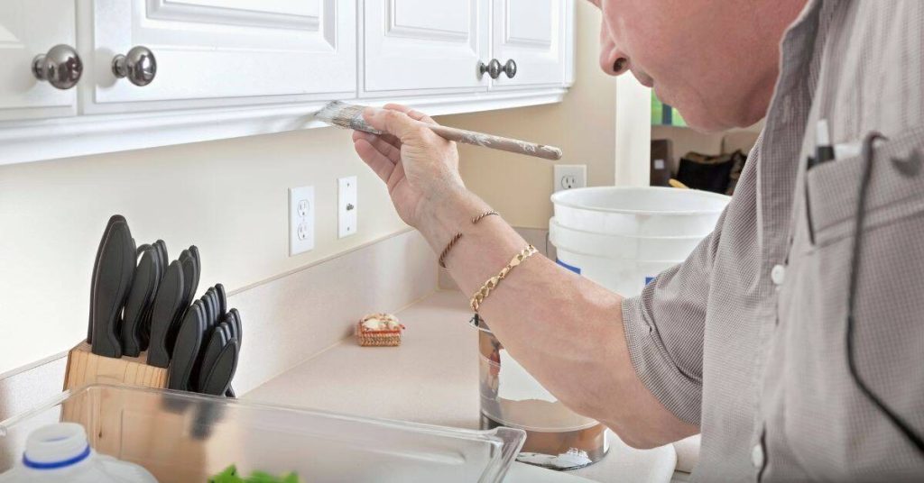
Scheduling, prep work, and ventilation safety
Before you start painting, follow this checklist to ensure your kitchen is ready and safe for the job.
- Measure walls: Calculate wall area by multiplying height x width. This helps estimate paint needed.
- Clean surfaces: Remove dirt, grease, and grime using a degreasing cleaner or TSP (trisodium phosphate).
- Degloss glossy surfaces: Use deglosser or sand lightly to help primer and paint adhere better.
- Repair cracks: Fill gaps, holes, and cracks with spackle or caulk. Sand smooth once dry.
- Mask areas: Protect trim, cabinets, and floors with painter’s tape and drop cloths.
- Ideal painting times: Paint when temperatures are between 65-85°F (18-29°C) for best results. Avoid painting in direct sunlight or extreme humidity.
- Ventilation: Turn on your range hood, open windows, and use a portable fan to keep the air moving. This helps reduce odors and dries paint faster.
- PPE (Personal Protective Equipment): Wear gloves, eye protection, and a respirator if needed for sanding or painting in poorly ventilated areas.
- Electrical safety: Turn off power at the circuit breaker before working near electrical outlets or switches.
Quick rule: Always prioritize ventilation. It helps control odors, dries paint faster, and keeps you safe from harmful fumes.
Conclusion
Color choice in a small kitchen packs a punch for safety, durability, and how the space feels in everyday use. Plan from the testing stage and keep the risks of damage or costly mistakes in front of you at all times.
First, test patches in a concealed area and watch how the color reads in different lighting, then compare undertones and reflectivity with surrounding surfaces, choose a paint with a compatible formulation, and plan for proper priming and ventilation before you buy. Do the work in clear steps: prep, test, pick a color, then paint in stages, and always wear proper PPE and keep a good fresh-air flow.
Common mistakes to avoid include skipping the testing step, painting without prepping or sealing surfaces, and picking a color that looks great on a chip but wrong on the wall under fluorescent or warm lighting. Safety rules are simple: ventilate the room well, use a respirator or mask, protect floors and cabinets, and keep a dry, stable workspace so you don’t cause damage that’s hard to fix later.
If you encounter wiring, structural issues, or persistent adhesion problems, or if the space has unusual finishes, it makes sense to call a pro rather than pushing on solo. Stay disciplined, follow the testing plan, and you’ll end up with a kitchen that feels bigger and stays durable for years to come.
FAQ
How do I understand color complexity when choosing paint for a small kitchen?
Colors aren’t just one shade. They have undertones that show up differently with light and adjacent surfaces. Test multiple chips in your space and compare them side by side, not just online swatches.
How does lighting affect paint colors in a small kitchen?
Different lights change how a color reads. Check swatches under your main kitchen lights, plus any task lighting and natural light at different times of day. If a color shifts too much, pick a more stable option.
How do reflectivity and surrounding context change color perception?
Glossy finishes bounce more light; flat finishes absorb it. Surfaces nearby—cabinets, counters, tile—also reflect color. Test colors on a wall patch next to those surfaces before committing.
Is it safe to trust internet-based color picks for my kitchen?
Online picks can look different in person. Always compare with real paint chips in your space and under your lighting. Read labels and follow manufacturer instructions; don’t rely on online images alone.
What practical strategies help make a small kitchen look bigger through color?
Choose light, neutral bases with cool or balanced undertones. Keep contrast limited and test with big patches on the wall you use most. Use the same undertone family across walls, trim, and nearby surfaces to avoid jarring shifts.