
Introduction
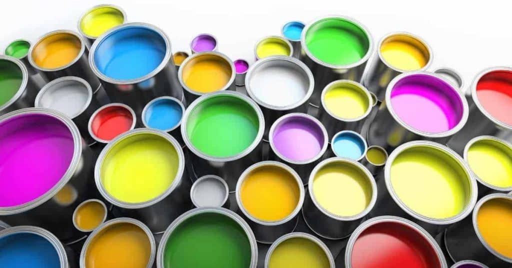
Paint colors can instantly upgrade a living room by changing mood, light reflection, and how the space reads.
As a hands-on DIY job, start with the room’s lighting and size, then pick a color family that fits. Test swatches on large poster boards and in multiple corners before committing to a finish and sheen.
Color psychology and lighting dramatically influence the final look, so plan how warm or cool tones feel in your space. Pair colors with trim, furniture, and flooring to create contrast without clashing. Always check the product label and manufacturer instructions for coverage, drying times, and recommended sheens.
Key takeaways
- Test color samples on multiple walls at different times of day before committing.
- Choose neutral bases for flexibility; add personality with accent walls or trims.
- Lighting dramatically shifts hues; check swatches under daylight, bulbs, and fixtures.
- Balanced contrast enhances depth: darker trim or furniture should echo walls softly.
- Popular colors cycle; calm tones remain timeless while bold shades energize focal points.
- Safety: ventilate well during painting and follow paint label safety guidelines.
Table of Contents
- Introduction
- Key takeaways
- How Paint Color Transforms a Living Room: Quick Overview
- Best Paint Colors That Instantly Upgrade Most Living Rooms
- Factors That Influence Which Colors Work Best
- Psychological Effects of Paint Colors on Mood and Function
- Testing Colors Safely: Samples, Lighting Tests, and Mockups
- Painting Techniques and Finishes to Maximize Impact
- Budget-Friendly Vs. Professional/High-End Options
- Longevity, Maintenance, and Environmental Factors
- Conclusion
- FAQ
How Paint Color Transforms a Living Room: Quick Overview
Color changes how we perceive space, mood, and light in a room. Small shifts in hue, value, and saturation can make a big difference in a living room’s feel. This section outlines the problem/solution approach you’ll see across the article.
Think about visual scale and balance: light walls can make a space feel larger when paired with dark furniture, or vice versa. Saturation levels affect ceiling height perception and create focal points you can nail with simple placement tips. You’ll also map mood to function, with quick guidelines for neutrals, warm neutrals, and accent pops while testing color in real-time areas.
When color change is the right solution
The living room feels dull, small, or chaotic? Before moving furniture or rearranging, consider a fresh coat of paint. Color changes perceived space, mood, and light reflection.
Dullness signals a need for brighter hues or lighter values. Small feel? Lighter walls with darker furniture creates depth, making the room seem larger.
Clashing tones? A color palette overhaul can unify the space. Remember, small changes in hue, value, and saturation can yield outsized effects.
Common pitfalls to avoid
Don’t let these frequent mistakes dampen your living room upgrade. Learn from them to achieve the desired result.
- Too-dark hues: Dark colors absorb light, making rooms feel smaller and moodier than intended.
- Ignoring undertones: Undertones can change a color’s appearance under different lighting conditions. Test thoroughly to avoid unpleasant surprises.
- Mismatched finishes: Different sheens on walls, trim, and furniture can clash. Plan your finish combinations carefully.
- Relying solely on samples: Small paint chips or even larger swatches don’t always represent the final look. Test on large poster boards to see how colors interact in your space.
- Not considering room use and lighting: Colors that work well for relaxation might not be suitable for socializing or watching TV. Consider function and light quality when choosing hues.
By avoiding these pitfalls, you’ll create a living room that’s truly upgraded with the perfect paint colors.
Best Paint Colors That Instantly Upgrade Most Living Rooms
We’ll categorize picks into neutrals, warm tones, cool tones, and accent colors, highlighting benefits for common living-room goals like coziness or airiness. Each category offers broad applicability and thoughtful first-choice suggestions. Undertones and lighting will influence how a color reads in your space.
Learn when to lean warm or cool to affect mood and how to keep furniture and flooring in harmony. Accent color strategies cover walls, trim, and accessories to avoid clutter, with quick swatch testing methods and a simple in-wall decision checklist. Finishes and maintenance tips round out the practical side for busy rooms.
Universally flattering neutrals
Neutral colors are a safe bet for any living room. They create an illusion of larger space and pair well with various styles.
White, gray, and beige are popular choices. Consider undertones – warm whites have yellow or pink undertones, cool whites have blue or gray undertones. Gray can lean warm or cool depending on its base color.
For a modern look, go for light grays with cool undertones. For a cozy feel, consider warmer beiges and creams.
Bold and modern accent colors
Accent walls can add drama and personality to your living room. Deep, bold colors like navy blue, emerald green, or terracotta are great choices.
These colors work best in well-lit rooms with neutral furniture. They’re perfect for modern styles and can create a focal point when used on one wall.
Test these colors by painting large sample patches on your wall at different times of the day to see how they look in various lighting conditions.
Soft, calming palettes for relaxing spaces
For a serene atmosphere, consider soft, muted tones. Pastels like pale pink, light blue, or muted green can create a soothing environment.
These colors are ideal for living rooms used mainly for relaxation – think reading nooks or family movie nights. They work best in rooms with natural light to prevent them from feeling too dark.
Pair these soft hues with neutral furniture and add texture with throw pillows, rugs, and other accessories to keep the space interesting.
Factors That Influence Which Colors Work Best
Color perception hinges on lighting, room size, ceiling height, floors, and furniture finishes. Plan in-situ tests at different times and with lamps on to see undertones shift. This section provides a practical decision framework you can follow as you narrow options.
We cover how ceiling and architectural features steer color emphasis, how flooring and built-ins reflect or mute hues, and how exposure shapes neutral bases. A concise testing steps checklist helps you define mood, set up lighting scenarios, and finalize with a staged mockup.
Natural and Artificial Lighting Effects
Lighting plays a significant role in how colors appear in your living room. North/south exposure and bulb temperature can dramatically change the way paint swatches look.
North-facing rooms get cool, indirect light. South-facing rooms have warm, direct sunlight. Test swatches at different times of day to see how they adapt to changing natural light.
Artificial lighting also affects color perception. Incandescent bulbs cast a warm glow, while fluorescent or LED bulbs can appear cool or harsh. Swap out your current bulbs with ones that match the desired ambiance and test swatches under these conditions.
Furniture, Flooring, and Fixed Features
Your living room’s existing elements greatly influence your paint color choice. Coordinate with wood tones, upholstery, rugs, and permanent features like fireplaces.
Dark floors call for lighter walls to balance the space. Conversely, light floors allow for darker, bolder wall colors. Test swatches next to real surfaces to ensure undertones match.
Upholstered furniture can dictate your color scheme. Choose paint that complements or contrasts with your sofa and chairs. Consider the overall look you’re aiming for – monochromatic, complementary, or analogous.
Fixed features like fireplaces and built-ins should also be factored in. You might want to emphasize these with a contrasting color or mute them by matching the wall color.
Architectural Style and Desired Aesthetic
Your living room’s architectural style guides your color choices. Modern spaces often feature bold, dark colors or sleek neutrals. Traditional rooms may benefit from warm, earthy tones.
Transitional styles blend old and new, so consider a mix of neutral and subtle accent hues. Eclectic spaces can handle bolder, more vibrant colors that reflect the room’s unique personality.
Think about the mood you want to create – energizing or calming, formal or casual. Cool blues and greens tend to be relaxing, while warm reds and oranges can invigorate. Neutrals provide a versatile backdrop for any desired aesthetic.
Don’t forget to consider sheen levels too. High-gloss paints reflect light, making rooms feel larger and brighter. Matte finishes absorb light, creating a cozier atmosphere.
Psychological Effects of Paint Colors on Mood and Function
Color psychology basics explain how hues influence relaxation, energy, focus, and sociability. Warm versus cool tones and saturation levels play a key role in mood. These ideas guide how you choose a living-room palette.
Map moods to zones like conversation nooks or reading corners, and align color cues with lighting and finish choices. A practical testing plan and accessibility considerations help you keep the space welcoming for everyone while outlining an easy DIY path.
Colors that calm and encourage rest
For a relaxing living room, reach for cool hues with low saturation. These colors mimic natural environments like skies and water.
Blues, especially soft ones like ‘Whispering Spring’ or ‘Sea Glass’, promote tranquility. They slow heart rate and lower blood pressure.
Greens, inspired by nature, also have a calming effect. Consider shades like ‘Mint Green’ or ‘Pale Sage’.
For the bedroom or a cozy nook, try lavenders and greys. They’re neutral yet soothing.
Colors that energize and stimulate conversation
Warm, vibrant colors can liven up a living room and encourage socializing. They remind us of sunlight and fire.
Oranges, like ‘Pumpkin’ or ‘Coral Blush’, are energetic without being overwhelming. They increase oxygen supply to the brain, enhancing mental activity.
Reds are powerful stimulants. Shades such as ‘Tomato Red’ or ‘Burgundy’ can boost heart rate and raise blood pressure, creating a lively atmosphere. Use sparingly in small spaces.
For a more subtle approach, consider yellows. Soft shades like ‘Buttercup’ or ‘Lemon Zest’ can brighten up a room without being too intense.

Testing Colors Safely: Samples, Lighting Tests, and Mockups
Start with small swatches, advance to large sample boards, and finally test in actual living room corners to avoid costly mistakes. Plan tests under different light conditions to reveal undertones and shifts. A structured approach keeps you focused on real results.
Compare colors systematically by establishing a baseline white balance and evaluating warm versus cool effects on mood. Include finish and material considerations, and use digital and physical mockups to preview changes from multiple angles before committing.
How to apply and evaluate sample patches
Start by choosing a few colors you’re interested in. Get small paint samples from your local hardware store.
Apply these samples onto your walls using painter’s tape to keep them neat. Make each patch about 2′ x 2′, big enough to see the color clearly but not so large that it wastes paint or takes up too much wall space.
Place patches in different areas of the room, like near windows and in corners, to see how light affects them at various times of day. Observe them over several days, noting how they look under morning, mid-day, evening natural light, and common artificial lighting (soft white, daylight, LED).
Tools for virtual testing and in-home mockups
To visualize your color choices at scale before committing to a full paint job, use these tools:
- Color apps/mobile software (e.g., Sherwin-Williams ColorSnap Match, Behr ColorSmart): Snap a photo of your room or upload an existing one. Change the wall colors virtually to see how they’d look.
- Large sample boards: Purchase large, poster-board-sized samples from paint stores. These let you move around a life-size color swatch to different parts of the room.
- Removable adhesive (e.g., Command strips): Attach these to your sample boards or even directly to walls to hang them up for easy viewing and repositioning.
- Printouts: Use color printers to create large-scale printouts of your chosen colors. Tape these onto walls to see how they look in real life but without the commitment of painting.
- Optional: Rentable tools (e.g., virtual reality headsets): Some paint stores offer VR experiences that let you ‘walk’ through a room with different color choices applied.
Painting Techniques and Finishes to Maximize Impact
Different finishes shape light diffusion, color depth, and durability. Matte, eggshell, satin, semi-gloss, and gloss each have a role in living rooms. Choose finishes with an eye to how they handle traffic and cleaning needs.
Explore accent wall techniques like color blocking or patterns and plan how trim and architectural features interact with the main walls. A practical step-by-step section covers prep, testing, sample runs, and common pitfalls to avoid in DIY work.
Choosing the Right Finish for Walls and Trim
Selecting the correct paint finish is crucial to create a lasting, durable look. Here’s what each sheen offers:
Matte: Flat, non-reflective finish. Ideal for main walls in low-traffic areas like living rooms. Easy to touch up.
Eggshell: Slightly more durable than matte. Good for high-traffic areas and easy to clean. Reflects a bit of light.
Satin: More resistant to moisture and stains. Great for trim, doors, and accent walls. Shows imperfections but easy to touch up.
Semi-Gloss: Highly durable, resists moisture well. Ideal for kitchens and bathrooms. Reflects light, highlighting texture and imperfections.
Gloss: Most durable, easiest to clean. Best for trim, doors, and cabinets. Highlights every detail, shows imperfections.
Accent Techniques: Two-Tone, Wainscoting, and Focal Walls
Add depth and interest to your living room with these simple accent techniques:
Two-Tone: Paint the bottom half of a wall one color, top another. Use chair rail or picture rail as the dividing line.
Wainscoting: Install wooden panels on lower portion of walls, paint in contrasting color. Top with crown molding for a finished look.
Focal Wall: Paint one wall a bold color to draw attention. This could be behind the main seating area or fireplace.
Pair these techniques with trim and architectural features to maximize impact without overwhelming the room.
Budget-Friendly Vs. Professional/High-End Options
Outline the core cost considerations by contrasting entry-level budget paints and basic tools with premium brands and more advanced finishes. Your decision should reflect room size, wall condition, desired finish, and how long you’ll stay in the space. Check current product labels for guidance on coverage and maintenance expectations.
A practical framework helps you decide between DIY and professional help based on budget, time, and skill. We also cover ventilation, disposal, warranties, and when a pro might offer better value, plus tips for maximizing a budget with careful planning and storage of leftovers.
Best value paints and where to splurge
When it comes to paint, you get what you pay for. But that doesn’t mean you have to break the bank.
Splurge on pigment saturation. Cheap paints often skimp on pigment, meaning you’ll need more coats and end up using more paint overall.
Invest in durability for high-traffic rooms. Premium paints hold up better to scrubbing and wear, saving you touch-ups down the line.
Budget-friendly alternatives: Look for ‘value’ lines from major brands or regional stores. They often offer good quality at lower prices.
When to hire a pro and what to expect
A professional painter can save you time, stress, and even money in the long run. Here’s when it makes sense:
Complex surface prep. If your walls are damaged, textured, or have multiple surfaces (like popcorn ceilings), leave it to the pros.
High altitude jobs. Painting above ground level can be dangerous. Leave it to professionals with proper safety equipment.
Vetting quotes and timelines: Get at least three quotes, check licenses and insurance, and ask for references. A professional should provide a clear timeline and clean up when they’re done.
Longevity, Maintenance, and Environmental Factors
Durability and cleanability depend on chosen finishes and surface type, with guidance on selecting options that suit living-room use. Washability and wear resistance influence how often you’ll need to touch up. Plan around how the walls will be used and cleaned over time.
Environmental conditions like humidity, temperature swings, and sun exposure affect fading and gloss loss. Include preventive steps such as appropriate window treatments and a simple maintenance plan to extend appearance and minimize surprises down the road.
Climate and humidity impacts on paint performance
Moisture’s a paint enemy. Too much, and you’re looking at peeling or mildew. Here’s how to fight back:
Humidity: Keep indoor humidity below 50%. Use dehumidifiers if needed. Primer with a mold-resistant primer first.
Temperature swings: Paint expands and contracts with heat and cold. Use flexible, durable paints to minimize cracking.
Sunlight exposure: UV rays fade paint. Use UV-protective finishes or window treatments to cut down on sun exposure.
Cleaning, touch-ups, and repainting schedules
Regular cleaning keeps your paint looking fresh. Here’s a simple routine:
Cleaning: Use mild soap and water for walls, semi-gloss for trim. Avoid harsh solvents. Wipe gently to minimize abrasion.
Touch-ups: Do these as needed, but not too often. Over time, you’ll need a full repaint. Spot-repair small chips or scratches with touch-up paint.
Repainting: Every 5-10 years, depending on wear and tear. Inspect your walls annually for signs of fading, chalking, or peeling. When in doubt, test a small patch first.

Conclusion
Take action now with a clear plan: pick a color family that fits your room’s lighting, test with real samples in multiple spots, and commit to a final choice once you’ve seen it in different lights and at different times of day.
Finish the job with a simple check: outline the order of work in your head and then say it out loud as a short plan—prep the walls, protect floors, prime where needed, apply paint in even coats, let it cure, and reassess with lamps on and off. Keep testing colors in small patches first, compare under every light, and use the same finishes across walls for a cohesive look. If you’re unsure, start with budget-friendly options and only move to a higher-end finish after you’re confident in the color and sheen.
Common mistakes to avoid are clear: skipping proper surface prep and priming, ignoring sample results under real lighting, and choosing color based on a quick glance in a store rather than in your room. Safety rules are simple: ventilate well, wear a mask when sanding or using certain finishes, and never rush coats—let each layer dry fully before adding another. Don’t over-tint white or light colors, and avoid drastic color jumps on large walls without a staged test.
If the room has tricky lighting, large architectural features, or you’re balancing multiple finishes or textures, it makes sense to bring in a pro for color consulting, precise cutting, or high-end finishes. When in doubt, don’t push through a risky setup—ask for a quick color consult or a spray/roll plan. With the right prep, testing, and steady hands, you’ll get a living room that looks right, feels right, and lasts.
FAQ
How does lighting change color perception in a living room, and how should I test it?
Light shifts how a color reads. Check swatches in daylight, then in your lamps’ light and any LEDs you use at night. Use real samples on the wall for a few days in different times of day to see the true look.
What colors are popular right now for living rooms, without locking me into trends that will feel dated?
Soft neutrals, warm grays, and muted greens and blues stay friendly with most furniture. Bold accent colors work best if you keep most walls in a calm shade. Check current color guides and pull samples that match your existing furniture and floors.
How do I create good contrast and coordinate with trim, furniture, and floors?
Choose a wall color that differentiates enough from trim but stays within the same family. Use lighter or darker shades of the same hue for depth. Don’t clash wood tones or metal finishes—test against actual furniture and trim before painting large areas.
What impact does paint shade intensity have, and how should I test light vs dark options?
Darker shades can make a room feel cozier but may show imperfections and require more coats. Lighter shades brighten a space and can wash out features if overused. Start with large samples of both light and dark options on the wall and observe under your lighting setup, then decide.