

Introduction
Choosing kitchen paint colors is about picking hues that look good in your space and hold up in real life. This guide helps you pick colors and test them before you commit. We’ll cover testing ideas, lighting, and how to compare swatches in your kitchen.
Start with a small test area by painting a swatch on the wall or taping large color samples to a cabinet panel. Observe how the color reads in morning and evening light and how it plays with cabinets, countertops, and hardware. Always follow the label directions and check manufacturer instructions for ventilation, drying, and curing, and follow any local rules.
Key takeaways
- Test color swatches on large panels in your kitchen under common lighting.
- Check primer needs and surface prep for durable topcoats on backsplash and ceilings.
- Use proper safety gear: masks, eye protection, and ventilation during painting.
- Choose finishes and test durability by washing a painted sample.
- Budget time for curing and plan touch-ups after color settles.
Table of Contents
- Introduction
- Key takeaways
- Why Kitchen Color Matters
- Top Kitchen Color Schemes to Copy (with Examples)
- How to Choose the Right Shade for Your Kitchen
- How to Test Paint Colors Safely and Effectively
- Paint Finishes, Formula Choice, and Durability Considerations
- Tools and Materials Checklist for DIY Painting
- Common Mistakes and How to Avoid Them
- Budgeting and Timeline for a Kitchen Paint Project
- Conclusion
- FAQ
Why Kitchen Color Matters
Color in a kitchen does more than look nice. It affects mood, energy, and how long you want to cook or linger at the counter. The right shade can also make small kitchens feel more open and inviting.
Color choices can influence perceived cleanliness and organization. Subtle tones can hide wear, while brighter hues can highlight features you love. When you plan for resale, choose hues that appeal to a broad range of buyers without draining personality from the space.
Color psychology for kitchens
Colors in your kitchen aren’t just about looks. They can stir up feelings and influence how you feel and act.
Warm tones, like reds, oranges, and yellows, boost appetite and energy. Think of a cozy restaurant with warm lighting.
Cool colors, such as blues and greens, have a calming effect. They can make your kitchen feel more relaxed and spacious.
High-contrast palettes can make your kitchen feel modern and dramatic. Neutral bases are versatile and timeless, letting you change up accent colors easily.
Practical impacts: light, size, and materials
Your kitchen’s paint color can look different depending on the lighting and what it’s up against. Here’s how:
- Natural Light: North-facing windows cast cool light, making warm colors appear duller. South-facing windows bring in bright, warm light that can make colors pop.
- Artificial Light: Incandescent bulbs cast a warm glow, while fluorescent or LED lights give off cooler tones. Choose bulb color temperature to complement your paint.
- Cabinet Finishes: Glossy cabinets reflect light and make colors appear brighter. Matte finishes absorb light, making colors look darker.
- Countertop Materials: Dark countertops can make walls appear lighter. Light counters do the opposite. Granite or quartz with veining can also affect how colors are perceived.
- Size and Layout: Lighter colors make small kitchens feel bigger. Darker shades can make large kitchens feel cozier.
Top Kitchen Color Schemes to Copy (with Examples)
Soft neutrals paired with warm woods create a calm, timeless base that works with many styles. Add a pop with hardware or towels for a simple update. This scheme is easy to live with long term.
Bold two-tone palettes can define a zone, like a white upper cabinet with a darker lower cabinet. This approach adds depth and contrast without overwhelming the room. Use it where light and space allow it to breathe.
Classic neutrals and modern whites
When choosing whites, consider the temperature of your kitchen. Warm whites like Benjamin Moore’s ‘Simply White’ work well with traditional or transitional styles. They pair nicely with natural wood countertops and hardware.
For a cooler, more contemporary feel, try Sherwin-Williams’ ‘Alabaster’. It complements sleek quartz counters and stainless steel appliances.
Tip: Test paint samples in different lighting to see how they look at various times of day.
Bold accents and moody hues
Don’t be afraid to go dark. Deep blues like Farrow & Ball’s ‘Down Pipe’ on cabinets create a striking contrast with bright countertops. Green is another trending hue; try Sherwin-Williams’ ‘Evergreen Fog’. Balance these colors with lighter walls and plenty of natural light.
For a dramatic look, consider black cabinets. Benjamin Moore’s ‘Wrought Iron’ can make a statement, but keep the rest of the kitchen light to prevent it from feeling too heavy.
Tip: Use lighter countertops and backsplashes to offset dark cabinetry.
Two-tone kitchens and painted islands
Create contrast and cohesion with two-tone cabinets. Paint upper cabinets a lighter color than lower ones, or vice versa. This works especially well in smaller kitchens where it can create the illusion of height.
Painting your island a different color from your perimeter cabinets adds visual interest. For example, use a dark blue on the island to complement white cabinets and countertops.
Tip: Choose complementary tones that are adjacent to each other on the color wheel for a harmonious look.
How to Choose the Right Shade for Your Kitchen
Start by listing your musts: light, durability, and how often you want to repaint. Next, identify your priorities, such as warmth, brightness, or drama. This helps narrow down the options before swatching.
Assess the room’s existing finishes and natural light. Note how colors shift from morning to afternoon. Your style priorities should guide whether you lean toward calm neutrals or expressive tones.
Step-by-Step Process
Follow these practical steps to choose and apply the right paint shade for your kitchen.
- Preparation: Safety first! Clear the area, cover floors, and secure any loose items. Check for proper ventilation.
- Test patches: Paint 2×2 ft squares of your top choices in different areas to see how light affects them throughout the day.
- Live with it: Observe your test patches at various times of day, under different lighting conditions, and from all angles you’ll use the space.
- Make a decision: Choose the shade that works best with your lighting, complements existing finishes, and reflects your personal style.
- Application: Tape off edges, apply primer, then paint in 2-3 thin coats. Let dry between coats and after final application.
- Final checks: Inspect for any missed spots or drips. Touch up as needed.
Assessing lighting and orientation
Understanding how light interacts with your kitchen is key to choosing the right shade.
Observe natural light at different times of day. North-facing rooms get cooler, indirect light; south-facing rooms get warm, direct light. East and west-facing rooms see a mix.
Warm shades like yellows, oranges, and reds tend to pop in north- and east-facing kitchens. Cool shades like blues, greens, and purples work better in south- and west-facing spaces.
Pro tip: Consider artificial lighting too. Recessed lights cast even light; pendant lamps create focal points.
Matching to fixed elements (cabinets, counters, floors)
Your paint color should complement your kitchen’s existing finishes. Here’s how to ensure harmony:
For cabinets: Hold paint swatches against cabinet doors to see how they look together. Consider using a shade that’s one or two steps lighter or darker than your cabinets.
For countertops: Place swatches on the countertop itself, and also hold them up next to it. Look for colors that either contrast or complement your counters.
For floors: Swatch test against a small area of your floor. Consider using a shade that’s one step lighter than your flooring to create visual balance.
Creating a cohesive color flow through adjacent spaces
To maintain visual continuity, consider how your kitchen color transitions into adjoining rooms:
If you have an open floor plan, use the same shade in adjacent areas to create a seamless look. Or, choose shades from the same color family that are one or two steps lighter or darker.
For separate rooms, opt for complementary colors – those opposite each other on the color wheel – to create a sense of connection without being too matchy-matchy.
Pro tip: Consider using the 60-30-10 rule: 60% dominant color (walls), 30% secondary color (cabinets, counters), 10% accent color (accessories) to create balance and harmony.
How to Test Paint Colors Safely and Effectively
Use large swatches or sample pots on the wall near the main work areas. Paint boards or cardboard panels to move around the room and compare with lighting. This helps you see real-life color interactions.
Check color at different times of day to capture morning, noon, and evening light. Observe how the finish looks in these varied conditions, and document your observations for final choices.
Step-by-Step Process
Follow this clear, numbered sequence to test paint colors safely and effectively in your kitchen.
- Preparation: Gather materials (sample pots, painter’s tape, drop cloths) and ensure safety (ventilation, no naked flames).
- Choose locations: Select areas that represent different light conditions (natural, artificial) and times of day.
- Apply paint: Use sample pots to create large swatches or painted boards. Ensure they’re big enough to see color accurately.
- Observe and check: Spend time looking at the samples in various lights and times. Quickly check if colors complement fixed elements like cabinets and counters.
- Cleanup and final checks: Remove samples once you’ve made your decision, and double-check it’s right before painting.
Using sample pots and painted boards
Sample pots and painted boards are essential for accurate color testing. Here’s how to use them effectively:
Sample pots should be at least 8 oz (237 ml) to create large swatches. Apply paint directly onto the wall or a board using a roller or brush.
Place samples in locations that represent different light conditions and times of day. Observe them for at least 24-48 hours before making a decision to account for color shifts.
For painted boards, use ones large enough (at least 1 sq ft (0.3 sq m)) to see the true color and how it interacts with other elements in your kitchen.
Digital tools vs. physical samples
While digital tools can be helpful, they’re no replacement for physical samples. Here’s why:
- Color matching apps: Can give a rough idea but may not accurately represent the final color due to screen calibration differences.
- Virtual visualization tools: Help visualize colors in your space but lack the tactile experience and accuracy of physical samples.
- Augmented reality (AR) apps: Can overlay colors onto your space, providing a more realistic preview. However, they’re not perfect and still require physical samples for final decisions.
- Optional tools: Consider rentable devices like the Nix Paints color sensor ($29.99/month) to scan and match colors accurately.
Visual checkpoints for final approval
Use this checklist once you’ve narrowed down your color choices to ensure the final pick works in your kitchen.
- Consistency in different lights: Check if the color looks good under natural and artificial light at various times of day.
- Complements materials: Ensure the color works well with fixed elements like cabinets, counters, and floors.
- Meets mood goals: Confirm the color evokes the desired atmosphere in your kitchen.
- No harsh contrasts: Check for any jarring contrasts or clashes between colors and materials.
Quick rule: If a color passes all these checks, it’s likely the right choice. But trust your instincts too – if something feels off, re-evaluate.
Paint Finishes, Formula Choice, and Durability Considerations
Finish options range from matte to high-gloss, each with a different look and feel. Consider how much elbow grease you want for cleaning and scrubbing in a busy kitchen. Durability matters when choosing a sheen level.
Washability and stain resistance are important in kitchens. Look for formulas labeled as scrubbable or washable if you anticipate frequent cleanup. Always verify the product label for any concrete maintenance notes or recommendations.
Finish recommendations by surface
In the kitchen, different surfaces need different finishes. Here’s what works best:
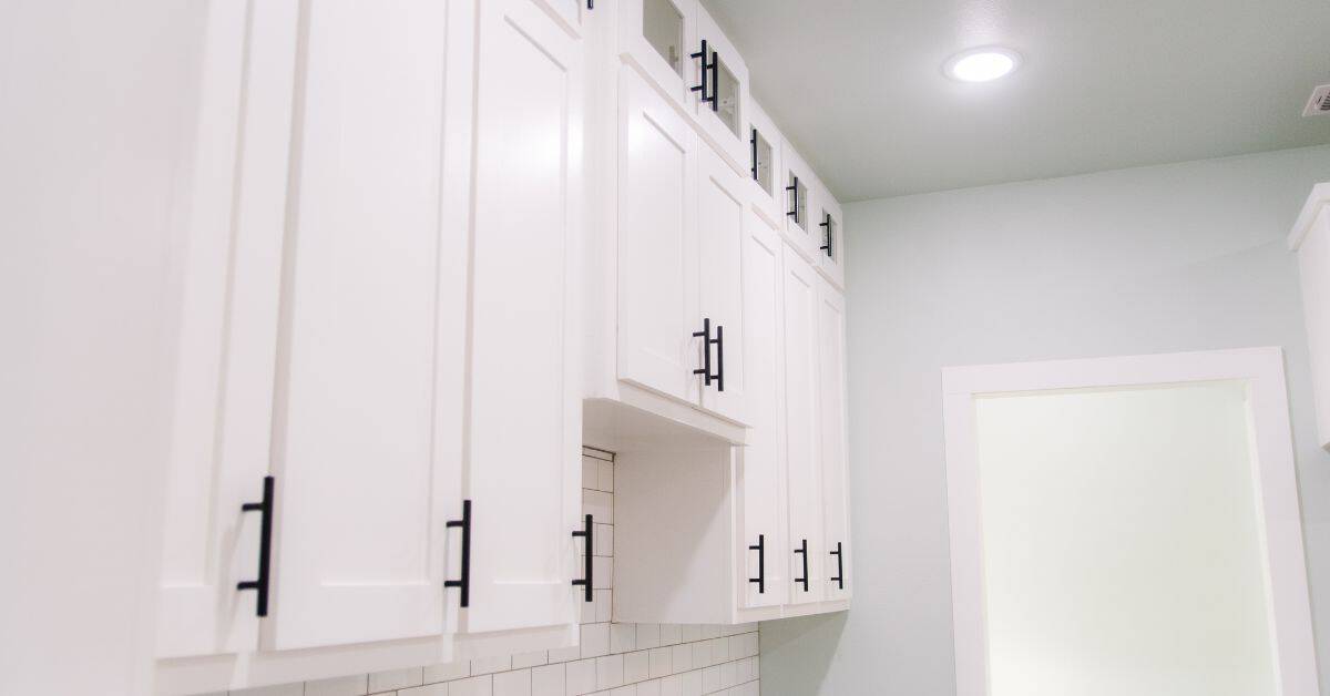
Cabinets and Trim: Semi-gloss or satin. These are easy to clean and hide imperfections.
Walls: Matte or eggshell. They’re durable, hide flaws, and don’t reflect light too much.
Ceilings: Flat or matte. They hide imperfections best and don’t show dust.
VOCs, eco-friendly options, and safety
Kitchen paint should be safe for your family. Here’s what to look for:
Low-VOC or Zero-VOC: These paints have fewer volatile organic compounds, making them better for indoor air quality.
Check labels for certifications like GREENGUARD or ECOLOGO. Ventilate well during and after painting to ensure proper curing.
Always follow manufacturer’s instructions for safe handling and disposal.
Tools and Materials Checklist for DIY Painting
Gather brushes, rollers, and edging tools sized for the cabinet and wall surfaces you’ll paint. Have painter’s tape, drop cloths, and patching supplies on hand for prep. Include a good primer if the surface requires sealing or stain blocking.
Stock protective gear like masks and eyewear, plus a compatible tray and liner. Don’t forget replacement parts and solvent or water for cleanup, as appropriate for your chosen paints.
Prep and protection essentials
Before you start painting, prep your surfaces and protect your kitchen. This checklist helps minimize mistakes.
- Inspect surfaces: Check for cracks, holes, or peeling paint. Ignoring these can lead to poor paint adhesion.
- Clean surfaces: Remove dirt, grease, and grime using a degreaser. Dirty surfaces won’t bond with paint.
- Sand surfaces: Lightly sand to smooth out imperfections. Skipping this step can result in an uneven finish.
- Wipe down: Remove dust from sanding with a damp cloth. Residual dust can cause paint to peel.
- Mask areas: Use painter’s tape and drop cloths to protect floors, cabinets, and countertops. Not masking can lead to unwanted paint spots.
- Cover outlets/switches: Protect them with plastic covers or tape. Paint drips here are hard to remove.
- Remove hardware: Take off cabinet knobs, hinges, and switch plate covers. Painting over these can cause issues.
- Check ventilation: Ensure your kitchen is well-ventilated to avoid fume buildup. Poor ventilation can lead to headaches or dizziness.
Quick rule: Always prep and protect before painting to ensure a smooth, mistake-free process.
When to hire a pro
While DIY painting is great, there are times when hiring a professional painter is advisable. Here’s when:
- Complex cabinetry: Intricate or custom cabinets may require a pro’s touch for a flawless finish.
- Structural prep: If your walls need repairs (holes, cracks), consider hiring someone with experience in this area.
- Large-scale color changes: Dramatic color shifts can be challenging to pull off perfectly. A pro can help achieve the desired look.
- High ceilings: Painting high areas safely requires special equipment and training.
- Time constraints: If you’re short on time, a professional can complete the job quickly and efficiently.
- Special finishes: Techniques like glazing, distressing, or metallic paints may require a pro’s expertise.
- Allergies/sensitivities: If you’re sensitive to paint fumes, consider hiring someone else to do the job.
Quick rule: Don’t hesitate to hire a professional when the job is complex or time-consuming. It’s worth it for a perfect result.
Common Mistakes and How to Avoid Them
Avoid choosing colors from photos alone. Lighting and screen rendering can distort what you’ll see on your walls. Always swatch in real conditions before committing.
Don’t skip proper prep or try to force a finish that isn’t compatible with the surface. If you’re unsure, check the manufacturer instructions or product label for prep steps and compatibility notes.
Color that looks different in photos vs. reality
Photos can trick you into choosing the wrong color. Lighting, screen resolution, and even the device you’re using can alter how a color appears.
To avoid this pitfall, always test your chosen colors with real-world samples. Paint large swatches in different areas of your kitchen to see how they look at various times of day. This way, you’ll know exactly what you’re getting before committing to a full paint job.
Don’t rely solely on photos or digital tools for color selection. While they can be helpful, nothing beats seeing the color in person under different lighting conditions.
Overmatching and lack of contrast
Choosing all your colors from the same shade range can make your kitchen feel flat and uninteresting. To avoid this, introduce contrast through trim, hardware, or accent walls.
For example, if you’ve chosen a light gray for your walls, consider painting your cabinets in a slightly darker shade or using a contrasting color for an accent wall. This will add depth and visual interest to your space.
Don’t be afraid to mix different shades and tones within the same color family. This can help create a more dynamic and inviting kitchen.
Budgeting and Timeline for a Kitchen Paint Project
Break the project into prep, priming, and coats, then allocate time blocks for each stage. Practical planning helps prevent overlap and delays. Keep a small buffer for unexpected issues during prep or touch-ups.
Estimate costs by material type and quantity, and review your local rules or building guidance if needed. Verify any required permits or recommendations from local authorities or homeowner guidelines before starting.
Cost-saving tips and prioritization
DIY painting is a great way to save on labor costs. You can do it yourself, or split the work with friends or family.
Invest in quality primer. It’ll help your paint adhere better and last longer. Don’t skimp here.
Mid-range paints are usually good enough for kitchens. They’re durable and won’t break the bank. But if you’ve got a high-traffic area or want extra protection, consider a premium paint.
Durable finishes like semi-gloss or satin are best for kitchens. They’re easy to clean and can handle moisture. Don’t go cheaper with flat or eggshell paints here.
Phased approaches for busy households
Repainting a kitchen doesn’t mean you have to live in chaos. You can stage the project to keep it usable during work.
Start with the island or peninsula. It’s usually the biggest piece and gets the most traffic. Paint it first, then move on to cabinets while you’re waiting for touch-ups to dry.
Next, tackle one section of cabinets at a time. Move everything off that section, paint it, let it dry, then move back in. This way, you’ll always have some counter space and cabinets to use.
Finally, do the walls. You can usually live without them for a few days while you finish up. Just keep a camp table set up for eating if needed.
Conclusion
Choosing the right kitchen color is about safety, durability, and how it feels in everyday use. A well selected shade and finish keeps the space looking fresh and works with real-life cooking and cleaning routines.
Start by selecting a color scheme you can live with, then pick a shade and finish, test them in a small area, and write down how they look in different lighting before you commit. Check your supplies and a simple timeline, and keep the testing process honest: if it passes the safety and durability checks, you’re ready to proceed with confidence.
Common mistakes to avoid include skimping on surface prep, skipping a proper test area, and using the wrong sheen for high-traffic zones. Always follow safe practices: tape off edges neatly, ventilate, protect surfaces, and allow coats to cure before heavy use. If you’re unsure about proper priming, formula compatibility, or a durable finish for a busy kitchen, pause and reassess rather than pushing through.
If the project starts feeling bigger than you can safely handle—especially when walls, cabinets, or built-ins are involved—consider calling a professional. Otherwise, you can finish strong with a steady pace and solid planning. You’ve got this; a fresh kitchen color is within reach, and the results will be worth the effort.
FAQ
What’s the fastest way to prep a kitchen before painting?
Clear the room as much as possible. Remove hardware and cover surfaces with drop cloths. Sand rough spots lightly and wipe down walls to remove dust and grease before primer.
How should I test color in a small kitchen with mixed lighting?
Test colors on several small patches in different spots, including near the sink and under cabinets. Observe the patches at different times of day and under artificial lighting. Use a big swatch or sample board to compare side by side with existing colors.
Which approach helps when repainting over glossy walls or old enamel?
Prime the walls to improve adhesion. Use a bonding or stain-blocking primer if the previous finish is shiny or has stains. Follow the primer’s instructions for dry times and second coats.
What should I do if cabinets or trim are already painted a contrasting color?
Paint or stain-proof the adjacent surfaces first, so you don’t have to redo large areas. Use painter’s tape to keep edges clean and reset if color bleed happens. Check manufacturer recommendations for any special primers needed on glossy surfaces.