

Introduction
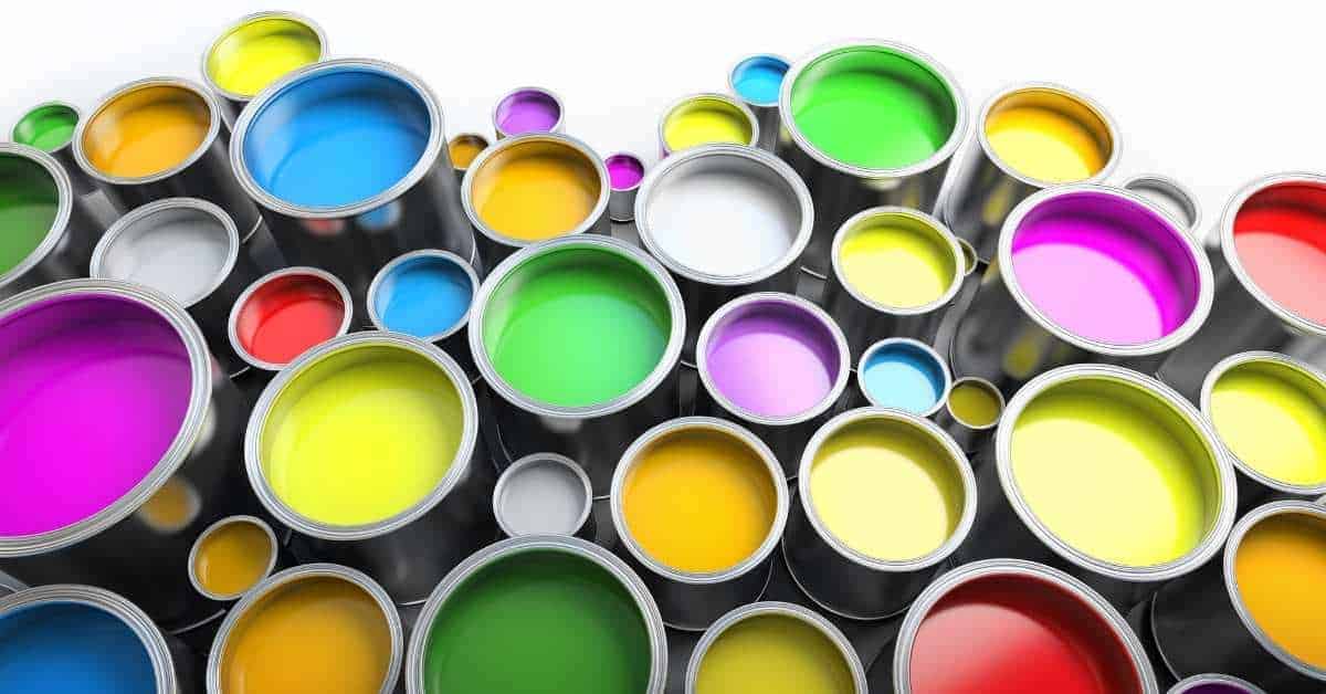
Five paint colors will dominate 2026.
The article explains how to apply these hues in your spaces, balance bold tones with neutrals, and consider practical, smart alternatives for different rooms and budgets.
You’ll learn how to choose shades, test color in a room, and adapt the ideas to fit your style and space.
Key takeaways
- Embrace warm muted terracotta as accent walls to ground airy rooms.
- Soft mineral blue pairs with natural textures for calming, durable interiors.
- Deep olive green works well in dining or study zones with wood.
- Muted golden yellow adds sunshine without glare on large surfaces.
- Soft charcoal with warm undertone supports bold art and lighting balance.
- Prepare swatches, test under natural light, and store color samples for reference.
Table of Contents
- Introduction
- Key takeaways
- Quick overview of 2026 color trends
- Color 1 — Warm Muted Terracotta
- Color 2 — Soft Mineral Blue
- Color 3 — Deep Olive Green
- Color 4 — Muted Golden Yellow
- Color 5 — Soft Charcoal with Warm Undertone
- Tools and materials checklist
- Step-by-step DIY project: Paint an accent wall using one trending color
- Conclusion
- FAQ
Quick overview of 2026 color trends
Five colors you’ll see a lot in 2026: calm neutrals, warm earthy tones, bold accent blues or greens, soft pastels, and finishes with a tech-inspired metallic feel. The drivers behind these choices are sustainability, comfort, and a stronger influence from tech in everyday spaces.
As a DIYer, you can mix and match these trends to freshen up a room without overspending. Check the label and manufacturer instructions for each product, test color samples in your lighting, and pick options that fit your space. If you’re unsure about disposal, check local household hazardous waste rules; and never dump paint or solvents down drains or into soil.
Why these colors are trending now
The five paint colors set to dominate 2026 reflect current market, cultural, and design trends. These hues incorporate a blend of sustainability, comfort, and technological influence.
Sustainability drives the use of earthy tones like terracotta and moss green, which evoke natural materials and environments. Comfort is key with soft pastels that create calming spaces in homes. Tech influence shows up through metallic shades that mirror modern gadgetry and digital interfaces.
DIY homeowners can leverage these trends to enhance their living spaces while staying ahead of the curve. By understanding why certain colors are trending, you’ll be better equipped to make informed choices for your home renovation projects.
How to use this guide
This guide offers a comprehensive look at five paint colors expected to dominate in 2026. You’ll find detailed descriptions of each hue, along with recommended room pairings for optimal visual impact.
In addition to color insights, the guide provides practical DIY tips on how to apply these paints effectively and efficiently. Whether you’re a seasoned pro or just starting out, there’s something here to help you tackle your next project.
To round things off, we also offer smart alternatives for those looking to explore different shades while still capturing the essence of current trends. This way, you can customize your home decor to suit your personal style and preferences.
Color 1 — Warm Muted Terracotta
Warm muted terracotta is a soft, earthy shade in the warm color family. It reads as calm but inviting, with a cozy, lived-in feel. Use it for accent walls, kitchens, and exterior trim to add warmth without shouting.
This color pairs well with natural materials like wood and stone and tends to hide dust a bit better than brighter reds. For DIY projects, it’s forgiving for beginners and versatile across rooms and facades. Check the label or manufacturer instructions for surface prep and topcoat guidance.
Room pairings and finishes
The warm muted terracotta color pairs well with neutral tones like off-white or light gray for a cozy feel. For contrast, you can go bold with dark wood or black accents in the trim and furniture. Check your local rules on fire ratings if using darker woods near exits.
For finishes, stick to matte or satin textures to keep that warm, earthy vibe. Avoid shiny glosses as they’ll clash with the muted tones of terracotta. You can mix it up a bit by adding some glossy accents in small areas like door handles or light fixtures for a touch of elegance.
When choosing complementary colors, think about nature—think greens and browns to mimic an outdoor setting. This will tie your space together nicely without overwhelming the terracotta base. If you’re unsure about color combinations, grab some paint swatches from the store or use online tools to test different palettes before committing.
DIY painting tips for Terracotta
When tackling a warm muted terracotta paint job, start with the right surface prep. Clean the walls thoroughly and make sure they’re dry before you begin. Check the base compaction to ensure it’s smooth and free of cracks or bumps that could affect your finish.
A good primer is crucial for any color but especially for terracotta tones. Use a high-quality, neutral-colored primer to help even out the surface and prevent uneven paint absorption. This step will save you time and frustration later on when applying the topcoat.
For rolling or brushing, choose tools that fit your project size and texture needs. A medium nap roller works well for most surfaces, but if you’re dealing with a rougher wall texture, go for a longer nap to get into all those nooks and crannies. When using brushes, opt for high-quality synthetic bristles which hold paint better than natural ones.
To avoid streaks when painting terracotta shades, work in small sections and keep your roller or brush moving at a steady pace. Apply thin, even coats rather than trying to cover too much area with one thick coat. This will help maintain the smooth look of the color without leaving visible marks.
Smart alternatives & accessibility options
If you’re leaning towards a warm muted terracotta but want to explore other shades that might suit different lighting conditions better, consider neutral tones like beige or gray. These colors can adapt well to both natural and artificial light without overwhelming the space.
For accessibility reasons, think about using low-VOC paints for your walls. They’re easier on the nose and better for indoor air quality, especially in homes with young kids or elderly residents. Plus, washable paint options are a smart choice if you have pets or small children who might get their hands dirty.
Color 2 — Soft Mineral Blue
Soft Mineral Blue is a calm, modern hue you can live with. It works well for walls and accents. Under warm light it feels warmer; under cool light it reads crisper.
Lighting changes this color a lot, so test samples in both daylight and lamps before you commit. The difference matters because the room’s feel can swing from cozy to cool as light shifts. Check the label and manufacturer instructions for finish notes and follow practical DIY guidelines when applying.
Best applications by room
Soft Mineral Blue is a versatile hue that brings calm and modern elegance to any space. In the bedroom, it creates a serene retreat where you can unwind after a long day. Balance this cool tone with warm wood accents like oak or walnut for contrast.
In bathrooms, Soft Mineral Blue adds a spa-like feel, perfect for relaxation. Use it on walls and ceiling to create an enveloping atmosphere. Pair it with metallic fixtures in brushed nickel or chrome for a sleek look.
For home offices or studies, this color enhances focus and creativity without overwhelming the senses. Incorporate light-colored furniture and plenty of natural light to keep the space airy and inviting.
DIY technique: achieving even coverage
To get a smooth, professional finish with Soft Mineral Blue, start by applying an appropriate primer. Use a neutral gray or white primer to ensure the color comes through evenly.
Selecting the right sheen is crucial for durability and appearance. For high-traffic areas like hallways or living rooms, go with eggshell or satin finishes. These provide good coverage while resisting wear and tear.
To blend edges seamlessly, use a drywall knife to feather out the paint at corners and along baseboards. This technique helps eliminate visible lines between coats and ensures an even look throughout the room.
Budget and eco-friendly swaps
When choosing Soft Mineral Blue, consider budget-friendly options like Behr or Valspar. These brands offer quality paint at a lower cost than premium labels without sacrificing coverage.
If you’re looking to go green, opt for low-VOC (volatile organic compounds) paints such as Benjamin Moore’s Natura line. These are better for the environment and healthier for your home.
For an even more eco-conscious choice, look into plant-based paint options like those from Yolo Colorhouse. These alternatives use natural ingredients and provide a similar finish to traditional paints but with less environmental impact.
Color 3 — Deep Olive Green
Color 3, Deep Olive Green, brings a rich green that feels grounded and warm. It reads as natural and sturdy, a good backdrop for busy spaces. It works well in entryways and cabinetry where you want lasting calm.
Using this shade helps hide small scuffs and wear, so it’s practical for high-traffic zones. It pairs with wood tones and neutral whites, giving a timeless look that ages well with you. Check the label or manufacturer instructions for finish and maintenance guidelines.
Styling tips and accents
To enhance the rich, grounding quality of Deep Olive Green, consider pairing it with warm fabrics like velvet or wool. These materials bring a cozy feel to your space.
For hardware finishes, opt for brushed brass or copper. They complement the green tone nicely without clashing. Don’t forget about trim colors—try off-white or light gray to keep things balanced and not too dark.
Adding pops of color through accessories can also elevate the look. Think deep reds, oranges, or even some earthy browns for a cohesive yet vibrant interior.
Prep and painting tips for cabinetry and doors
Before you start painting your cabinets or doors, make sure to sand them down. This is key for a smooth finish. Use fine-grit sandpaper to avoid damaging the wood.
Next, degloss the surface with a solvent-based cleaner. This step ensures that the paint adheres properly and won’t peel off later on.
Apply a high-quality primer before painting. It helps seal in stains and provides an even base for your topcoat. For smooth finishes, use a foam roller or a small brush to get into tight corners.
Lighter alternatives for small spaces
If you’re working with a smaller room and want to avoid feeling closed in, consider lighter shades of green. A paler olive or sage can still offer that grounding feel while keeping things bright.
Taupe is another great option if you prefer neutral tones. It pairs well with Deep Olive Green for an elegant contrast without overwhelming the space.
When choosing a lighter alternative, test it out in your room first. Use samples to see how natural light affects the color throughout the day before committing to paint.

Color 4 — Muted Golden Yellow
This color is a cozy, optimistic muted golden yellow that adds warmth without loud saturation. It works well in kitchens and hallways where you want bright but calm light. It helps spaces feel inviting without shouting color.
For a DIY job, this shade is forgiving and easy to live with day to day. It can help brighten small rooms and corridors without feeling harsh. If you’re unsure about coverage or durability, check the label or datasheet for guidance.
Color combos to soften the look
To keep a muted golden yellow from feeling too bright, pair it with calming neutrals like soft grays or pale creams. These colors will tone down the yellow and create a balanced space.
Another great option is cool blues, which can complement the warmth of the yellow without clashing. Think light shades that bring a serene feel to your rooms.
If you’re looking for natural elements, wood tones work well too. Whether it’s hardwood floors or wooden furniture, these earthy materials will add depth and texture to the space.
DIY: avoiding patchiness and sheen problems
Mistakes like patchiness and uneven sheen can really ruin a paint job. Here’s how to avoid them:
- Tint primer correctly: Use the right color tint in your primer so it matches the final coat, preventing visible lines.
- Select correct sheen: Choose matte for low traffic areas and semi-gloss or gloss for high wear zones to maintain a smooth look.
- Use proper technique: Roll out paint evenly with overlapping strokes to avoid lap marks. Work in small sections before the paint dries.
Following these tips will ensure your walls look professional and uniform, no matter how many coats you apply.
Smart alternatives for renters
If you’re renting and can’t paint the walls, there are still ways to bring in a muted golden yellow. Removable wallpaper is one option that’s easy to install and remove.
Another choice is temporary peel-and-stick paint effects. These come in sheets or rolls and let you add color without damaging the wall.
You can also use furniture accents like throw pillows, rugs, or lamps with yellow tones to bring a splash of this warm hue into your space.
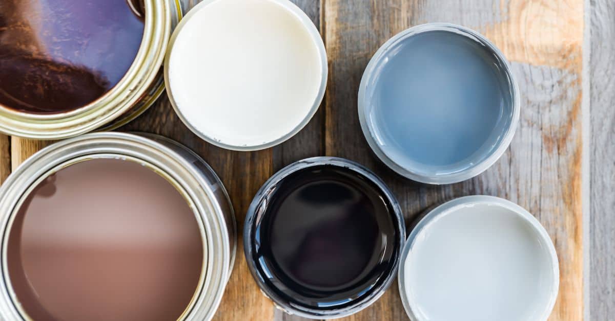
Color 5 — Soft Charcoal with Warm Undertone
Color 5, Soft Charcoal with Warm Undertone, is a modern neutral that works as an accent or full-room color. It reads warm and versatile under different lighting.
In practice, this shade pairs well with warm woods and bright whites, and it helps hide dust when used in larger areas. Check the label or datasheet for exact recommendations on sheen, coverage, and how lighting will shift the look.
Where to use Soft Charcoal
Soft charcoal is a modern neutral that works great as an accent color for living rooms, dining areas, and bedrooms. It pairs well with metallic finishes like brushed nickel or gold, adding a touch of elegance.
In the kitchen, soft charcoal can be used on cabinets or as a feature wall behind your range hood to create a dramatic effect. For exterior use, it’s perfect for trim work around windows and doors, giving your home a sleek look without being too dark.
When using soft charcoal in smaller spaces like bathrooms or entryways, consider painting just one accent wall to avoid overwhelming the room. This color also looks fantastic when paired with warm wood tones, creating a cozy yet sophisticated atmosphere.
DIY tips: achieving true undertone
To ensure you get that warm undertone right, start by testing samples in different lighting conditions. Soft charcoal can look quite different under natural daylight versus artificial light.
Before committing to a full room, paint small test patches and observe how the color changes throughout the day. This helps you decide if it fits your space’s overall vibe.
When priming, choose an eggshell or satin finish primer that complements the soft charcoal without overpowering its undertones. For topcoats, stick with a high-quality paint that offers good coverage and durability to maintain the color’s integrity over time.
Lighter smart alternatives and transitional shades
If you’re looking for something softer than soft charcoal but still want a sophisticated look, consider mid-gray tones or greige options. These colors offer the same modern feel with less intensity.
A mid-gray can be used as an alternative to soft charcoal on walls or cabinetry, providing a balanced and calming effect in any room. Greige is another great option for those who want a touch of warmth without going too dark.
Transitional shades like these work well when you’re redecorating gradually over time. They allow you to mix old pieces with new ones seamlessly while keeping your space fresh and updated.
Tools and materials checklist
This section lists the essential tools, brushes and rollers, primers, tapes, drop cloths, and safety gear, with notes on low-VOC options. It gives you a clear checklist you can pull into your cart before you start. Keep it short and practical so you don’t miss the basics.
Knowing what to have on hand helps the job go smoother and reduces trips back to the toolbox. Always check the label or datasheet for specifics, and follow the manufacturer’s low-VOC guidance; if you need a number, skip it and say to check the label. Disposal rules vary, so check your local household hazardous waste rules rather than dumping anything down the drain.
Paint finishes and when to choose them
Use this checklist before selecting paint finishes for your project.
- Mattes: For walls needing a flat look. Check if you want no sheen or reflection. Avoid in high-traffic areas as they show dirt easily.
- Eggshell: Ideal for bathrooms and kitchens. Look for slight gloss but not shiny. Helps hide minor imperfections better than matte.
- Satin: For walls that need a bit of shine. Confirm if you want a smooth, slightly glossy finish. Works well in dining rooms or hallways.
- Semi-gloss: Best for trim and doors. Ensure it’s durable with high gloss. Resists moisture and wear better than other finishes.
Quick rule: Choose matte for low traffic, eggshell for kitchens, satin for dining rooms, and semi-gloss for trims.
Sample testing and visual checkpoints
Use this checklist before committing to a paint color.
- Buy samples: Get at least 4 colors. Check if you can see the difference between them. Missing out on shades could lead to wrong final choice.
- Paint swatches: Apply in corners or less visible spots. Confirm if it looks good from different angles and distances. Avoid painting large areas without testing first.
- Evaluate lighting: Check colors at various times of day. Ensure the color doesn’t change drastically with light changes. Skipping this can result in a disappointing final look.
Quick rule: Test samples thoroughly before full application.
Step-by-step DIY project: Paint an accent wall using one trending color
This section guides you through painting one wall in a bold, trending color. Prep the surface, protect floors and trim, and apply even coats with time in mind, then finish with proper cleanup and safety checks. Plan your steps and expect a reasonable pace for each stage.
A solid plan saves you time and a cleaner finish. Following product labels for drying and recoat guidance helps you avoid wasted coats and frustration. If you run into problems, check environmental conditions, inspect for surface issues, and follow local rules for disposal.
Step-by-Step Process
This sequence guides you through preparing, painting, and finishing your accent wall with a trending color.
- Cover furniture and floors with drop cloths. Why: Protect surfaces from paint splatters. Quick check: No bare wood or fabric exposed.
- Tape off edges around trim and ceiling lines. Why: Keep clean, sharp lines between painted areas. Quick check: Tape is straight and tight against corners.
- Cut in along edges with a brush. Why: Ensure full coverage where rolling can’t reach. Quick check: No bare spots or paint buildup.
- Roll on the first coat of paint evenly. Why: Start building color depth and coverage. Quick check: Paint is smooth, no streaks or drips.
- Wait for drying time before applying second coat. Why: Allow initial coat to set properly. Quick check: Touch test shows dryness without sticking.
Prep and priming steps
Clean the wall thoroughly with a damp cloth, then let it dry completely before moving on. Why: Dust and dirt can affect paint adhesion.
Patch any holes or cracks using spackling compound. Sand smooth once dried. Why: Smooth surface ensures even paint coverage.
Sand the wall lightly with fine-grit sandpaper to remove old paint chips and create a slightly rough texture for better grip. Why: Helps new paint adhere properly.
Select an appropriate primer based on your wall type and color change needs. Apply evenly, focusing on areas needing extra coverage like corners or patches. Why: Primer seals the surface and provides a base for even paint application.
Painting and finishing techniques
Cut in around edges with a brush to ensure sharp lines, then roll on paint using an extension pole for larger areas. Why: This technique minimizes hand fatigue and ensures even coverage.
Use a roller with medium nap for smooth walls and long strokes to avoid visible patterns or streaks. Why: Smooth application reduces the need for touch-ups later on.
Allow each coat of paint to dry completely before applying another, checking manufacturer’s recommendations for drying times. Why: Premature recoating can cause unevenness and peeling.
If necessary, do a light touch-up with a small brush around edges or missed spots after the final coat dries. Why: Ensures a flawless finish without visible imperfections.
Conclusion
Choosing a trending color palette is about durability, easy maintenance, and how it reads in your space. Start with a single accent wall in a tested spot, and keep safety steps at the top of your plan to avoid costly mistakes.
Before you paint, assess the room light, test a small area with the chosen color, prep the surface, gather your tools and materials, and mix a fresh batch of paint if needed. Clean the surface, repair any flaws, tape edges, and protect floors and belongings. Follow the color direction you picked—warm terracotta or soft blues—consistently for the look you want, and let surfaces dry fully between coats.
Common mistakes to avoid are skipping surface prep, painting over a dirty or shiny wall, and applying paint in poor lighting or with rushing coats. Safety rules are simple: sand smooth, use a respirator or mask in dusty areas, ventilate the room, lay drop cloths, and never mix unknown household cleaners with paint. If a project involves plumbing, electrical, or structural work, or you hit stubborn stains that won’t cover, pause and consult a professional. With careful prep and steady hands, the room will come together cleanly and stay looking fresh for years. You’ve got this—start now, finish strong, and enjoy the update.
FAQ
What paint colors are trending for 2026?
Expect warm neutrals and bold accent shades to mix with bright white trims. Don’t chase every trend; pick two colors that fit your space and lighting. Stay practical with durable finishes for high-traffic rooms.
Should I use DIY versus hiring a pro for color selection?
You can pick colors yourself, but get samples on a large patch wall and view at different times of day. A pro can help with undertones and long term light changes. If you are unsure, test with a small room first.
How do I choose colors that work with furniture and flooring?
Start with one dominant color and pull others from your furniture and floors. Use lighter tones to make small rooms feel bigger. Be mindful of undertones in wood and fabric when pairing shades.
What about smart alternatives like washable or stain-resistant paints?
Go for washable finishes in busy areas. Stain-resistant coatings help with spills and fingerprints. These options save time and keep walls looking fresh longer.