
Introduction
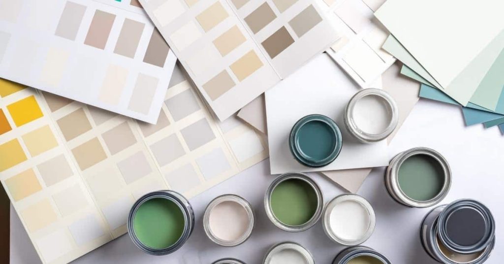
Avoid common paint color regrets by choosing versatile hues and testing samples before committing.
You’ll learn practical tips for identifying risky color choices, testing colors in your space, and pairing hues and finishes to achieve a cohesive result.
Key takeaways
- Test samples on multiple surfaces and lighting before committing to tones.
- Choose versatile neutrals with undertones matching existing fixtures and flooring.
- Avoid extreme darks or neon hues in small rooms or bathrooms.
- Introduce color with accent walls or accessories rather than full-wall saturation.
- Calibrate white by lighting; test temperature and glare in working areas.
- Plan color progression across adjacent rooms to avoid jarring transitions.
Table of Contents
- Introduction
- Key takeaways
- Quick overview: why color trends can backfire
- Trend 1 — All-over ultra-dark walls
- Trend 2 — High-saturation neon and hyper-bright hues
- Trend 3 — Overly trendy greige and muddy neutrals
- Trend 4 — All-white everything
- Trend 5 — Monochrome minimalism gone flat
- Trend 6 — Trendy paint-on-ceiling colors that overwhelm
- Trend 7 — Strong open-plan color uniformity
- Conclusion
- FAQ
Quick overview: why color trends can backfire
Trendy paint colors often look great in magazines but can lose appeal fast in real rooms. They can fade or feel dated, and that can hurt resale or just make you want to repaint sooner. Also, lighting changes how bold colors read, so what looks right during the day can look off at night.
This section sticks to practical moves: pick versatile neutrals, test in your lighting, and plan for easy touch-ups. You’ll learn how to spot color risks and choose safer options that stay pleasing longer.
Common consequences of a regrettable paint choice
Picking the wrong paint color can leave you with a room that feels outdated and uninviting. Resale value drops when buyers see dated or overly bold hues, making your home less attractive to potential buyers.
Another issue is redecorating challenges. A trendy shade might look great now but could clash with new furniture or decor down the line. This forces you into frequent repainting rounds, which can be costly and time-consuming.
The lighting in a room also plays a big role. What looks vibrant under one light source may appear dull or harsh under another. So choosing a trendy color without considering your home’s specific lighting conditions could lead to disappointment.
How to use this guide
This guide helps you navigate the pitfalls of trendy paint colors by offering critiques and alternatives. Start by reviewing each trend we highlight, noting why it might not be a good long-term choice.
Then look at our suggested alternatives tailored for different rooms and lighting conditions. For instance, if your living room gets lots of natural light, you’ll want to pick something that looks great in bright settings.
Think about how the color fits with your lifestyle too. If you entertain often or have kids, go for a more neutral tone that’s easier to maintain and redecorate around over time.

Trend 1 — All-over ultra-dark walls
All-over ultra-dark walls can look bold, but they can make a room feel cramped and drain the light. It also shows dust, fingerprints, and scratches easily. It can work in spaces with strong natural or artificial lighting and simple furniture.
Before committing, test a large patch on a wall and observe at different times of day. Choose a finish that hides dust and fingerprints but keeps color depth, and plan for bright lighting. If you go dark, keep trim lighter and expect more frequent cleaning; always follow the label instructions and check local disposal rules.
Why it often fails in everyday homes
Painting an entire room ultra-dark can make a space feel small and cramped, especially in smaller rooms. Imagine trying to host guests or work from home in a darkly painted living room—it feels like you’re in a cave rather than a cozy retreat.
In rental properties, this trend is risky because it’s hard to appeal to new tenants who might prefer lighter, brighter spaces. If you’re thinking of selling your place anytime soon, ultra-dark walls can be a turn-off for potential buyers looking for easy updates and modern flair.
Lighting also plays a crucial role. Dark rooms need strong lighting to look good, which means higher electricity bills and more maintenance for light fixtures. Plus, dust and scratches show up easily on dark surfaces, making upkeep a hassle.
Better alternatives and color pairings
A safer option is to use ultra-dark colors as an accent wall or in furniture pieces like cabinets. This way, you get the dramatic effect without overwhelming the room. For example, a deep navy accent wall paired with white trim can create a striking contrast that adds depth.
Another approach is using mid-tone neutrals for walls and pairing them with darker shades on accessories or larger items like sofas and rugs. A soft gray wall with dark brown furniture creates a balanced look that’s both sophisticated and welcoming.
Remember, the key to good color pairings is contrast and reflectivity. Lighter colors bounce light around better, making spaces feel more open and airy. Darker tones add richness and drama when used thoughtfully.
Trend 2 — High-saturation neon and hyper-bright hues
High-saturation neon and hyper-bright hues tend to look fresh at first but age quickly. They can overwhelm furniture and fixtures, making the room feel loud and busy. Long-term, they wear on the eyes and limit future decorating options.
If you’re painting a room, these colors tend to dominate and can clash with furniture over time. Use them sparingly or as accents rather than the main color. Check the label for colorfastness and fade resistance before you commit.
When to use bright colors strategically
Bright neon and hyper-bright hues can add a bold splash of personality, but they’re best used sparingly. Think about using them in small doses like accent walls or as pops in accessories such as throw pillows or artwork.
If you decide to go with a bright color, make sure it’s applied to surfaces that are easy to maintain and won’t show wear easily. A powder room is a great spot for these colors because the space is used less frequently and can handle high-impact visuals without feeling overwhelming.
When choosing finishes, opt for ones that stand up well over time. High-gloss or semi-gloss paints are more durable than flat finishes and resist scuffs better. This way, your bright color stays vibrant longer.
Mellowed alternatives and coordinating palettes
If you’re looking to avoid neon colors but still want a bold look, consider muted jewel tones like deep emerald green or sapphire blue. These shades offer richness without being too brash.
Saturated pastels are another option that can give your space a fresh feel while remaining soothing and easy on the eyes. Think dusty rose, mint green, or soft lavender for a modern twist on classic colors.
To achieve visual interest without overstimulation, pair these mellowed alternatives with neutral tones like off-white, light gray, or beige. This creates a balanced look where your chosen accent color can really shine.
Trend 3 — Overly trendy greige and muddy neutrals
Trend 3 is all about greige and muddy neutrals. These grey-beige hybrids can read muddy in some lights and quickly look dated or dirty.
When you use them, pay attention to how light shifts the color and how dirt shows up. They can save you money on paint choices, but they require planning and upkeep if the mood changes with seasons or light. Check the product label or manufacturer instructions for notes on fading, cleaning, and color retention.
How lighting and undertones change perception
When you pick a greige paint, it’s like choosing a chameleon. The color can shift based on the light hitting it. In some rooms, that grey-beige mix might look muddy or dirty under certain lights.
To avoid this trap, test your samples in different lighting conditions. Take photos of them at various times of day and see how they change. If you spot a lot of variation, consider going with something more solid like crisp greys or soft whites that won’t shift as much.
Also, pay attention to the undertones. Sometimes what looks neutral can actually have hints of blue, green, or yellow. These subtle shades can make your walls look dated fast if they clash with your furniture and fixtures. Use a color wheel to check for harmony before you commit.
Cleaner neutral choices and undertone guidance
Instead of going all-in on greige, opt for cleaner neutrals that won’t muddy up your space. Crisp greys work great in modern settings where you want a sleek look without too much warmth.
If you prefer something warmer, go with soft whites or warm beiges. These colors add coziness and blend well with natural wood tones and earthy decor. Just make sure they don’t have any unwanted undertones that could clash with your room’s lighting.
When choosing a neutral for your space, think about the orientation of the room. North-facing rooms can benefit from warmer neutrals to bring in more warmth, while south-facing spaces might do well with cooler tones to keep things balanced.

Trend 4 — All-white everything
All-white finishes can feel sterile and cold. They show every fingerprint, stain, and scuff. For busy families and high-traffic areas, that clean look won’t last.
If you go white, be ready for frequent cleaning and touch-ups. It matters because wear shows fast in busy spots, so plan for practical maintenance and sturdy products. Check the label or datasheet for cleaning guidance and expected durability.
Practical modifications to keep white fresh
When you go with an all-white palette, it’s important to think about how to maintain that clean look over time. One key step is choosing washable paints. These are easier to clean and can handle the wear and tear of daily life without showing dirt or stains.
To avoid a clinical feel, add warm accents throughout your space. Soft throw blankets, wooden furniture, and woven rugs can bring in warmth and texture that make white walls feel more inviting. Layering these elements helps balance out the starkness of pure white.
Another trick is to play with different shades of white. Mixing a few whites together—like a bright white for the ceiling and a slightly warmer shade for the walls—can create depth without losing the overall light, airy feel you’re aiming for.
Off-white alternatives and contrast strategies
If an all-white look feels too stark, consider off-whites that add warmth while still keeping things light. Creams or soft beiges can give you the same airy feel but with a bit more character.
To enhance this effect, use white for your main walls and introduce off-white trim. This contrast will highlight architectural details like moldings and door frames without overwhelming them. It’s a subtle way to add depth and interest.
Another approach is to keep the walls white but choose off-white or light gray for other elements, such as cabinets or furniture. This creates visual balance and keeps your space feeling open and bright while adding some dimension.
Trend 5 — Monochrome minimalism gone flat
Relying on one color with almost no contrast or texture makes a room look flat and boring. Monochrome fails to create depth; you lose shadows and dimension. You need variation to keep the space inviting.
Mix in different tones, textures, and finishes to keep the space from reading flat. That contrast helps define zones, shadows, and depth so the room feels alive. If you’re unsure how much variation to use, check the label or datasheet for guidance.
Adding depth with finishes and materials
Picking the right finishes and materials can make a big difference. They add texture and contrast, which helps prevent your space from looking flat.
- Varnished wood: Use for furniture or flooring; look for high-quality varnish that resists scratches; avoid cheap options that wear off easily.
- Textured paint: Adds subtle depth without changing the color too much; check for durability ratings to ensure it lasts long-term; avoid overly thick textures that can crack.
- Metallic accents: Use sparingly on walls or furniture; look for high-quality metallic paints that don’t fade over time; avoid cheap alternatives that peel off quickly.
- Stone veneer: Adds natural texture and warmth to walls; ensure proper adhesion with strong mortar or adhesive; avoid using lightweight stones that can fall off easily.
- Suede fabric: Great for pillows, curtains, or upholstery; choose durable options that resist stains and wear; avoid materials that pill or fade quickly.
Accent strategies that preserve minimalism
To keep your space feeling calm yet interesting, focus on small-scale accents. These can be patterns in rugs, subtle colors in furniture, or textured elements like pillows.
Avoid large, bold statements that break the monochrome theme. Instead, opt for soft contrasts and gentle textures to add depth without overwhelming the room.
For example, a rug with a slight pattern or color variation can introduce interest while maintaining the overall minimalist feel. Similarly, adding a few pieces of furniture in a slightly different shade can create visual intrigue without disrupting the harmony.
Trend 6 — Trendy paint-on-ceiling colors that overwhelm
Bold paint on the ceiling can feel dramatic, but it often makes a room seem lower and off balance. It can clash with natural and artificial light, causing shadows or glare. Think twice before going dark on the ceiling.
Before you commit, test on a small area or a few sample boards to see how it looks with your lights and walls. Lighter ceilings usually keep a room feeling open; dramatic colors require careful lighting and balance. If a color seems too strong, back off or choose a hue closer to neutral and work with accents instead.
When colored ceilings succeed
Colored ceilings can work wonders in certain spaces, especially those with high ceilings or vaulted designs. A bold color on a tall ceiling adds drama and draws the eye upward, making the room feel more spacious.
Vaulted rooms are prime candidates for this treatment because they naturally have an airy quality that complements darker shades. Just make sure there’s plenty of natural light coming in to balance out the dark ceiling.
Another scenario where colored ceilings shine is when you want to highlight a specific architectural feature, like exposed beams or intricate molding. A soft contrast between the ceiling and walls can really bring these details into focus without overwhelming the space.
If your room has standard eight-foot ceilings but gets lots of natural light, a darker color can still work if used sparingly. Consider painting just one accent wall or a small section of the ceiling to add depth and character without making the room feel cramped.
Subtle ceiling alternatives
If you’re hesitant about bold colors but still want some visual interest, there are plenty of subtle options. One approach is to use a soft contrast between the ceiling and walls. A light grey or off-white can add depth without overpowering.
Another way to bring attention to your ceiling is by highlighting architectural elements like beams or molding with contrasting trim paint. This draws the eye upward while keeping the overall look cohesive.
If you’re feeling adventurous, consider adding a small accent area on the ceiling using wallpaper or textured finishes. A patterned strip along the top edge can add character and dimension without overwhelming the space.
Remember, the goal is to enhance your room’s features rather than dominate them. By choosing subtle alternatives, you can create an inviting atmosphere that feels balanced and well-proportioned.
Trend 7 — Strong open-plan color uniformity
When you paint an open-plan space in one color, it can look flat and boring. A single color tends to erase the zones where you should move from living to dining to cooking. That makes the room feel monotone and hides how you actually use the space.
Mix in subtle color shifts or use different finishes on walls, trim, and ceilings to cue those zones. It helps the eye read the space and can make rooms feel bigger without breaking the flow. If you’re unsure, check the label or manufacturer instructions for color compatibility and test small patches first.
Defining zones with color and texture
To keep your open-plan space from feeling like one big room, you can use different shades of the same color or contrasting textures to define separate areas. For instance, if you have a living area that transitions into a dining nook, try painting the walls in two complementary shades.
Another way is by using rugs and flooring materials with varying finishes. A hardwood floor in one zone can transition smoothly into a plush carpet in another. This not only helps to visually separate spaces but also adds warmth and comfort underfoot.
You could also play around with wall textures or finishes, like adding a smooth paint finish in the living area and a textured plaster in the dining space. These small changes make each zone feel distinct without breaking up the overall flow of your home.
Transitional palettes that flow
A great way to maintain visual continuity while defining zones is by using a transitional palette. This means gradually changing the saturation or intensity of colors as you move through different areas.
For example, if your living room opens into a dining area and kitchen, start with a lighter shade in the living space and then transition to a slightly darker tone in the dining zone. By doing this, you create a natural flow that guides the eye smoothly from one area to another.
Remember, it’s all about balance. You want each zone to feel distinct yet still part of the same cohesive design scheme. So pick colors that complement each other and gradually shift rather than abruptly changing hues.
Conclusion
Color trends can hurt a room’s feel and durability if you chase them. The safer path is to pick tones that fit the space, test them, and respect the basics of lighting, finish, and maintenance.
To finish strong, check your plan in order: sample patches on different walls, observe at different times of day, confirm the color with neutral trim and natural light, test in small areas before full use, and keep a simple map of what works where so you don’t overdo one idea across the whole plan. Use real room lighting to sanity-check every choice, and if a color reads off in any area, revise before you commit.
Common pitfalls to avoid are choosing ultra-dark walls without sufficient contrast or contrast control, chasing neon or muddy neutrals that clash with furniture, and painting ceilings or full-open spaces with colors that overwhelm the space. Always follow basic safety: ventilate well, use low-toxicity finishes when possible, patch and sand any defects before applying another coat, and test a small patch first to prevent irreversible damage. If the job feels beyond your comfort zone or you’re balancing multiple large spaces, call in a pro sooner rather than later to protect your walls and budget. Stay steady, test often, and you’ll finish with a solid look you won’t regret.
FAQ
1. Should I avoid ultra-light whites for living spaces?
Ultra-light whites can show every scuff and dirty fingerprint. They also look washed out in rooms with little natural light. If you want easy maintenance, go for a warmer white or a pale gray instead.
2. Are bold colors ever a good idea for big rooms?
Bold colors can work, but they steal energy from a room and can make furniture look odd. They’re hard to balance with accents and lighting. Save bold for a small wall or an accent piece, not the whole space.
3. Will trendy grays still feel fresh in a few years?
Many grays age poorly as lighting changes. They can look blue, green, or flat depending on time of day. If you want a durable look, pick classic base colors with warm undertones and add depth with accents.
4. How should I pick colors to avoid a regretful palette?
Test large swatches on walls for at least a week in different light. Look at them at morning, afternoon, and evening. Choose colors with consistent undertones that play well with your furniture and flooring.