
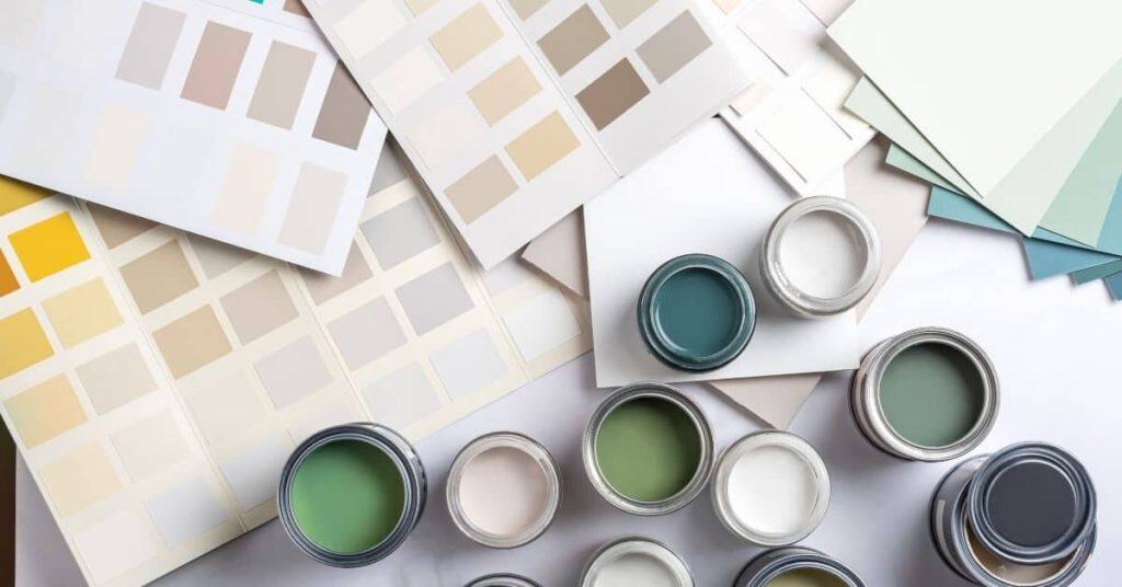
Introduction
Paint color trends are popular looks that may fade, so plan for longevity. In this hands-on guide, you’ll learn how to pick colors that stay practical in daily use. We’ll cover spotting patterns, testing choices, and what to look for on a label.
Start by testing colors in the actual space before committing. Apply small patches on the wall and watch them in morning and evening light with your furniture in place. Check the label for coverage, drying time, and recommended surfaces, and follow manufacturer instructions and any local requirements you need to respect.
Key takeaways
- Test large patches in multiple lighting rooms before committing to a final color.
- Label sample boards with room name and date for accurate comparisons.
- Inspect drywall and primer compatibility to prevent flashing or peeling later.
- Consider natural light color shifts; cool tones may appear differently across rooms.
- Choose a versatile base and two accent options that harmonize long-term.
- Always ventilate and follow label safety for solvents and aged paints.
Table of Contents
- Introduction
- Key takeaways
- Quick Overview: Why Trendy Paint Choices Can Backfire
- The 9 Paint Color Trends People Most Often Regret (Grouped)
- The Core Technical Reasons Trends Fail in Real Rooms
- How to Choose Colors That Minimize Future Regret
- How to Test Paint Properly Before Full Application
- Room-by-Room Considerations and Trend Suitability
- Practical Prep, Tools, and Materials Checklist
- Visual Checkpoints, Maintenance, and When to Repaint
- Conclusion
- FAQ
Quick Overview: Why Trendy Paint Choices Can Backfire
Trends rise fast and fade faster, which can leave you with a look that feels dated in a short time. You may discover the color clashes with existing furniture, finishes, or architecture. The resale impact is something to consider before committing to a bold choice.
This section sets expectations for practical steps you can take, including how to test and observe colors in real light and in relation to fixed elements. You’ll learn to spot red flags early and avoid costly recolors. Use these cues to guide a calmer, more intentional selection process.
What ‘regret’ typically looks like
Ever felt stuck with a color choice you can’t stand? That’s regret. It starts when you’re tired of seeing that shade every day, but it’s still there, staring back at you.
Costly repainting is another sign. Trends come and go fast. What’s ‘in’ today might be out tomorrow. And when that happens, you’ll find yourself reaching for the paintbrushes again, spending more money to keep up.
Reduced appeal is a big one too. When your home doesn’t look its best because of an outdated color, it can affect how you feel about living there. It might even make it harder to sell later on.
How trends differ from classic palettes
Trends are like fashion – they come and go. One year, everyone’s raving about ‘greige’. Next year, it’s all about ‘moody blues’. Classic palettes, on the other hand, stand the test of time.
Trendy colors often have a specific look or feel that might clash with your home’s architecture or your furnishings. They can be too bold, too bright, or just plain wrong for your space. Classics, however, are versatile and work well in most settings.
A trend might be appropriate if you’re going for a specific look that’s popular right now. But remember, it’s a risk. You could end up regretting it when the trend fades away.
The 9 Paint Color Trends People Most Often Regret (Grouped)
The nine trends are organized into three themes, with concise notes on what each aims to achieve. Expect that some palettes can feel loud, reduce perceived space, or clash with existing materials. Grouping helps you spot common risk patterns at a glance.
These groupings explain why trends may be risky in everyday homes and point to practical checks you can perform—like testing under your lighting and considering how furniture and fixtures will read with the color chosen. Decide with context in mind rather than popularity alone.
Group A — Very saturated and moody palettes
Trends like deep blues, blacks, and greens can create stunning spaces. But they’re risky in small rooms or homes with low light. They can overwhelm spaces, making them feel smaller and darker.
Moody colors also reveal undertones. If your walls have yellow undertones, a dark blue might look purple. Test first to avoid surprises.
Tip: Use moody colors in well-lit rooms or as accents to keep spaces balanced.
Group B — Novelty neutrals and undertone-heavy greiges
Neutrals are usually safe, but trendy ones with strong undertones can shift in different light. A ‘greige’ might look like a warm beige in one room, then cool grey in another.
These novelty neutrals also date quickly. What’s hot today may feel tired tomorrow. Choose timeless neutrals for longevity.
Tip: Test neutrals at different times of day to see how they change with light.
Group C — Statement accent colors and unexpected hues
Bold accents like neon greens or bright corals can make a statement. But they might clash with fixed elements like cabinets or flooring, making your space feel chaotic.
Unexpected hues also pose integration challenges. A bold color that works in a magazine spread may not work in your home’s unique light and layout.
Tip: Use accent colors sparingly and test them with fixed elements to ensure harmony.
The Core Technical Reasons Trends Fail in Real Rooms
Lighting is variable and colors shift with sun or artificial light, making undertones appear differently at various times of day. Look for how a hue leans warm, cool, or neutral in your space. Undertones become especially apparent near whites and grays.
Finish, room size, and adjacent colors also affect outcomes. Plan to test in small sections and observe over a day or two to see how tone, contrast, and perceived brightness land in your room. These checks are your early warning system before committing to full coats.
Lighting and directional light effects
Ever noticed how a color can look different under various lights? That’s because lighting, both natural and artificial, plays a big role in how we perceive paint colors. Here’s what you need to know:
Natural light changes throughout the day. What looks great at noon might feel too dark or dull by evening. So, test your color choices at different times of day to see how they hold up.
Artificial lights also cast different hues. Incandescent bulbs give off warm, yellowish light while fluorescent ones emit cool, blue-white light. Make sure to check your colors under the specific lighting you’ll have in the room.
Pro tip: Use temporary samples or swatches and move them around the room at different times of day to see how they react to various lights.
Undertones and adjacent surfaces
Colors don’t exist in a vacuum. They interact with their surroundings, creating shifts that can surprise you. Here’s how:
Base undertones – the subtle colors hidden beneath your main hue – can clash or complement other elements in the room. For instance, a warm-toned paint might look great next to cool-toned flooring, but terrible with warm-toned furniture.
Trim, flooring, and fabrics all play a part too. A color that looks perfect on its own might feel off when paired with your existing decor. So, test your colors alongside these elements before committing.
Pro tip: Bring home samples of your chosen paint and place them next to your existing surfaces and furniture to see how they interact.
Finish, texture, and surface condition
The sheen or finish of a paint can dramatically alter its perceived color. Here’s why:
High-gloss paints reflect more light, making colors appear brighter and more vibrant. Matte paints absorb light, toning down the color. So, choose your finish wisely based on the look you want.
Wall texture also affects color perception. Rough textures can make colors look darker while smooth surfaces can make them seem lighter.
The condition of your walls matters too. Damaged or uneven surfaces will show through any paint, affecting its appearance and longevity. Always prep your surfaces before painting.
Pro tip: Consider the overall look you want for the room – including lighting, texture, and surface condition – when choosing your paint color and finish.
How to Choose Colors That Minimize Future Regret
Start with clear goals for each room—use, mood, and how long you expect to live with the color. Audit fixed elements like trim, cabinetry, and flooring to know what must visually harmonize with your choice. This helps prevent clash and overload.
Match color intensity to room function and scale, favoring restraint in smaller spaces and higher contrast only where it reads well with surrounding features. Emphasize a deliberate process over chasing trends, and document your reasoning as you go.
Step-by-Step Process
Follow this clear sequence to choose colors that’ll stand the test of time.
- Prep your space: safety first, cover floors, remove switch plates.
- Gather supplies: tape, drop cloths, samples, stir sticks.
- Test colors: paint large swatches in different lights, observe over time.
- Check undertones: see how colors interact with adjacent surfaces and lighting.
- Final checks: ensure no drips, bubbles, or missed spots before declaring it done.
Establish your long-term goals and style anchors
Before you pick up that paintbrush, figure out what you want from your space in the long run.
Ask yourself: do I want a flexible canvas for future changes or a personal statement now?
Consider resale value if you might move. Think about how colors will grow with your family or adapt to new hobbies.
Find inspiration in magazines, online, or even your existing furniture to anchor your style choices.
Audit permanently fixed elements
Before you dive into paint colors, take a good look at what’s already there and won’t be changing anytime soon.
Check your flooring: dark floors need lighter walls to balance, light floors can handle darker hues.
Inspect cabinetry, countertops, and hardware. These elements set the tone for your space. Choose paint colors that complement rather than clash with them.
Consider how new colors will work with existing furniture and decor. You don’t want to regret a color choice just because it doesn’t play nice with what you’ve already got.
Choose saturation and contrast deliberately
When it comes to color, not all spaces are created equal. You need to balance boldness with practicality.
In small rooms or halls, opt for lighter, neutral colors to keep the space from feeling cramped. Darker hues can overwhelm these areas.
For larger rooms or open-concept spaces, you’ve got more leeway. But even here, balance is key. Pair bold colors with neutrals to prevent your room from feeling too intense.
Use contrast wisely: dark walls with light trim can make a room feel bigger, while the reverse can create coziness. But be careful not to overwhelm small spaces with too much contrast.

How to Test Paint Properly Before Full Application
Begin with labeled sample pots and small test patches on the actual walls you plan to paint. Apply one coat and let it dry before evaluating. Photograph the patches at different times of day to compare how the color reads with light shifts.
Build a mock‑up with larger boards or cardboard panels to see how the color looks next to furniture and flooring. Observe for a full day or more, noting undertone shifts and overall brightness. Use these observations to decide whether to proceed.
Step-by-Step Process
Follow these practical steps to test paint properly before full application, ensuring you’re well-prepared and confident in your color choice.
- Preparation: Gather materials (sample pots, brushes, tape, etc.) and clear a workspace. Safety first – ensure good ventilation and no naked flames nearby.
- Sample Applicatio