
Introduction
The Editor’s Picks are nine gray paint shades chosen for easy, durable results on walls. This intro will guide you through simple steps and common stop points in a DIY paint job. Think of it as practical advice from a crew chief who’s rolled plenty of gray coats.
You’ll get practical steps for prep, application, and a clean finish you can stop at when you’re ready. I’ll mention common hold-ups to watch for, like uneven patches or visible brush marks, and how to fix them. Always check product labels and local rules for drying times, ventilation, and what’s recommended for your space.
Key takeaways
- Test swatches in multiple lighting moments to confirm true gray shade.
- Prime drywall and repair patches before painting to minimize texture issues.
- Use a labeled color chart to compare grays with trims and ceilings.
- Wear eye protection and cover floors; protect adjacent walls from splatter.
- Stop points: pause after cut-in, mid-coat, and final coat inspections.
- Test for dryness before second coat to avoid tackiness and smudges.
Table of Contents
- Introduction
- Key takeaways
- At-a-Glance: the 9 Greatest Grays and Their Top Uses
- How to Choose the Right Gray for Your Room and Lighting
- DIY Painting Steps: Prep, Application, and the Critical Stop Points
- Tools and Materials Checklist for Diyers
- Sample Testing, Visual Checkpoints, and How to Read Swatches
- Pairing Grays with Trim, Ceilings, and Accent Colors
- Troubleshooting, Maintenance, and When to Call a Pro
- Conclusion
- FAQ
At-a-Glance: the 9 Greatest Grays and Their Top Uses
Here’s a quick, visual tour of the nine grays with clear cues. Each entry highlights the shade’s undertone as warm, cool, or neutral, plus the best room or surface to try it on. Use this as a fast reference when you’re scouting samples in gray light.
Focus on the dominant undertone and the surrounding colors in your space. Look for how the gray reads on walls, cabinets, or trims under your lighting. Use this as a starting point, not a final decision, and verify with your own swatches and lighting tests.
Warm and Greige Grays
Grays with warm undertones bring a cozy, inviting feel to any space. They’re perfect for low-light rooms or traditional homes.
Look for grays with hints of beige or brown. These ‘greige’ shades blend the best of gray and beige, creating a soft, neutral backdrop that works well in living rooms, bedrooms, and hallways.
Try these: Benjamin Moore’s Revere Pewter, Sherwin-Williams’ Agreeable Gray, or Behr’s Balanced Beige.
Cool and Blue-Leaning Grays
Grays with cool undertones create a crisp, modern feel. They’re great for bright spaces or minimalist interiors.
Seek out grays with hints of blue. These shades reflect light beautifully, making them ideal for kitchens, bathrooms, and other rooms that benefit from a fresh, airy vibe.
Consider these: Farrow & Ball’s Down Pipe, Valspar’s Sea Salt, or Glidden’s Gray Cashmere.
How to Choose the Right Gray for Your Room and Lighting
Match undertones to the room’s natural and artificial light, so the gray stays true from morning to night. Consider how the space will feel with the flooring and existing furniture as a backdrop. This is about harmony, not just the color on a chip.
Test in place rather than relying on photos. Create a few small swatches in different lighting and observe over time. Check product labels and manufacturer instructions to confirm any lighting recommendations or limitations.
Step-by-Step Process
Follow these practical steps to choose the right gray for your room and lighting. This sequence ensures you make an informed decision that’ll look great in all conditions.
- Preparation: Safety first! Clear the area, remove any obstacles, and ensure proper ventilation.
- Measure your space: Accurate measurements help determine how much paint you need. Don’t forget to account for doors and windows.
- Test your grays: Buy sample pots of your top choices. Paint large swatches on different walls at varying times of day to see how light affects them.
- Consider undertones: Warm, cool, or neutral undertones can change a gray’s appearance. Make sure it complements your room’s existing colors and lighting.
- Final check: Before you commit, stand back and look at your test swatches from different angles and in various lights. If it still looks good, go for it!
Understanding undertones and color shift
Gray’s undertone – warm, cool, or neutral – influences its appearance. Understanding this helps you pick a shade that stays true across different lights.
Warm grays have pink, peach, or brown undertones. They’re cozy and inviting but can look dull in bright, natural light.
Cool grays lean blue, green, or purple. They’re crisp and modern but may feel cold in low light or small spaces.
Neutral grays have balanced undertones that don’t shift much with lighting changes. They’re versatile but can feel boring if not paired with the right accents.
Room-by-Room Recommendations
Here are practical rules-of-thumb for choosing grays room by room:
Bedrooms: Opt for soft, warm grays to create a cozy atmosphere. Consider the room’s size and natural light – smaller rooms may benefit from lighter shades.
Living Rooms: Neutral or cool grays work well here. They provide a clean backdrop for your decor but won’t overwhelm the space. Consider the room’s function – darker shades can create a dramatic look for media rooms.
Kitchens & Bathrooms: Light, neutral grays are usually best in these spaces. They reflect light and make small rooms feel bigger. Consider the room’s fixtures and fittings – cool grays can complement stainless steel while warm grays pair well with brass or copper.
Exteriors: Darker, more robust grays hold up better to outdoor conditions. Consider your home’s architecture and surroundings – a gray that looks great on its own may not work as well in a neighborhood of similar homes.
DIY Painting Steps: Prep, Application, and the Critical Stop Points
Outline a practical workflow from prep to cleanup, with clear decision pauses. Each stop point marks a moment to inspect and adjust before proceeding. Emphasize safety, proper drying cues, and quality checks along the way.
Keep the process simple: surface prep, masking, primer if needed, cut-in work, rolling, and final touch-ups. At each stop, assess evenness, coverage, and edge fidelity before moving to the next phase. Follow your own checklist to avoid skipped steps.
Surface Prep and Primer Decisions
Before you start painting, assess your surfaces. Fill any holes with spackling compound and sand smooth. Wipe clean with a damp cloth.
Use a bonding or tinted primer if your surface is new, bare, or previously painted with oil-based paint. It helps seal the surface and improves paint adhesion.
For glossy surfaces, lightly sand to help paint stick. Wipe clean. Prime these too for best results.
Application Technique and First-Coat Stop Point
Start at the top, working your way down. Use a roller for large areas, brushing edges and corners with a 2-inch angled brush.
After the first coat, let it dry as per manufacturer’s instructions. Then, step back and inspect:
Check coverage – if you see spots, apply another light coat. Ensure sheen is even – touch up any shiny areas. Verify color uniformity – ensure no streaks or patches.
Final Coats, Touch-Ups, and Final Stop Point
After your first coat inspection, decide if another light coat is needed. Remember, better coverage now means less touch-up later.
For touch-ups, use a small brush or even a toothpick to apply paint sparingly. Blend edges with a damp cloth.
Once dry, do a final inspection. Check for any missed spots, drips, or areas that need blending. If satisfied, your job’s done. Clean up and store leftover paint properly.
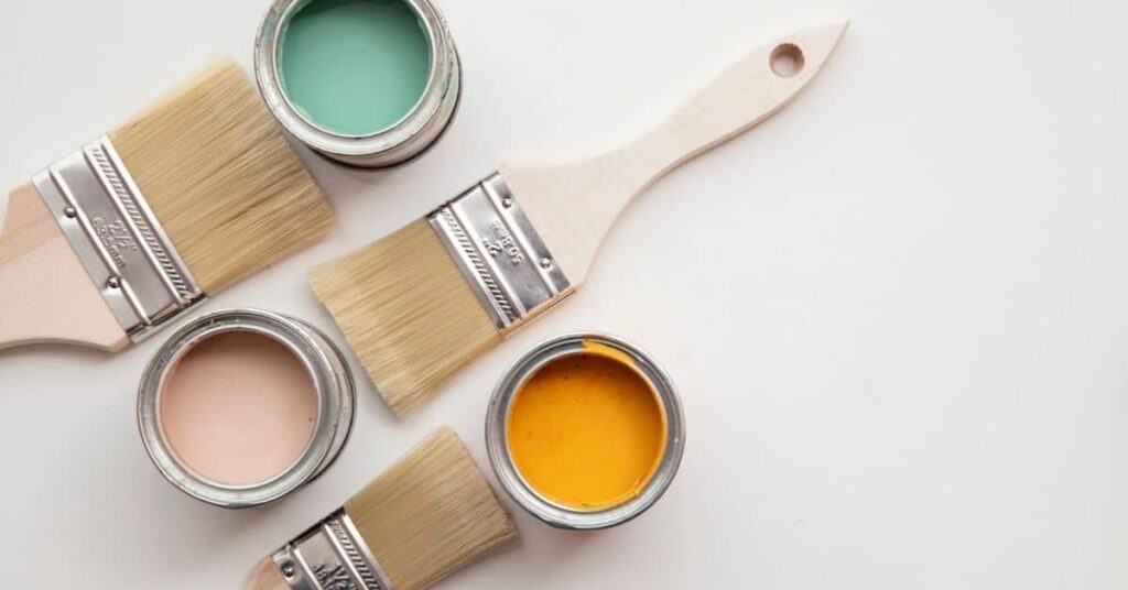
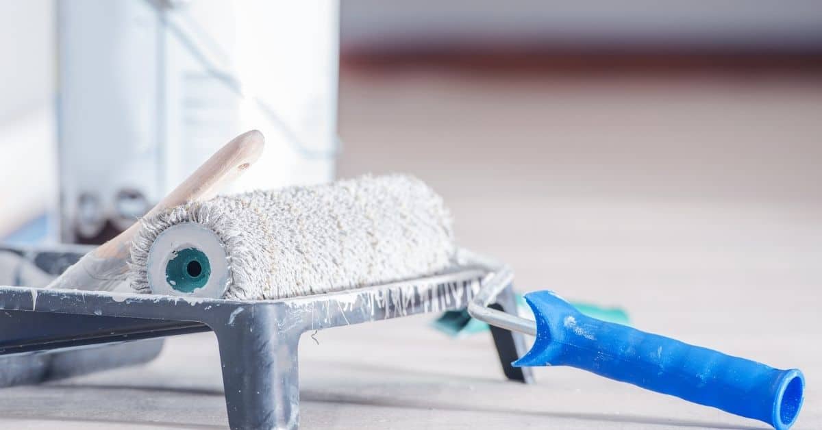
Tools and Materials Checklist for Diyers
Translate the job into a practical, practical checklist that covers brushes, rollers, drop cloths, masking supplies, safety gear, and paint finishes. Include budget and prosumer alternatives where appropriate. Tailor the list to your project scope and space.
Explain what to check on product labels, such as finish and VOC guidance, rather than assuming specs. This helps you compare options safely and choose what fits your needs. Double-check each item before you head to the project.
Essential tools every DIYer must have
Before you start, make sure you’ve got these non-negotiable tools to achieve a professional-looking gray finish.
- Quality paint brushes (2-2.5 inches): For cutting in and detail work. Skip this, expect sloppy edges.
- High-quality roller covers: 9-inch for walls, 18-inch for ceilings. Cheap ones leave lint behind.
- Roller frames: To fit your roller covers. Don’t skimp here, it affects coverage.
- Drop cloths: Protect floors from spills and drips. Plastic sheets work, but canvas is better.
- Painter’s tape: For clean lines. Use a high-quality one to avoid peeling paint off.
- Safety gear (gloves, goggles): Protect yourself from chemicals and debris. Don’t risk it, wear them.
- Sandpaper (120-grit): For surface prep. Skipping this leaves a rough finish.
- Primer: To seal surfaces and improve paint adhesion. Skip this, expect peeling later.
Quick rule: Don’t skimp on tools. Cheap ones lead to poor results.
Optional upgrades and time-savers
Invest in these optional tools or materials for a smoother, faster paint job.
- Paint sprayer: For large surfaces like walls and ceilings. Worth it if you’re tackling multiple rooms.
- Paint edger tool: For cutting in corners. Saves time and gives cleaner lines.
- Extending roller pole: For hard-to-reach areas. Skip this, expect ladder accidents.
- High-quality paint (low VOC): Better coverage, less smell. Worth it for your health and time.
- Paint conditioner: Improves paint flow and leveling. Use if you’re using old or thick paint.
- Paint spray tent: For protecting furniture from overspray. Skip this, expect a mess.
- Paint tray liners: For easy cleanup. Reusable ones save money in the long run.
- Safety respirator: For prolonged exposure to paint fumes. Don’t risk it, wear one.
Quick rule: Upgrade tools based on your project’s size and scope. Safety gear is always a good investment.
Sample Testing, Visual Checkpoints, and How to Read Swatches
Describe a repeatable method for testing paint in situ, including how to place swatches for accurate observation. Note the importance of assessing color at different times of day. Use temporary sample panels to compare side by side.
Identify visual checkpoints such as edge sharpness, uniformity, and undertone behavior in real lighting. Record what you see and compare it to your initial expectation. Reference labels or data sheets for guidance on application notes.
Creating and positioning test swatches
Before you start painting, use this checklist to create and position your test swatches for the best results.
- Choose 4-5 samples: Different undertones and finishes can change how a gray looks. More samples help you compare.
- Test in different areas: Paint swatches on walls, near windows, and in corners to see how light affects them throughout the day.
- Avoid direct sunlight: Swatches in direct sun can fade or look too bright. Keep some in shade for a true test.
- Compare undertones: Place similar shades next to each other to see their undertones clearly.
- Test finishes: If you’re choosing between eggshell and satin, test both on the same wall to compare sheens.
- Avoid doorways and walkways: Swatches here can get scuffed or damaged before you’ve made your choice.
- Use painter’s tape: Tape off each swatch for clean edges. Remove it after 24 hours to avoid pulling off paint.
- Make them big enough: Swatches should be at least 1′ x 1′ to see the true color and finish.
Quick rule: The more samples you test, the surer you’ll be of your choice. But don’t overwhelm yourself or your walls.
What to look for over several days
Check these visual cues at different times of day to confirm your gray choice.
- Morning light: See how the gray looks in soft, indirect light. It should still read as a neutral gray, not too cool or warm.
- Afternoon sun: Check if the gray washes out or turns too blue or yellow under direct sunlight. It should maintain its neutrality.
- Evening glow: Observe how the gray looks in warm, artificial light. It should still complement your room’s lighting scheme.
- Color shift: Notice if the gray changes hue dramatically from morning to evening. A good gray should maintain its neutrality throughout the day.
- Reflectance: See how the gray reflects light in different conditions. It should neither absorb too much nor reflect too harshly.
- Contrast with furniture: Check if the gray complements or clashes with your room’s existing colors and textures.
- Mood: Trust your instincts. Does the gray make you feel comfortable, relaxed, or energized? That’s a good sign it’s right for your space.
- Wait 24 hours: Let your eyes adjust to each sample before making a final decision.
Quick rule: Patience is key. Don’t rush your decision. Give each sample time to show its true colors.
Pairing Grays with Trim, Ceilings, and Accent Colors
Walk through coordinating baseboard and ceiling colors, metallics, and accents to complement each gray. Explain how contrast and balance influence the perceived shade. Use trim paint to subtly shift the gray’s impression without changing the wall color.
Discuss practical pairing ideas without fixed numbers. Consider how different trims and ceilings reflect light and affect mood. Verify options with swatches under your room’s lighting before committing.
Trim and ceiling strategies
When choosing trim colors, consider the mood you want to create. White or off-white trims can make a room feel brighter and more spacious, while a contrasting color can add depth and drama.
For cool grays, consider white or light gray trims to keep the space feeling fresh. For warmer grays, an off-white or even a soft beige can complement nicely.
Ceiling color is often overlooked but plays a big role in setting the tone of your room. A lighter ceiling can make a room feel taller and more open, while a darker one can create a cozy, intimate atmosphere.
For most grays, a white or light gray ceiling works well. But don’t be afraid to experiment with color – a dark ceiling in a cool gray room can create a stunning contrast.
Accent colors and finishes that elevate gray
Gray is a versatile base color, but it’s the accent colors and finishes you choose that really bring your space to life. For warm grays, consider accents in rich jewel tones or earthy hues. Cool grays pair well with bright, bold colors.
Matte finishes can create a sophisticated, modern look, while eggshell and satin offer durability and easy cleaning.
Wood, metal, and textiles can all be used to balance out your gray walls. Warm woods pair well with cool grays, while metals like brass or copper can add a touch of glamour to warm grays.
Don’t forget about texture too – a mix of smooth and rough surfaces can create visual interest in an otherwise monochromatic space.
Troubleshooting, Maintenance, and When to Call a Pro
Cover common problems like visible seams, blotchy coverage, and undertone surprises, with practical fixes you can try yourself. Include routine maintenance tips to extend the life of painted surfaces. Note clear indicators that a pro should be involved rather than attempting risky DIY fixes.
Have ready the project details you’d share with a contractor, such as space, surfaces, and observed issues. Avoid pricing guesses; instead, prepare factual notes from your inspection and product labels. Use this to decide if stepping up to professional help is warranted.
Quick fixes for common DIY mistakes
Don’t let minor mishaps ruin your paint job. Here are some quick fixes to keep your gray walls looking their best.
- Lap marks: These happen when you overlap wet paint. To fix, sand lightly, then touch up with a small brush and the leftover paint.
- Missed spots: Inspect your work under different lighting to spot any missed areas. Touch up as needed.
- Uneven sheen: This can happen if you didn’t sand between coats or used a poor quality primer. Lightly sand, wipe clean, then apply another coat.
- Drips and runs: These are usually caused by applying paint too thickly. Gently scrape off excess with a razor blade, then touch up.
Remember, prevention is key. Sand well, use good quality materials, and work in manageable sections.
Long-term care and touch-up guidance
Maintaining your gray paint job isn’t hard, but it does require some regular TLC. Here’s how to keep your walls looking fresh.
Cleaning: Use a mild detergent and water solution for general cleaning. Avoid harsh chemicals that can damage the paint.
Touch-ups: Store leftover paint in an airtight container, away from heat and light. When touch-ups are needed, use a small brush to apply the paint, blending it well with the surrounding area.
Preventative care: Keep your walls protected from excessive moisture, direct sunlight, and heavy traffic areas. This will help maintain the longevity of your gray paint job.
Conclusion
Choosing the right gray isn’t cosmetic fluff—it affects safety, durability, and how the room actually feels every day. Get it right and you gain a quiet, cohesive look that holds up under real use.
Do this in rough order: start with safety and prep, inspect walls for moisture or damage, protect floors and furniture, test swatches in real light on a hidden wall, decide the sheen and whether primer is needed, mix and pour the paint, cut in at edges before rolling, apply in even coats, watch the stop points and don’t rush the dry time, then inspect the finish and clean your tools. Keep the process steady and methodical, and you’ll avoid costly mistakes and surprises.
Avoid these common missteps: skipping a test patch or choosing a gray that looks right only in a store light, neglecting moisture or peeling paint, skipping primer on problematic surfaces, overloading brushes or rollers, or skipping the required drying time between coats. Always wear proper safety gear, protect surfaces, and work in a well-ventilated area.
If you encounter persistent moisture, cracks, mold, major color bleed between walls, or stubborn uneven results after a couple coats, call a professional. Stick to the plan, stay patient, and you’ll finish strong with a finish you can be proud of. Stay focused and make it happen.
FAQ
How do I judge a gray in my room without wasting paint on a full coat?
Test small patches on the wall with the room’s lighting at different times of day. Check how it looks on the actual wall surface under your chosen finish.
Use the manufacturer’s test cans or swatch sheets and compare them side by side. Don’t rely on a single sample in a single corner.
What if the gray I pick looks different once it’s topcoated or dried?
Check the finish type and sheen on the label, then test the same shade with the final topcoat you’ll use. Some finishes can warm or dull the color slightly.
If the tone shifts, choose a lighter or darker shade within the same family and test again before committing to the whole wall.
How can I protect trim, ceilings, and floors while I’m painting gray walls?
Mask edges with painter’s tape and use drop cloths or plastic sheeting for floors. Keep your brushes and rollers clean to avoid color transfer where it’s not wanted.
Seal off adjacent areas with temporary barriers if you’re working in a tight space. Recheck tape and covers before you roll or cut in near those lines.
What should I do if patchy coverage or streaks show up after the first coat?
Make sure you’re using the right nap length roller for the surface and have loaded the roller properly. Apply even strokes in one direction then cross for smooth coverage.
Let the coat dry fully, then assess. If streaks persist, you may need a second coat with careful technique, using the same product and finish as the first coat.