
Introduction
Pairing paint colors is choosing hues that look good together in a space, then testing them to confirm in your environment. This article keeps it practical for DIY work. You’ll get a plain‑spoken plan you can actually follow.
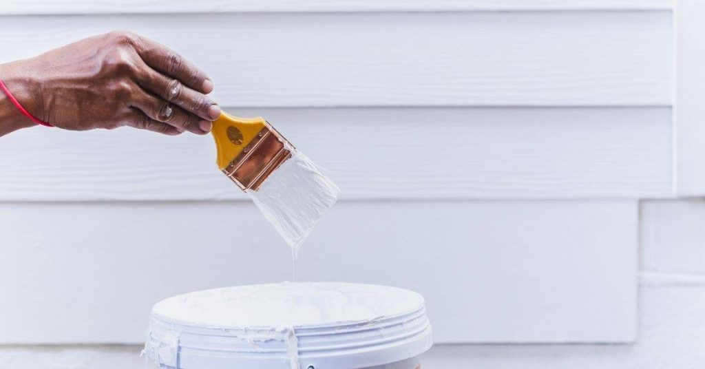
Start with large swatches and test them in the space—on the wall or a sturdy board—under the room’s lighting. See how undertones shift with daylight and artificial light, and compare neighboring colors to keep things cohesive. Always check the product label and manufacturer instructions for dry time, finish, and any prep or surface considerations, and follow local rules or guidelines where applicable.
Key takeaways
- Test colors on large swatches in the room’s lighting before committing.
- Label each color sample and record expected undertones for comparisons.
- Check plaster/paint sheen compatibility to avoid patchy, inconsistent finishes.
- Pair warm and cool tones by balancing value changes across rooms.
- Test under natural and artificial light to reveal true color shifts.
- Safety: use drop cloths, masks, and proper ventilation during testing.
Table of Contents
- Introduction
- Key takeaways
- Why Thoughtful Paint Pairing Matters
- Color Fundamentals: Hue, Value, Chroma, and Undertones
- Pairing Strategies and Palette Rules That Actually Work
- Choosing Colors by Room Function, Light, and Architecture
- Tools and Materials Checklist for Pairing and Testing
- How to Test Paint First: Ordering, Applying, and Viewing Protocol
- Interpreting Test Results and Deciding on Pairings
- Common Pairing Mistakes and Quick Fixes
- Conclusion
- FAQ
Why Thoughtful Paint Pairing Matters
Pairing paint colors on a project isn’t just about looking fresh. It sets mood, guides how a room feels, and helps you move through a space without it feeling chaotic. Done right, it saves time on decisions and reduces costly redo work later.
Good pairing also helps resale and daily comfort, since the eye can follow a coherent flow from one room to the next. You’ll spend less time second-guessing choices when colors work together naturally. It’s practical, not mystical.
Mood and atmosphere impact
Color choices aren’t just about what looks good. They also set the mood, energy, and calm of a space. Think about it – warm colors like reds and oranges make us feel lively, while cool blues and greens create a sense of tranquility.
Kitchen, for instance, benefits from energetic hues to stimulate appetite. Meanwhile, bedrooms need soothing tones for relaxation. Get this wrong, and you’ll be fighting with your space instead of enjoying it.
So, before you grab that paintbrush, consider how each color will make you feel. It’s not just about what looks good in a catalog; it’s about what works for you.
Visual continuity and balance
Ever walked into a house where each room is a different color? It’s like stepping into a box of crayons. Not exactly inviting, right?
That’s why it’s crucial to coordinate your palette. A cohesive look creates visual flow, guiding you from one space to another. It makes your home feel bigger, too – no more closed-off rooms.
Architectural elements, like trim and moldings, should also play nice with your wall colors. They frame your space, so make sure they’re not fighting for attention.
Think of it like a symphony. Each instrument has its part, but they all work together to create harmony. Your paint colors are the instruments; use them wisely.
Risk and cost of poor choices
Bad paint pairings can turn your dream home into a nightmare. You might end up with clashing undertones, like a warm yellow wall next to a cool blue one – it’s like looking at a bad magic trick.
Worse still, you’ll likely have to repaint. That’s time and money down the drain. And let’s not forget about resale value. Buyers want consistency, not chaos. A poorly painted home can be a real turn-off.
So, before you make a costly mistake, take your time. Test those colors first. It might seem like extra work now, but it’ll save you grief (and cash) later on.
Color Fundamentals: Hue, Value, Chroma, and Undertones
Hue is the color family you see on the swatch. Value is how light or dark it reads. Chroma is how vivid or muted the color appears. All of these affect how a paint reads on walls in real life.
Undertones matter because they can tilt a color warm or cool in different lighting. Understand that undertones exist, then check them across several light situations to see how colors actually pair. This isn’t theory—it changes what reads as harmonious in your space.
Understanding undertones
Undertones are the subtle colors that lie beneath your paint’s main hue. They can shift a color’s appearance, making it look warmer or cooler.
For instance, a blue with a red undertone will appear purple, while one with a green undertone will lean towards turquoise.
To detect undertones in samples or existing elements, hold them up to a white surface and compare. The underlying color will become more apparent.
Neutral undertones are key for versatile pairing. They can adapt to different lighting conditions and adjacent colors.
Value and saturation effects
Value refers to how light or dark a color is, while saturation determines its intensity. These factors change contrast and perceived space, regardless of hue.
High value (light) colors make spaces feel larger and brighter. Low value (dark) colors create intimacy and drama.
High saturation colors demand attention, while low saturation ones blend into the background.
Balance value and saturation across your space to control contrast and visual impact.
Interaction with light temperature
Light temperature, whether natural or artificial, can push colors warmer (yellowish) or cooler (bluish). This alters their perceived chroma and overall appearance.
For example, a yellow paint will look creamier under warm incandescent lights but could appear mustard-like in cool fluorescent light.
Test your color choices at different times of day to see how they react to natural light. Also, consider the type of artificial lighting you’ll use.
Choose colors that adapt well to your space’s lighting conditions for best results.
Pairing Strategies and Palette Rules That Actually Work
Start with a primary color you like and add an accent that contrasts just enough to pop. If you want calm, lean toward analogous neighbors; if you want energy, try complementary accents.
Use the rule of if this, then that: if the primary is light, choose a darker accent; if the primary is bold, keep accents more subdued. Neutral bases with a single color pops often work well in living areas and kitchens.
Complementary and high-contrast choices
For drama, consider opposite hues on the color wheel. These complementary colors create a strong contrast that can make each shade appear brighter.
Tip: Control intensity by adjusting value (lightness/darkness) and chroma (saturation). Too much contrast can cause visual tension.
Start with one hue as the dominant color, then introduce its complement in smaller doses – accents, accessories, or trim. Test patches to see how they interact before committing.
Analogous and layered color schemes
Adjacent hues on the color wheel create a harmonious, cohesive look. Layer different values of these colors for depth and interest.
Tip: Use one hue as the dominant shade, then introduce lighter or darker tints and shades from the same family in varying amounts.
For example, if you choose blue, use navy (dark), royal (medium), and sky (light) for a layered effect. Test different combinations to find your perfect balance.
Neutral backbone with accent colors
Using neutrals as the base anchors a room, providing stability and calm. Accent colors add personality and visual interest.
Tip: Choose one or two accent shades that complement your neutral base. They can be complementary (opposite on the color wheel) or analogous (next to each other).
For instance, pair a neutral like beige with accents of deep teal and warm mustard. Test small areas first to ensure they work together in your specific lighting.
Choosing Colors by Room Function, Light, and Architecture
Match color mood to how the room will be used. A bright, busy space may need a calmer anchor, while a quiet room can handle a bolder accent. Think about furniture and fixtures you’ll keep long-term.
Assess light: natural daylight changes color, while artificial light can shift warmth. Consider architectural features like trim, moldings, and built-ins as anchors for your palette so the pairing feels intentional.
Room Function and Intended Mood
The first step in choosing colors is understanding the room’s purpose. Is it a relaxing bedroom, an energizing home office, or a social space like a living room?
For relaxing spaces, opt for low chroma (soft) and low contrast colors. Think blues, greens, and neutrals.
For energizing spaces, consider higher chroma (vibrant) and medium contrast colors. Yellows, oranges, and reds can work well here.
For social spaces, balance is key. Neutral backbones with accent colors can create a welcoming atmosphere.
Natural and Artificial Light Considerations
Lighting plays a big role in how colors appear. Start by looking at your room’s natural light situation.
For north-facing rooms, which get cool, soft light, warmer colors can help balance this out. Think yellows, oranges, and warm reds.
For south-facing rooms, which get bright, harsh light, cooler colors can help soften the effect. Blues, greens, and cool grays are good choices.
Also consider your artificial lighting. Incandescent bulbs cast warm light, while fluorescent or LED bulbs can be cool. Choose colors that complement your lighting setup.
Working with Architectural Features and Finishes
The architecture of the room should guide your color choices. Look at moldings, built-ins, floors, and permanent materials.
If you have dark wood flooring, consider lighter walls to balance it out. Conversely, light floors can handle darker walls.
Moldings and trim should be considered too. They often look best in a color that’s one or two shades lighter than the wall color.
Built-ins and permanent materials should also influence your choices. If you have a lot of white tile, for example, consider warm colors to balance it out.

Tools and Materials Checklist for Pairing and Testing
Gather sample pots, a small roll of wall-safe tape, and clean white paper or test boards. Have a sharp pencil for labeling and a marker for quick notes. A solid, inexpensive lamp or a portable light will help you compare at different times of day.
Reuseable options save money: magnetic or clip boards for swatches, and a simple binder to track which samples go where. Keep everything labeled to avoid mixing up rooms.
Paint sample types and quantities
Before you start painting, it’s crucial to know what kind of samples to get and how many. Here’s a quick checklist.
- Color swatches: Great for initial color selection. They’re cheap and easy to use but don’t show true color.
- Sample pots (8 oz): Ideal for testing colors on walls. Small enough to be affordable, big enough to cover a good area.
- Peel-and-stick cards: Convenient for quick checks. Not as reliable as paint samples but handy for comparing hues.
- Quantity: Aim for 3-4 colors per room. You’ll likely narrow it down to one, but better safe than sorry.
Quick rule: More samples mean more chances of finding the perfect color, but don’t go overboard – you’ll waste money and time.
Application tools and surfaces for testing
To get accurate color readings, you need the right tools. Here’s what to grab.
- Paintbrushes: Essential for applying samples. Use a good quality one for best results.
- Rollers (2-4 inch): For larger areas. Get a small one for trims and details.
- Poster board or foam core: Cheap, reusable surfaces to test colors before going on walls.
- Drop cloths: Protect your floor from drips and spills. Old sheets work too.
Quick rule: Always apply samples in the same way – same tool, same pressure, same time of day – for consistent results.
Lighting and viewing aids
Lighting can drastically change how colors look. Use these tools to view your samples consistently.
- Portable bulbs (daylight balanced): Mimic natural light. Essential for accurate color perception.
- White balance cards: Help you adjust camera settings for true-to-life color capture.
- Art lighting clips or clamps: Position your samples under consistent, directed light.
Quick rule: Always view and compare colors under the same lighting conditions to avoid confusion.
How to Test Paint First: Ordering, Applying, and Viewing Protocol
Order small sample pots that cover your main color and a couple of close neighbors. Label them clearly by room and wall location before they arrive. Plan to test under the actual lighting you’ll use.
Apply sample boards in a few spots per room and note how they look at different times of day. Keep the test process methodical and avoid guessing—mark impressions and move on to the next option if something reads off.
Step-by-Step Process
Follow these practical steps to test paint first, ensuring a methodical approach from ordering samples to viewing them in situ.
- Preparation: Check your surfaces are clean, dry, and primed. Safety first – wear gloves and eye protection.
- Ordering Samples: Use the strategies and palette rules mentioned earlier to select colors. Order samples from reputable brands, ensuring you get enough for each room.
- Labeling: Clearly mark each sample with its color code, manufacturer, intended location, and a quick note on why you chose it.
- Applying Patches: Make multiple, same-size patches using consistent application technique. Use a paintbrush or roller, depending on the surface.
- Viewing Protocol: Allow 24 hours for drying before viewing. Check your patches at different times of day and under various lighting conditions to see how they react.
- Final Checks: Once you’ve made your decision, double-check it’s right by living with the color for a few days. If unsure, consult a professional.
Order and label samples systematically
Keeping track of your paint samples is crucial to avoid confusion later on. Here’s how:
Start by creating a simple spreadsheet or use a note-taking app to record details for each sample.
Include: color code, manufacturer, intended room/location, and any notes about why you chose that shade.
When labeling physical samples, use a permanent marker to write on the edge of the card or bottle. This way, the label won’t peel off or get lost.
Best practices for applying test patches
Applying test patches correctly ensures accurate color representation and easier decision-making:
First, ensure your surfaces are primed and ready. This helps the paint adhere better and gives a truer color.
Use painter’s tape to create even rectangles or squares for each patch. Aim for around 2′ x 2′ for walls, larger if possible for floors.
Apply: two coats of paint, allowing adequate drying time between coats (usually 4-6 hours). This gives you a better idea of the final color and sheen.
When and where to view samples
Viewing your test patches at different times and under various lighting conditions helps catch undertone shifts and sheen differences:
Start by viewing them in natural light. Check at different times of the day – morning, afternoon, and evening – to see how the color changes with varying sunlight.
Next, turn on your room’s typical artificial lights (e.g., overhead, floor lamps) and view the patches again. This gives you an idea of how the colors will look in the evenings or during power outages.
Don’t forget: to view them from different angles and distances. Stand back, walk around, and check from various heights to get a well-rounded impression of each color.
Interpreting Test Results and Deciding on Pairings
Look for undertone alignment with fixed elements like floors, furniture, and cabinetry. Check contrast levels against your walls and trim, not just the color alone. Harmony means surroundings support the primary color, not fight it.
Use a simple pass/fail approach: does the color feel right in person in multiple spots and light conditions? If not, note what needs adjustment and test a close alternative.
Visual checkpoints to compare
Before you decide, look at your samples side by side. Here’s a quick checklist to help.
- Color bleeding: Check if one color is overpowering another. If yes, they might not harmonize well.
- Muddiness: Look for any murky or unclear colors. They won’t pop like you want.
- Undertone match: Compare undertones. They should be close to create harmony.
- Contrast level: Check if the contrast is too high or low. It should complement, not clash or bore.
- Harmony with fixed elements: Hold samples next to your furniture, flooring, etc. They should blend, not fight.
- Color consistency: Make sure the color looks the same in different lights. If it doesn’t, it might be a problem.
- Saturation: Check if both colors are vibrant enough for your room’s mood. Too dull or too bright can throw off balance.
- Color placement: Try them out in different spots. Some placements might work better than others.
Quick rule: If something feels ‘off’, trust your gut. It’s usually right.
Common decision rules and tolerances
When comparing, keep these rules in mind:
Undertones should align within two shades. More than that, and they might clash.
Contrast levels should complement, not overwhelm. Too much contrast can be jarring; too little, boring.
Tolerance: Be flexible. Colors look different in different lights and spaces. What looks great in a store might not work at home. Re-test if you’re unsure.
If something feels ‘off’, trust your gut. It’s usually right. If it doesn’t feel right, try again with new options.
Getting feedback and final verification
Before you commit, get some objective second opinions:
Invite friends or family. Fresh eyes can spot things you might miss.
Final in-home check: Before you paint the whole room, test your top pick on a small patch. See how it looks at different times of day and under different lights. This is your last chance to be sure.
If it passes, go ahead and paint. If not, back to the drawing board. Better now than after you’ve painted the whole room.
Common Pairing Mistakes and Quick Fixes
Avoid ignoring undertones; a slight shift can make a color look off in certain lights. If a sample reads yellow, check with cool or neutral neutrals and compare again in the same spot.
Sheen and placement matter too—don’t rely on a single wall. If the look isn’t cohesive, try a lighter/darker shade of the same hue or swap the accent to a nearby color in the palette.
Misreading undertones
Undertones can trip you up. They’re the hidden colors in a paint that affect how it looks under different lights and next to other colors.
For instance, a ‘blue’ might have red undertones, making it look purple in some light. To spot this, test your paints with neutrals like white or beige. If they clash, you’ve got an undertone conflict.
Fix: Use neutral paint samples to check for undertones. Adjust the value (lightness/darkness) of your colors to balance them out. Or, consider trims and accents in neutral shades to tie rooms together.
Finish and sheen mismatches
Sheen affects how light reflects off your walls, changing the perceived color. A semi-gloss will look different from a flat finish.
Mistake: Using the wrong sheen can make your pairings clash or look dull. For example, using a high-sheen paint next to a low-sheen one can create an unwanted contrast.
Fix: Match sheens where possible. If you’re stuck with different sheens, use trims and moldings to soften the transition between them.
Sample placement and viewing errors
Where and how you test your paint samples can make or break your pairing decisions. Avoid these common mistakes:
- Small swatches: Tiny samples don’t show true color. Use larger patches (at least 2′ x 2′).
- Wrong wall: Test on the actual wall where the paint will go, not just a scrap.
- Single-light viewing: Check your samples in different lights – natural, artificial, and both together.
- Viewing from one spot: Observe from various angles to see how color changes.
Remember, the goal is to mimic real-world conditions. So, test big, test on the actual wall, and test in different lights and viewing angles.
Conclusion
Get confident by testing early and protecting the work. The right pairings will look intentional, hold up over time, and keep you from costly mistakes.
Start with a simple, natural-language checklist you can follow in order: confirm the room function and light, choose a baseline palette, order and apply sample swatches, view them under different lighting, compare undertones, check finish and sheen compatibility, document the results, and then finalize your plan. Do this in a small, controlled area first and only scale up after you’re satisfied.
Avoid common missteps like skipping test patches, ignoring undertones, chasing trends that clash with room function, using the wrong finish for the space, or rushing the viewing time. Always ventilate and wear basic PPE when mixing or applying paint, mask clean-up edges, and keep surfaces protected. If you run into stubborn undertones, high-traffic needs, or persistent color bleed at edges, call a professional instead of forcing a DIY fix, and remember: careful prep and deliberate testing now save the most money later. Stay decisive, stay practical, and you’ll finish with a palette that works in real life. Strong, practical testing leads to durable, beautiful results.
FAQ
How do I test color under different lighting conditions before committing?
Paint a few large swatches on the wall and observe at morning, afternoon, and evening. Compare how the color reads in natural light versus artificial lighting. Use the same tester size you plan to apply in full coats, and check for color shifts on all days of the week if you can.
Should I test both color and sheen together on the same wall?
Yes. Test the color with the finish you plan to use. Sheen can change how a color looks and reflect light differently. Use actual paint samples or samples labeled with the exact finish you’ll buy.
What’s the best way to interpret a swatch test on a real wall before buying?
Apply larger swatches (not tiny chips) in the room you’re painting. Observe for at least a couple of days if you can, and compare against the existing trim or nearby walls. If it looks off, adjust color or finish and re-test in the same light conditions.
What practical steps should I take to avoid bad odors or weather issues when testing indoors?
Open tester cans in a well-ventilated area and allow samples to cure on the wall or board before final judgment. Follow label guidance for drying times and air circulation. If testing outdoors, do it on a shaded, dry surface and protect from rain.