
Introduction
Cool grays, sage greens, and warm neutrals pair best with honey oak cabinets.
Choosing the right color affects room mood, light reflection, and perceived space, so this guide focuses on practical pairing ideas.
You’ll learn simple rules of thumb, how to test paint in your space, and example pairings to try.
Key takeaways
- Test warm neutrals first beside honey oak to avoid yellow undertones.
- Pair light grays or creams for contrast without overpowering natural grain.
- Consider low-saturation blues or greens for cool, balanced cabinet pairing.
- Sample tests should cover lighting changes at morning, noon, and evening.
- Plan budget and timeline around two coats plus drying time.
- Safety note: seal or ventilate when testing paints near wood surfaces.
Table of Contents
- Introduction
- Key takeaways
- Quick Overview: Why honey oak matters for paint choice
- Simple pairing rules you can use today
- Best color families and specific shade directions
- Sample test plan: how to test paint with honey oak cabinets
- Real sample tests — 6 room scenarios and results
- Trim, ceiling, and accent advice (including safety near wood)
- Budgeting and timeline for selecting and implementing paint
- Common mistakes and how to avoid them
- Conclusion
- FAQ
Quick Overview: Why honey oak matters for paint choice
Honey oak carries warm golden undertones with a hint of amber. Those undertones shift how paint reads in bright light versus dim rooms. Finishes like natural, matte, satin, and polyurethane change color resonance and how much light is reflected.
Use quick checks on sample boards in your room lighting, compare wall to cabinet proximity, and layer swatches to see undertones play out. This matters because it guides you toward warm neutrals, creams, and soft earthy hues while warning against overly yellow or dull results.
Key visual characteristics of honey oak
Honey oak cabinets are known for their distinct grain patterns and warm yellow-orange hue. The grain is usually straight but can have a slight wavy texture, adding character to the wood. When choosing paint colors, it’s crucial to pick shades that complement this natural warmth.
Typically, honey oak finishes come in two main sheen levels: satin or semi-gloss. Satin provides a subtle shine that highlights the grain without being too glossy, while semi-gloss offers more reflectivity and is easier to clean. Before you start painting, check your cabinet’s current finish to decide on the best paint sheen.
The warm tones of honey oak can make a room feel cozy and inviting. When selecting paints, opt for colors that enhance this warmth rather than clash with it. Neutral shades like beige or light gray work well, but you can also experiment with deeper tones if you want to add some drama.
How wood undertones affect perceived paint color
Honey oak’s warm tones can make nearby colors look different. When you’re picking a paint shade for honey oak, remember that the wood’s base hue will reflect onto your walls or ceilings. This means a neutral gray might appear warmer and more yellowish next to honey oak.
Warm woods like honey oak tend to bring out warm tones in nearby paints, making cool colors look less vibrant. If you want to keep things balanced, choose cooler shades that have blue undertones to counteract the warmth of the wood. But be careful—too much contrast can clash and make your space feel unbalanced.
Before you commit to a paint color, test it out on a small section near your honey oak. This way, you’ll see how the light plays with both the wood and the paint throughout the day. It’s like checking if your new shirt goes well with your shoes before buying—just make sure everything looks good together.

Simple pairing rules you can use today
These simple rules help you pair honey oak with paint today without overthinking. Think in quick contrast: go with high-contrast cool tones, subtle warm neutrals, or near-tone creams, and note what reads as dated versus contemporary.
Balance temperature by avoiding strong warm stains with cool paints; aim for a temperature match so cool whites feel at home with warm oak, or warm neutrals with honey oak. Check undertones: honey oak tends toward yellow or amber; pick paints with complementary undertones to avoid clashes. Keep trims and doors cohesive: carry the cabinetry tone through or deliberately contrast, keeping trim a shade or two lighter or darker.
Rule: Use cool neutrals for balance
Cool grays, greiges, and soft blues are your go-to choices when you want to neutralize the warmth of honey oak cabinets. These colors act like a natural counterbalance, keeping things from feeling too warm or overwhelming.
When to use: Opt for cool neutrals in rooms where you want a contemporary look without overpowering the wood’s natural beauty. They work great in kitchens and bathrooms with lots of light, creating a fresh, airy feel.
Avoid using these colors if your room is small or lacks natural light; they can make spaces feel cold and cramped. Instead, go for warmer tones that bring warmth back into the space.
Rule: Use warm and muted tones for harmony
If you want a cozy, harmonious look with your honey oak cabinets, reach for warm creams, soft terracottas, or muted greens. These colors blend seamlessly with the wood’s natural undertones, creating a cohesive feel.
When to use: Warm and muted tones are perfect for living rooms, dining areas, or bedrooms where you want a relaxed, inviting atmosphere. They work well in spaces that need a touch of warmth without being too bold.
Avoid using these colors if your room is already warm and needs cooling down. Instead, opt for cooler neutrals to balance out the space.
Rule: Consider contrast levels and room size
The level of contrast between your honey oak cabinets and wall paint can dramatically affect how the space feels. Lighter walls make cabinets stand out, while darker walls create a more cohesive look.
For small rooms: Use lighter shades to keep things open and airy. Dark colors in tight spaces can feel oppressive and close off natural light.
For large rooms: You have more flexibility with dark paint tones, which add depth and richness without overwhelming the space. Just make sure there’s enough contrast so that cabinets don’t get lost against the walls.
Best color families and specific shade directions
For honey oak cabinets, focus on color families that pair well: neutrals, blues, greens, gentle pastels, and subtle warm tones. Choose a shade direction—light, cool, or warm—to balance the oak’s amber warmth, with warm neutrals, dusty to cobalt blues, sage to olive greens, soft pastels, and understated warm tones all workable options.
A practical DIY approach is to test on laminate or paint swatch boards and then on large surface samples under kitchen lighting at different times of day. Use that testing to guide your contrast strategy (low, soft, or bold) and to coordinate with countertops, backsplash, and hardware, while also noting maintenance and durability for painted surfaces.
Neutrals that pair well
Cool greys and warm greiges are great choices for honey oak cabinets. Cool greys, like Benjamin Moore’s OC-17, bring a crisp contrast to the amber tones of honey oak. Warm greiges, such as SW 6254 Grayish Beige, blend in nicely and add warmth without overwhelming.
Off-whites can also work well but choose ones with subtle undertones like beige or cream. A light off-white like Benjamin Moore’s OC-17 keeps things bright while adding a touch of sophistication.
To pick the right neutral, consider your room’s lighting and size. In smaller spaces, lighter neutrals help make the area feel more open. For larger rooms, you can get away with slightly darker tones to create depth.
Blues and Greens That Work
Soft blues like dusty navy or sky blue pair beautifully with honey oak’s warm undertones. These colors add a touch of calmness without clashing. Try Dutch Boy’s Soft Navy for a subtle, elegant look.
Sage greens are another great option. They offer a natural feel and complement the wood’s amber hues nicely. A muted sage like Valspar’s Sage Green can bring life to your kitchen or dining area without overpowering the cabinets.
To find the right shade, test samples in different lighting conditions throughout the day. This helps ensure you get a color that looks good no matter what time it is.
Pastels and Accent Colors
Gentle pastel shades like blush or pale aqua can add softness to your space. Muted blush tones, such as Dutch Boy’s Blush Pink, bring a delicate touch of warmth that complements honey oak beautifully.
Bolder accent colors like navy blue or charcoal work well for trim or feature walls. Navy adds depth and contrast without being too harsh. Charcoal can create a striking look, especially in larger rooms with good lighting.
When choosing pastels or accents, consider how they interact with your countertops and backsplash. A light countertop might call for darker accent colors to balance the space, while a dark countertop could work well with softer pastel tones.
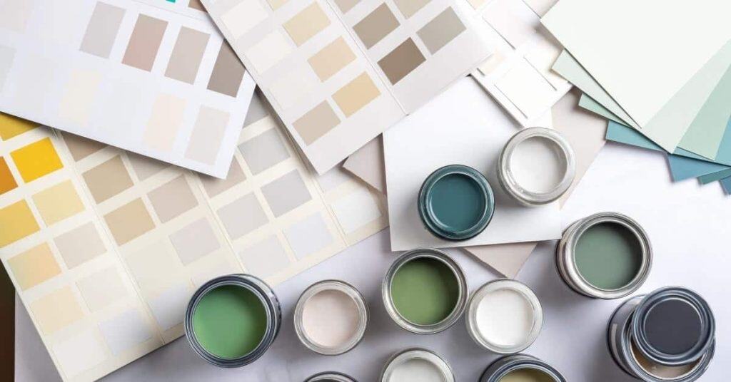
Sample test plan: how to test paint with honey oak cabinets
This section lays out a practical, step-by-step plan for testing paint colors with honey oak cabinets, focusing on selecting three to five plausible colors, noting warm or cool undertones, and comparing finishes like matte, eggshell, or satin. You’ll prepare standardized test boards (12×24 inches) with consistent surface prep and edge treatment, label every sample, and apply the same primer and number of coats to keep the comparisons fair. The plan also covers testing under different lighting—natural daylight, warm indoor, and LED cool—and in a kitchen-like setting to mimic real conditions, with checks at multiple intervals to see how colors shift or settle.
Why it matters: a structured test helps you pick colors that harmonize with the grain and warmth of honey oak without guessing. You’ll document results with photos and notes, score each color for harmony, grain visibility, washability, and touch-up ease, and make a customer-friendly, rationale-driven final pick. You’ll also edge in practical constraints like cost, time, maintenance, and safety, plus disposal tips per local rules, so the plan stays doable in a real project without overpromising on products or timelines.
Materials and tools checklist
Use this list before you start your paint sample tests to ensure everything is ready.
- Paint samples: Gather three to five color swatches or small cans of paint. Confirm they are labeled clearly with the exact shade name.
- Primer: Have a primer that matches the finish you plan for your final coat, and confirm it’s suitable for wood surfaces.
- Plywood boards: Cut 12×24 inch test boards from consistent plywood. Check they are sanded smooth and edges are sealed or taped to avoid seepage.
- Brushes/rollers: Use foam brushes or small rollers for even application without leaving brush marks.
- Tape: Have painter’s tape on hand to mask off areas around the test boards if needed.
- Notebook and camera: Keep a notebook handy for quick notes, and use your phone or camera to document changes over time.
- Lights: Set up multiple light sources including natural daylight, warm indoor lighting, and LED cool lights. Confirm they are positioned consistently each day.
- Safety gear: Wear gloves and a mask when handling paints and primers to avoid skin irritation or inhalation of fumes.
Quick rule: Always double-check your materials before starting to ensure no steps are missed.
Testing method and evaluation checklist
Follow this checklist during each test session to maintain consistency in how you evaluate the paint samples.
- Lighting setup: Position lights consistently for each test. Confirm they are turned on at the same time daily.
- Paint application: Apply primer and paint evenly, using the same technique for all boards to avoid bias.
- Drying times: Allow sufficient drying time between coats as per manufacturer instructions. Check that no board is rushed.
- Placement of samples: Place test boards in a kitchen-like setting near actual honey oak cabinets. Confirm they are visible from different angles.
- Evaluation timing: Evaluate colors at 24, 48, and 72 hours after application to catch any color shifts or changes over time.
- Note changes: Document any changes in color harmony, grain visibility, and overall room mood. Include photos for reference.
- Mood assessment: Consider how each color affects the room’s atmosphere. Confirm you are standing back to assess from a distance.
- Scoring criteria: Use a simple scoring rubric focusing on color harmony, grain visibility, washability, and touch-up ease. Ensure all samples are scored fairly.
Quick rule: Stick to the same evaluation process each day to ensure accurate results.

Real sample tests — 6 room scenarios and results
Real sample tests cover six concrete scenarios—kitchen, small galley, open-plan living/dining, bathroom, laundry, and entry—showing how tested color directions with honey oak interact with undertones and lighting. You’ll get concise outcomes like warmth, contrast, or calm receding effects described without naming any brand colors. The focus is on practical directions and how the space changes with different finishes and light.
This matters because room size, light, and cabinet finishes change how honey oak reads. Use a simple swatch test at different times of day, photograph results, and note perceived warmth, contrast, or recede effects. Self-check tips help you avoid high-contrast mistakes, and the takeaway guidance ties tests to real-world pairing rules you can apply to your own cabinets.
Scenario A — Bright kitchen with north light
In a bright kitchen with north-facing windows, cool neutrals like soft grays and blues work well. These colors complement the honey oak’s warm amber undertones without clashing.
The cool tones help balance out the natural light, making the space feel fresh and airy. A soft blue can add a calming touch while still letting the cabinets stand out.
For testing, apply swatches in different areas of the kitchen at various times during the day to see how they interact with the north light. This will help you pick a shade that looks good under all lighting conditions.
The expected outcome is a space where the honey oak cabinets add warmth without overpowering the room’s cool ambiance. Remember, avoid high-contrast colors in small spaces to keep things looking cohesive and relaxing.
Scenario B — Small, low-light galley kitchen
In a compact galley kitchen with limited natural light, opt for light warm neutrals. These colors help maintain warmth while preventing the space from feeling cramped.
A soft beige or pale cream can make the room feel larger and more inviting. Use trim to highlight key areas like windowsills and door frames, which adds visual interest without overwhelming the cabinets.
Test your paint choices in adjacent rooms with similar lighting conditions before committing. This helps ensure you pick a shade that works well under low light.
The goal is to create a cozy yet open feel. Light neutrals let the honey oak cabinets recede slightly, providing a calm backdrop for daily activities without feeling too stark or cold.
Scenario C — Open-plan great room/kitchen
In an open-plan space where the kitchen and living area are connected, cohesive paint strategies are key. Use similar tones throughout to maintain visual flow.
A soft gray or light taupe can work well here, providing a neutral base that complements honey oak cabinets while allowing for accents in other areas like dining nooks or seating zones.
Consider using an accent wall with a slightly darker shade of the same family. This adds depth and interest without breaking up the space visually. Trim should match the walls closely to keep sightlines clean.
The expected outcome is a harmonious, unified look where honey oak cabinets blend seamlessly into the overall design scheme. Test your colors thoroughly in different lighting conditions to ensure consistency across the open plan.
Trim, ceiling, and accent advice (including safety near wood)
Pick trim and ceiling colors that pair with honey oak using warm neutrals, creamy whites, or soft grays, and test undertones with swatches in different lighting. Plan clean transitions between wood-tone cabinetry and painted surfaces by choosing a consistent sheen, like eggshell or satin, and create crisp edge lines at crown molding, window casings, and ceiling borders. Keep safety in mind when finishing near finished wood, focusing on ventilation, masking, and using compatible, low‑VOC products; avoid strong solvents near dust and exposed wood.
Prep the surface with gentle cleaning and a light skim of dust, then choose a primer that suits the job and test paint compatibility on scrap wood or a hidden patch before committing. A practical test plan helps; run 2–3 small patch tests on the wall adjacent to the honey oak, and compare results in morning, afternoon, and evening light. This approach reduces surprises and helps you pick colors and sheens that stay true over time, while keeping finishes durable and safer to work around wood surfaces.
Trim and molding strategies
When it comes to trim and molding around honey oak cabinets, you’ve got a few choices. First off, consider matching the trim with your cabinet color for a cohesive look. This works well if you’re going for a traditional or classic style.
If you want something more modern, try contrasting the trim against the wood tones. A crisp white or soft gray can really make those honey oak cabinets pop. Just be mindful of how much contrast is too much—don’t go overboard in small spaces.
For continuity between rooms, think about using a complementary color that ties both areas together. For instance, if you have an adjacent dining room with darker wood tones, a light trim can bridge the gap nicely without clashing.
Ceiling and crown choices
The ceiling color plays a big role in how warm or cool your honey oak cabinets look. A bright white ceiling will make those wood tones appear warmer, giving the room a cozy feel.
For a softer touch, consider using a light gray or cream for the ceiling. This can help balance out any overly dark corners and create a more uniform lighting effect throughout the space.
When it comes to crown molding, aim for a similar tone as your trim but slightly lighter if you’re going with a white or off-white look. This creates depth without overwhelming the room.
Painting safety and protecting wood surfaces
When painting near finished honey oak cabinets, it’s crucial to protect them from overspray and fumes. Use painter’s tape or a drop cloth to mask off areas that shouldn’t get paint.
Choose low-VOC paints for better indoor air quality and less chance of damaging the wood finish. These products are easier on your nose and won’t leave harmful residues behind.
To test if a new paint will work with existing finishes, do small patch tests on scrap wood or hidden areas first. This helps ensure there’s no unexpected reaction between old and new materials.
Budgeting and timeline for selecting and implementing paint
This section outlines a realistic budgeting and scheduling plan for testing colors, selecting paints and supplies, and applying finish coats, with the key variables you must check. Expect a simple breakdown into sample testing, paint and supplies, and any specialty products, with low, mid, and high ranges to reflect regional price differences, plus buffers for drying, weather, and potential rework.
Knowing these factors helps you plan and avoid surprises: room size, cabinet material porosity, number of test areas, and whether you need color matching or custom blends will influence cost and timing. Build in time for surface prep, priming, the initial coat, inspection, touch-ups, and final topcoat curing, and use in-situ tests on actual cabinet panels, reuse hardware when possible, buy primers and finishes in bulk, and include a contingency. Also check ventilation, masking, and surface cleaning to prevent delays, and follow local rules for disposal of materials and any waste.
Cost-saving tips
To keep costs down, start with a few color swatches instead of buying full sample boards. You can also test paint colors using small samples on scrap wood or directly on the cabinets if you’re confident in your choice.
Buy primer and paint in pint sizes for testing different shades without wasting materials. Once you find the right shade, buy larger quantities to get a discount. Reusing existing hardware like hinges and pulls can save money too.
DIY prep work is key. Clean cabinets thoroughly before painting to ensure good adhesion. This saves on labor costs if you’re doing it yourself. Also, consider buying brushes and rollers in bulk for better prices.
Always set aside a contingency budget of 10-20% to cover unexpected expenses like touch-ups or additional supplies needed during the project.
Project timeline example
The first step is selecting color options, which can take about a week. This includes testing swatches and digital mockups to narrow down your choices.
Once you’ve picked the paint colors, surface prep and priming will follow. Allow at least 2-3 days for this phase, including cleaning, sanding, and applying primer. Let everything dry thoroughly before moving on.
The actual painting process usually takes about a day per coat. Start with an initial coat followed by touch-ups as needed. A second topcoat is recommended to seal in the color and protect your cabinets. Each coat needs drying time, so plan for at least 2-3 days between coats.
Build in extra buffer days for weather delays or if you need additional repaints due to mistakes or coverage issues. This ensures a smooth process without rushing through critical steps like drying times.
Common mistakes and how to avoid them
Common mistakes in pairing honey oak finishes are easy to miss: undertones, lighting, and bold contrasts can all derail a look. Focus on checking true undertones, testing under different lights, and avoiding harsh high-contrast combos. Do proper swatches and document your results to keep the plan honest.
This matters because real room lighting and wood grain change how color reads day to day. Do test patches in the actual space over time, note aging and reflections, and compare with the cabinet surface. Keep a simple record of shades, lighting conditions, and pros/cons to prevent rework and muddy results.
Misreading undertones
Honey oak cabinets can have subtle warm or cool undertones that aren’t always obvious. To avoid a mismatch, start by holding paint samples next to the wood in natural light. Look for any hints of pink, green, or blue undertones.
Once you’ve identified the undertone, choose paints with complementary hues. For example, if your honey oak has warm undertones, opt for cool-toned paints like blues and greens. If it’s cooler, go for warmer tones such as yellows and reds.
To double-check, do a small test patch on an inconspicuous part of the cabinet or wall. Wait at least 24 hours before making any decisions to see how the paint ages under different lighting conditions.
Choosing colors without testing in variable light
Relying solely on daylight can lead to big mistakes. Paint colors change dramatically with different types of lighting, so test your choices under multiple conditions: ambient, task, and overhead.
If you have an open-plan space like a great room or kitchen, extend your tests into adjacent areas. This ensures the color works throughout the entire living area.
Take notes on how each paint looks at different times of day. A morning light test might look completely different from evening lighting. Use these observations to make informed decisions and avoid costly repaints later.

Conclusion
Choosing paint for honey oak cabinets comes down to safety, durability, and a look you can live with. Do the testing, protect the wood, and keep expectations realistic so the result stays clean and lasting.
safety first: start with a small test area, seal and prep the wood properly, and use a compatible primer and finish. Then check color under the room’s light, document your results, and move in clear steps: pick a color family, do at least two shade tests, compare on both doors and frames, and dry fully before deciding. Use the order: prep, test, compare, decide, and finally, apply in stages to avoid mistakes.
Common mistakes to avoid include rushing the color test, skipping proper surface prep, and ignoring safety near wood like avoiding sanding dust exposure and using compatible cleaners. A simple rule is to test first in a hidden spot, then in a visible area with the right lighting, and always wear a mask when sanding or handling finishes. If you’re unsure about primer or finish compatibility, pause and reassess before committing.
If the project involves large areas, damaged surfaces, or you’re unsure about the finish you want, it’s wise to call a professional. When in doubt, step back, set a plan, and push forward with measured tests and proper safety. You’ve got this—follow the plan, stick to the tests, and you’ll get a fresh look you can be proud of.
FAQ
What color tones go best with honey oak cabinets?
Stick to warm neutrals like creamy whites, soft beiges, and light greiges. These keep the room bright without clashing with the honey undertones. Stay away from stark cool greys or pure black right next to honey oak.
Should I paint walls white with honey oak or try a warmer color?
White walls can look clean and modern with honey oak. If you want a cozy vibe, choose a warm neutral like eggshell beige orSettled greige. Too cool a white will make the cabinets look yellowish.
What about accent colors for a feature wall or accessories?
Choose muted greens, soft blues, or warm terracotta accents. These play well with honey oak without overpowering it. Avoid bright, saturated colors that fight with the wood.
Are there any colors to avoid near honey oak cabinets?
Avoid cool blues or deep purples that clash with the warm oak. Steer clear of pure black on large walls unless you balance with lighter trim. Don’t go ultra bright unless you want a bold, temporary look.