
Introduction
Tacky flooring colors are hues and finishes that look dated, busy, or cheap in a room. They often clash with trim, cabinets, or lighting and can make a space feel smaller or less inviting. This article helps you spot them and choose better options.
Stick with neutral or timeless tones that suit the space and stay away from harsh contrasts. Test samples in different lighting and room use, and ask yourself if the color will age well. If in doubt, check manufacturer guidance and local norms for flooring color and finish recommendations.
Key takeaways
- Test large floor samples in natural light for several days before committing.
- Check under artificial lighting too, since bulbs alter color perception significantly.
- Coordinate colors with walls and trim using a full-spectrum swatch panel.
- Avoid high-contrast combos that dominate spaces and fatigue the eyes.
- Choose durable finishes and wear-hiding colors to ease cleanup over seasons.
- If safety matters, remove trip hazards during tests and protect fresh surfaces.
Table of Contents
- Introduction
- Key takeaways
- Why Flooring Color Choice Matters
- Common Flooring Colors and Finishes That Often Read as Tacky
- Material-Specific Color Mistakes (Wood, Tile, Vinyl, Carpet)
- Color Pairing Mistakes with Walls, Trim, and Furnishings
- How to Test and Evaluate Flooring Color Before Committing
- Maintenance, Resale, and Long-Term Considerations Tied to Color
- DIY Fixes and Upgrades for Floors That Look Tacky
- Conclusion
- FAQ
Why Flooring Color Choice Matters
Floor color changes how big a room feels, the mood it sets, and how well the space reads as a whole. The shade you choose should fit how the room will be used and the lighting it gets. It can either make the room feel open and bright or cozy and grounded.
When you’re DIYing this, think about function and light first. Lighter floors brighten and visually expand a space, while darker tones anchor and soften it. If you need exact guidance on color, check the product label or datasheet for tone and finish options.
Visual impact on room size and flow
Light-colored floors can make a small room feel bigger, brighter. Dark floors do the opposite, creating a cozy, intimate space.
Tip: In narrow rooms, run flooring planks parallel to the longest wall to enhance length.
Continuity is key between spaces. Matching floor colors can make them feel connected, like one large room. Different colors create distinct zones.
Color psychology and lifestyle fit
Warm colors like reds, oranges, and yellows create inviting, energetic spaces. They’re great for social areas like kitchens and living rooms.
Cool colors such as blues and greens promote calmness, relaxation. Perfect for bedrooms and bathrooms.
Neutrals are versatile, timeless. They work well in any room, with any decor. Ideal for busy families or frequent movers.
Common Flooring Colors and Finishes That Often Read as Tacky
Too-bright yellows, muddy grays, fake wood tones, and high-contrast patterns can read as tacky on many floors. Finishes with inconsistent sheen or obvious undertones make rooms feel dated. Keep color and finish simple and consistent to avoid that tacky look.
Understanding undertones and how light hits a floor helps you pick safer options. When a color shifts under different lights or clashes with trim and cabinets, it reads as cheap to visitors. Check samples in your space and follow manufacturer guidance and local rules for best results.
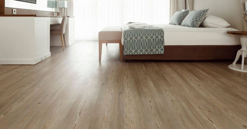
Overly yellow/orange hardwoods and amber stains
Amber-stained hardwoods and overly yellow-orange tones can look dated real quick. Why? They clash with most wall colors, especially neutrals and cool-toned hues.
These warm tones also show every little scratch and dent. Over time, your floor starts looking like a battle zone. Not the vibe you want in your home.
Instead, opt for neutral stains or subtle gray washes. They’re easier to match with wall colors and hide wear better.
High-contrast fake-wood patterns and glossy veneers
Fake wood with super-contrasted grain prints screams ‘fake’ louder than a megaphone. The high-gloss finish doesn’t help either – it looks cheap, not sleek.
These floors might look good in the store, but they’ll stick out like a sore thumb in your home. They’re too busy and reflect light poorly, making your space feel smaller.
Go for subtle grain patterns and matte or satin finishes instead. They’re more natural-looking and easier on the eyes.
Muddy or washed-out neutrals that read dirty
Low-contrast greiges or taupes can make your space feel dull and unkempt. They’re too close to the color of dirt, so they don’t exactly scream ‘clean’.
These colors also show every speck of dust and crumb. It’s like living in a constant state of messiness.
Choose neutrals with a bit more contrast or warmth. They’ll still be neutral but won’t make your space feel so… dirty.
Material-Specific Color Mistakes (Wood, Tile, Vinyl, Carpet)
Color mistakes happen when you assume one finish fits all. Wood, tile, vinyl, and carpet all soak, reflect, and stain differently. Pick color guidance by material and test a small swatch before committing.
Knowing the quirks saves you time and money. Check product labels and manufacturer instructions for color recommendations, and match to how the material will look in your lighting. Test on a hidden area or scrap piece, compare to the end result, and adjust shade if needed.
Hardwood and Engineered Wood Pitfalls
When it comes to hardwoods and engineered woods, some color choices can make your floors look less than stellar. Here are some mistakes to avoid.
- Overly yellow or orange tones: These can make your space feel dated or cheap. Stick with neutral or cool-toned woods instead.
- Amber stains: They can darken over time and show every little scratch. Opt for natural or light stains that won’t highlight imperfections.
- Mismatched planks: Ensure your wood has consistent undertones. Mixing too many species or grades can create a hodgepodge look.
- High-gloss finishes on veneers: They reflect light too much, highlighting every grain and imperfection. Matte or satin finishes are more forgiving.
Remember, the key is consistency and subtlety with wood floors.
Tile and Grout Color Mismatches
Inappropriate tile colors or contrasting grout can create a busy, dated look. Here’s how to avoid that.
Match your grout to your tiles: This creates a seamless, clean look. Contrasting grout can make your floor look like a mosaic gone wrong.
Consider the size of your room and the color of your walls when choosing tile colors. Lighter colors reflect light, making small rooms feel bigger. Darker colors absorb light, so they’re better for larger spaces.
And remember, less is often more with tiles. A simple, consistent color scheme will serve you well in the long run.
Vinyl/Laminate and Printed Pattern Issues
Synthetic floors can look cheap if not chosen wisely. Here are some pitfalls to avoid.
Avoid stark contrasts: While high-contrast looks can be trendy, they can also date your floor quickly. Stick with subtle variations in color and pattern.
Be wary of unrealistic prints: Floors that look too much like wood or stone can end up looking fake. Opt for prints that mimic natural materials subtly.
And watch out for repeating patterns: They can create a busy, overwhelming effect. Choose patterns with varied repeats or go for solid colors instead.
Carpet Color and Pile Visibility Problems
Certain carpet colors can show wear, stains, and crush marks more readily. Here’s what to look out for.
Light colors: They show every little speck of dirt and every footstep. If you must have light carpets, consider textures that hide imperfections better.
And be cautious with short piles: They can show vacuum marks and crush easily. Longer piles are more forgiving but can show traffic patterns in high-traffic areas.
Dark colors can hide dirt but show every little fiber change. Consider mid-tone or neutral shades that aren’t too light or dark for the best of both worlds.
Color Pairing Mistakes with Walls, Trim, and Furnishings
Color pairing mistakes happen when walls, trim, and furnishings clash instead of working together. Aim for a cohesive palette that ties the floor to the surrounding finishes, and avoid big, jarring contrasts.
Look at the undertone of your floor and the surrounding finishes. Small shade shifts can read as a mismatch from across the room, so keep to related tones. If you’re unsure, check the label or datasheet for guidance and stick to a simple tonal family.
Floor-to-wall undertone conflicts
Undertones are the subtle colors hidden within a shade. They can make or break your room’s harmony.
Warm undertones like reds and yellows clash with cool undertones like blues and greys. Check undertones by holding a white sheet next to your wall and floor. If they look off, consider changing one of them.
Tip: Use a color wheel to find complementary undertones before you buy.
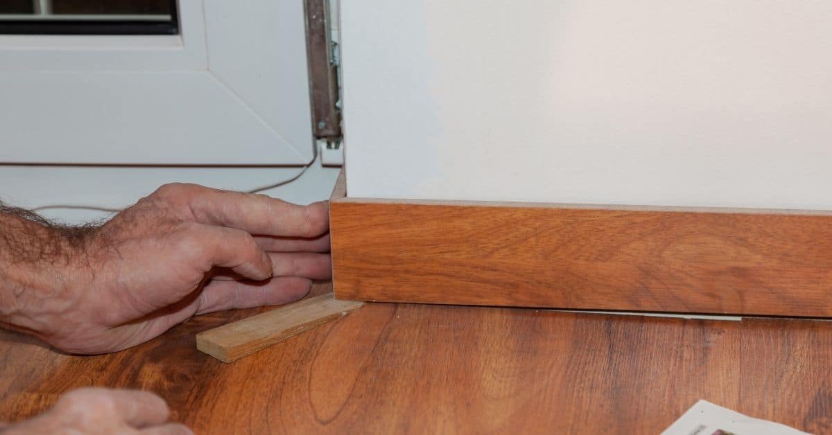
Trim, baseboard, and transition visibility
Trim, baseboards, and transitions should blend with your floor, not fight it. Poor choices make your floor look like an afterthought.
Dark trim with light floors can look stark. Light trim with dark floors can disappear. Match the color family or use a contrasting shade that complements your floor’s hue.
Tip: Consider using the same material for transitions as your floor to create a seamless look.
How to Test and Evaluate Flooring Color Before Committing
To pick a flooring color, test real samples in your space. Look at them under your actual lighting and with your furniture in place. Compare several options side by side and in the room’s corners.
Color can look different in your room due to lighting and reflections. Take samples to different times of day and view from typical angles to see the real look. If you’re unsure, check the label or datasheet for guidance.
Step-by-Step Process
Follow these practical steps to test and evaluate flooring color before committing. This sequence helps you make informed decisions and avoid costly mistakes.
- Preparation: Clear the area, remove any obstacles, and ensure safety by turning off power sources if necessary.
- Sample Placement: Position samples in various locations where the floor will be installed. Consider different lighting conditions like natural light from windows and artificial light from fixtures.
- Main Test: Observe the samples at different times of day to see how they react to varying light. Check them under both natural and artificial light sources.
- Final Checks: Inspect the samples for any signs of discoloration, fading, or other issues that might indicate a poor color choice in your specific space.
- Cleanup: Remove the samples once you’ve made your decision to avoid confusion or accidents during installation.
Sample Placement and Time-of-Day Testing
Placing large samples in multiple locations allows you to see how the color interacts with your space under different conditions. This step is crucial for making an informed decision.
Start by positioning samples near windows, in corners, and along walls. These are areas that will experience varying light throughout the day. Remember, colors can appear differently in direct sunlight versus indirect or artificial lighting.
Next, observe the samples at different times of day. Morning light, afternoon sun, and evening artificial light can all bring out different aspects of a color. Make notes on how the color looks under each condition to help you make a well-informed decision.
Photographic and In-Room Comparison Tips
Taking photographs of samples in your space can help you visualize how the color will look once installed. It also allows you to compare colors side by side with ease.
Use both natural and artificial light when taking photos. This helps you see how the color behaves under different lighting conditions. Pro tip: Take photos at different times of day to capture the color’s behavior throughout the day.
Compare samples next to furniture, paint swatches, or other elements that will be in the room. This gives you a better idea of how the floor color will work with your overall design scheme. You can also use these comparisons to check for undertones and contrast levels that might not be apparent when looking at samples alone.
Maintenance, Resale, and Long-Term Considerations Tied to Color
Color choices affect cleaning frequency, visible wear, and resale appeal. Some colors hide dirt and scuffs better, while others show wear faster. Pick a color with the long-term look you want before you commit.
This matters because your day-to-day upkeep and a future sale hinge on that choice. A practical color plan keeps chores predictable and may affect how the space reads to buyers. If in doubt, check the label or manufacturer instructions for any specific guidance on sealing, fading, or staining.
How color shows dirt, scratches, and pet wear
Light colors show every speck of dust. Dark ones hide it well.
Darker shades are your friend if you’ve got pets or kids tracking in mud. They mask scuffs too.
High-gloss finishes show off every scratch. Matte and satin sheens hide them better.
Expect to clean more often with light colors. Dark ones need less frequent cleaning but show pet hair more.
Market-safe choices for resale and rental properties
Neutrals like beige, gray, or light brown are safe bets. They appeal to most buyers/renters.
Stick with these in high-traffic areas. You can go bolder in less-used rooms.
For rentals, consider durable, low-maintenance materials like vinyl or laminate in neutral tones.
If you must have color, stick to soft blues, greens, or warm grays. Avoid bright, bold hues that may turn off potential buyers/renters.
DIY Fixes and Upgrades for Floors That Look Tacky
This section covers practical options to clean up floors that look tacky, from quick temporary fixes to solid upgrades. Start with simple fixes you can do now, then decide if refinishing is enough or if you need to replace. We’ll separate what works short-term from what stands up long-term.
Knowing when to refinish versus replace saves time and money and helps you plan. It shows you which choices fit your floor type, foot traffic, and budget, so you don’t chase the wrong fix. Be blunt about bad ideas and choose methods that improve durability and appearance.
Temporary and low-cost cover strategies
If your floors are looking tacky but you’re not ready for a big project, try these quick fixes to improve their appearance.
Area rugs can hide worn spots and add warmth. Place them under furniture to anchor the space and create a cohesive look.
Runners in high-traffic areas like hallways or stairs can protect your floors and add a pop of color or pattern. They’re easy to clean and replace when they wear out.
Peel-and-stick vinyl tiles or planks are another low-cost option for refreshing your floors. They install quickly and can be removed if you change your mind. Just make sure to measure carefully and follow the manufacturer’s instructions.
When to refinish, stain, or replace
Before you start any project, assess your floors’ condition. Here are some guidelines to help you decide whether to refinish, stain, or replace.
Refinishing: If your hardwood floors have minor scratches and dents but still have their original finish, consider refinishing. This involves sanding down the existing finish and applying a new one. It can make your floors look like new again, but it’s a big project that requires specialized equipment.
Staining: If your hardwood floors are in good condition but you want to change their color, staining might be an option. This involves applying a new stain over the existing finish. It can update the look of your floors without the hassle of refinishing, but it won’t hide major imperfections.
Replacing: If your floors are severely damaged or you want to change the type of flooring, it’s time for a replacement. This is a big project that requires careful planning and professional installation if you’re not up to the task yourself.
Tools and materials checklist for DIY upgrades
Before you start any flooring project, make sure you have the right tools and materials. Here’s a checklist to help you plan.
- Safety gear: Safety glasses, work gloves, ear protection, and a dust mask are essential for protecting yourself during sanding and installation.
- Tools: You’ll need a sander (orbital or drum), sandpaper in various grits, a vacuum, a trowel, a level, and a tape measure.
- Materials: For refinishing, you’ll need wood filler, sanding sealer, stain, polyurethane, and possibly new flooring if there are gaps or missing pieces.
- Safety check: Before starting any project, make sure your floors are structurally sound. Check for squeaks, warping, or other signs of damage.
- Moisture test: If you’re installing new flooring, especially hardwood, test the moisture level in your subfloor to prevent warping later on.
- Flooring type check: Make sure your chosen flooring is suitable for your home’s climate and traffic patterns. Some types of flooring are better suited for certain environments than others.
- Permits check: Depending on where you live, you may need permits to install or replace flooring. Check with your local building department before starting any project.
- Waste disposal plan: Have a plan for disposing of old flooring and debris. Some materials can be recycled, but others will need to go to the landfill.
Quick rule: Always read and follow the manufacturer’s instructions for any products you use. This will help ensure that your project turns out as expected.
Conclusion
Choosing the right flooring color isn’t a cosmetic decision alone—it affects how safe the space feels, how durable the finish stays, and how long it lasts without costly repairs. Think through tests, light, and wear before you commit.
Standards you can follow: evaluate color in different rooms with the actual lighting, test a small area first, compare samples side by side, check how it looks with your trim and furnishings, and confirm it holds up under traffic and cleaning in real use. If you’re unsure, proceed slowly and document results so you can back out without big damage.
Common mistakes to avoid include picking a palette that looks great in a store but harsh in your home, ignoring maintenance needs that tint or scratch finishes, and rushing through tests. Always keep a clear safety rule: don’t sand, stain, or seal beyond what the product directions allow, and protect surrounding surfaces during any trial. Test in a discreet area, use proper ventilation, and wear basic eye and skin protection when handling finishes or cleaners.
If the color, finish, or material questions start to feel overwhelming, or if you’re making a major change across multiple rooms, call a professional for a quick consult or a small patch test plan. A good plan here saves money, prevents costly mistakes, and leaves you with floors that look durable and cohesive. You’ve got this—steady testing, careful comparison, and solid decisions will get you to a result that works for years to come.
FAQ
How can I tell if a flooring color will clash with my cabinets and walls before I install it?
Test with real samples in the space. Look at the undertones in the sample next to your cabinets and wall swatches. Check under the room’s natural and artificial light to see how it changes.
What simple fixes can improve a floor color that’s already reading tacky?
Consider refinishing or recoloring with a more neutral tone if possible. Add a compatible finish or sealant per the manufacturer’s instructions. If that’s not feasible, plan a coordinated update to trim or walls to balance the look.
How should I evaluate floor color in different lighting conditions?
Move samples around the room at different times of day and under lamps. Compare how the color looks in bright sun, shade, and mixed lighting. If it always feels off, it’s a sign to reconsider the shade.
When is it better to replace or redo the floor color rather than patch it up?
If the color is inconsistent, severely dated, or clashes with most furniture, replacement or a major color change is worth considering. Always check product labels, finish options, and local rules before committing to a big change.