

Introduction
This article highlights popular paint colors for 2018 and how to pick and test them. You’ll get a practical, hands-on way to choose colors that fit your space. We’ll cover how to test swatches, consider lighting, and avoid trendy misses.
Start by testing actual paint on a small patch of wall under your room’s lighting. Look at how the color shifts from morning to evening and compare with furniture and accents. Always follow label directions for prep, application, and drying, and double-check manufacturer instructions or local rules if you’re unsure.
Key takeaways
- Consider lighting: test colors in your room at different times of day.
- Group palettes guide room mood, finish choices, and compatibility with lighting and accessories.
- Test with full-swatch posters and sample boards before painting sessions.
- Always check paint labels for VOCs and safe handling guidelines.
- Plan trim color to contrast or harmonize with wall shade.
- Work in a well-ventilated area and wear mask during painting.
Table of Contents
- Introduction
- Key takeaways
- Why These 18 Colors Matter in 2018
- Overview: the 18 Colors Grouped into Usable Palettes
- Room-by-Room Recommendations for Using These Colors
- How to Choose the Right Shade for Your Light and Space
- How to Test Paint First: Samples, Swatches, and Mockups
- Tools and Materials Checklist for Testing and Painting
- Pairing Colors, Trim Choices, and Finish Selection
- Buying, Color-Matching, and Working with Professionals
- Conclusion
- FAQ
Why These 18 Colors Matter in 2018
Color trends don’t arrive in a single flash. They reflect what people respond to in light, texture, and daily life. This year’s palette captures a mix of calm, warmth, and a touch of boldness that feels approachable for real homes.
Think of trends as inspiration rather than hard rules. Use the ideas to guide your choices and adapt them to your space, lighting, and personal style. The point is to translate the mood of the moment into colors that feel at home in your room.
Trend signals and what they mean for homeowners
Ever wondered why certain colors suddenly pop up everywhere? It’s not just luck or coincidence. Trends in interiors, fashion, and manufacturing push hues into popularity.
For instance, you might see a surge of greenery-inspired tones after a few years of urban gardening gaining traction. Or, warm metallics like brass and copper could rise due to increased use in industrial design and architecture.
As a homeowner, keep an eye on these trends. They’re not strict rules, but they can inspire your color choices. Just remember, trends come and go, so choose what feels right for you and your space.
When to follow trends and when to ignore them
So, should you always jump on the trend bandwagon? Not necessarily. It depends on your goals and personal style.
If you’re planning to sell soon, stick with timeless neutrals. They appeal to a wider range of buyers and make your home feel more spacious.
But if you’re staying put, trends can be fun! Just pick colors that speak to you. If you love the look, it’s worth investing in, even if it’s not ‘in’ right now.
Also, consider longevity. Some trends fade fast, while others stick around for years. It’s okay to follow a trend, but make sure it’s one you’ll still love next year – or even five years from now.
Overview: the 18 Colors Grouped into Usable Palettes
We’ve organized the 18 colors into practical groupings to make choosing easier. Neutrals anchor rooms with versatility and lasting appeal. Blues and greens offer calm, nature-inspired vibes that work in multiple spaces.
Warm accents boost energy without shouting, while deep anchors provide grounding for traditional or modern schemes. Use these groupings as a quick-reference map when you’re planning color blocks, trims, or focal walls.
Neutrals and Greiges (Soft, Versatile Bases)
Warm greiges, creamier whites, and soft taupes are your foundation colors. They adapt to undertones and light, creating a flexible base for your space.
Greige, a mix of grey and beige, is a versatile neutral that works well in both modern and traditional homes. It’s like a chameleon, changing its appearance based on the lighting and adjacent colors.
Creamier whites, like Benjamin Moore’s Simply White or Sherwin-Williams’ Alabaster, add a touch of warmth to your space without being too overwhelming. They’re great for ceilings, trim, and small rooms as they reflect light and make spaces feel larger.
Soft taupes are another excellent neutral choice. They have a slight grey undertone that keeps them from feeling too brown or yellow. Try Sherwin-Williams’ Accessible Beige or Farrow & Ball’s Ammonite for a subtle, sophisticated look.
Blues and Greens (Calming to Dramatic)
From muted sage to deep navy, blues and greens offer a range of moods and uses. They can create a calming atmosphere or make a bold statement.
Muted sages and soft blues, like Farrow & Ball’s Calke Green or Sherwin-Williams’ Acacia Haze, are perfect for creating a serene environment. They work well in bedrooms, bathrooms, and other spaces where relaxation is key.
For a more dramatic look, consider deeper shades like navy blue or hunter green. These colors can add depth and richness to a room. Try Benjamin Moore’s Wrought Iron or Farrow & Ball’s Down Pipe for a sophisticated, moody feel. Remember, darker colors can make rooms feel smaller, so use them wisely.
Don’t forget about the emotional effects of these colors. Blues are often associated with calmness and stability, while greens can evoke feelings of growth, harmony, and balance. Choose your shades based on the mood you want to create.
Warm Accents and Terracotta Tones
Accent shades like terracotta, blush, and warm mustard add modern warmth when paired with neutrals. They’re perfect for adding a pop of color to your space.
Terracotta, once popular in the ’70s, is making a comeback. It’s a warm, earthy red that works well in both interior and exterior spaces. Pair it with neutrals like greige or soft white for a balanced look. Try Sherwin-Williams’ Terra Cotta or Farrow & Ball’s Red Earth.
Blush, a soft pink with warm undertones, is another great accent color. It adds a touch of femininity and warmth to a space without being too overwhelming. Pair it with neutrals for a sophisticated look. Try Benjamin Moore’s Blush or Sherwin-Williams’ Rosewater.
Warm mustard is another trendy accent shade. It’s a bold, warm yellow that can add a pop of color to a neutral room. Use it sparingly – a little goes a long way. Try Farrow & Ball’s Yellowcake or Sherwin-Williams’ Mustard Seed.
Room-by-Room Recommendations for Using These Colors
In kitchens, look for durable, easy-to-clean options that still read warm. Bathrooms benefit from lighter neutrals or soft blues that read clean in moisture-rich spaces. Living rooms gain their mood from mid-tones that pair well with furniture, rugs, and metals.
Bedrooms often benefit from softer, soothing tones, while exteriors require colors that handle natural light and weather without fading. For each space, match the color’s feel to how you plan to use the room and how much daily maintenance you’re willing to manage.
Kitchens and high-moisture areas
In kitchens, durability is key. Go for semi-gloss or satin finishes to resist stains and clean easily.
Neutrals like ‘Agreeable Gray’ (SW 7029) or ‘Accessible Beige’ (SW 7036) work well with cabinets and countertops. For a pop of color, try ‘Retreat’ (SW 6211), a soft blue-green.
In bathrooms, opt for moisture-resistant paints or those labeled as ‘bathroom & kitchen’ friendly. ‘Stardew’ (SW 9081), a warm gray, is a great choice. For a bold look, consider ‘Anchors Aweigh’ (SW 6234), a deep navy.
Bedrooms and relaxation spaces
For restful sleep, stick to calmer hues. ‘Serenity’ (SW 6470), a soft blue, is perfect for bedrooms. It pairs well with warm undertones in bedding and lighting.
‘Mindful Gray’ (SW 7016) is another great choice. Its neutral base makes it versatile, while its subtle green undertone promotes tranquility.
To balance undertones, consider your lighting. Warmer lights can bring out red or orange undertones, while cooler lights enhance blue or green ones.
Living areas and statement walls
In open-plan living spaces, use deeper, more saturated colors sparingly to avoid overwhelming the room. Consider using them on a single wall or as an accent color.
‘Deep Plum’ (SW 2019), a rich purple, can make a bold statement when used on a feature wall. Pair it with neutrals like ‘Alabaster’ (SW 7008) to keep the space balanced.
For a more subtle but still dramatic look, try ‘Acacia Haze’ (SW 6154), a warm, earthy green. It works well in living rooms and pairs nicely with natural wood tones.
How to Choose the Right Shade for Your Light and Space
Natural light direction can dramatically shift how a color appears. Observe how sun moves through the room at different times of day. Consider the room’s size and how reflective the surface is to judge whether a shade will feel airy or cozy.
Account for artificial lighting as well, since bulbs can skew color. Before you commit, test a few options on the actual wall and note how they read in the combined light setup.
Step-by-Step Process
Follow these practical steps to choose the right paint shade for your space, ensuring a successful DIY project.
- Preparation: Ensure the area is clear of debris and safe for painting. Cover floors with drop cloths and secure any loose items.
- Light assessment: Evaluate natural and artificial light in the room during different times of day to understand how it affects color perception (see ‘Reading natural and artificial light’ below).
- Color selection: Based on your light assessment, choose a paint shade that complements your space. Consider undertones and fixed elements in the room.
- Test patches: Apply test patches of your chosen colors on different walls to see how they look under various lighting conditions throughout the day.
- Final check: Once you’ve decided on the perfect shade, double-check that it works well with all fixed elements in the room and meets your aesthetic goals before proceeding with painting.
Reading natural and artificial light
Understanding how natural and artificial light affects color perception is crucial when choosing a paint shade for your space.
North-facing rooms have cool, soft light. Paint colors may appear cooler and less vibrant here. Consider warm-toned paints to counteract this effect.
South-facing rooms receive bright, direct sunlight. Colors can look more vibrant and intense in these spaces. Opt for lighter or neutral shades if you prefer a subtle look.
East- and west-facing rooms experience changing light throughout the day. Test your paint colors at different times to see how they adapt to varying lighting conditions.
Artificial light also plays a significant role. Incandescent bulbs cast warm, yellowish light, while fluorescent or LED bulbs emit cooler, whiter light. Choose bulbs that complement your desired color scheme and provide adequate illumination for the space.
Identifying and compensating for undertones
Undertones in paint colors can significantly impact how a shade looks in your space. Learning to spot cool or warm undertones will help you choose harmonious colors that complement fixed elements like flooring, countertops, and furniture.
Cool undertones are typically blue, green, or purple-based. Warm undertones have yellow, orange, or red bases. To identify undertones, look at the color’s most prominent hue when viewed under different lighting conditions.
When selecting a paint shade, consider the undertones of fixed elements in your room. For example, if you have cool-toned flooring, choose warm-toned paint to create balance and harmony. Conversely, pair cool-toned paint with warm-toned floors for a striking contrast.
Test patches are essential here as well. Apply them on different walls at various times of day to see how undertones interact with natural and artificial light in your space.
How to Test Paint First: Samples, Swatches, and Mockups
Start with small sample pots on inexpensive boards or drywall patches. Place them in areas that see typical light and traffic to compare how they change. Create a few credible mockups before full commitment.
Scale your testing by viewing at different times of day and across multiple walls. If possible, observe a full-wall test under the same lighting conditions you’ll have after painting.
Step-by-Step Process
Follow this clear, numbered sequence to effectively test paint colors before committing to a full job.
- Preparation: Gather materials (sample pots, brushes, tape, etc.) and ensure safety by covering floors and moving furniture. Check local regulations if painting outdoors.
- Sample application: Paint samples on boards or directly onto walls using 3×3-foot squares. Start with neutrals and greiges to set a base.
- Observe in different light: View your samples at various times of day, under natural and artificial light, to see how colors change.
- Test adjacent colors: Apply accent colors next to your base shades to check for harmony or clash. Consider using a color wheel for guidance.
- Cleanup and final checks: Once you’ve made your decision, clean up the area and double-check that your chosen color works in all lighting conditions before painting the entire room.
Making and using painted sample boards
Painting multiple large boards allows you to move colors around your house, comparing them in different spaces and light conditions.
Use a brush or roller to apply paint evenly onto boards. Aim for a 12×12-inch size for easy maneuvering. Let dry completely before moving.
Pro tip: Label each board with the color name and number of coats applied for easy reference.
Move boards around your home, observing how colors interact with furniture, flooring, and other elements. Keep them up for at least a week to get a good sense of the color’s behavior throughout the day and night.
Live wall samples and temporary tests
Painting a sample directly onto the wall or using peel-and-stick swatches provides a more accurate representation of how the color will look in your space.
Choose a 3×3-foot area, preferably near a window for natural light exposure. Apply two coats of paint, allowing adequate drying time between coats.
Observe the sample throughout an evening and morning light cycle to see how the color changes. Check if it complements your existing decor and creates the desired mood.
Temporary test: If you’re unsure about painting directly onto your wall, use peel-and-stick swatches. However, keep in mind that these may not provide as accurate a representation of the final color due to their smaller size and lack of texture.
Visual checkpoints to confirm your choice
Use this checklist once you’ve narrowed down your options to ensure you’ve made the best color choice for your space.
- Undertone clash: Check if your chosen color clashes with undertones in adjacent rooms, flooring, or furniture. Hold a swatch next to these elements to confirm harmony.
- Contrast with trim: Ensure your chosen color works well with existing trim colors and creates the desired level of contrast.
- Appearance near fabrics: Place a swatch near upholstered furniture, curtains, or other textiles to ensure they complement each other.
- Mood under dim/bright light: Observe your chosen color in both bright and dim lighting conditions to confirm it creates the desired atmosphere at different times of day.
- Color consistency: Check if the paint color appears consistent throughout the room, with no unexpected shifts or variations.
- Saturation level: Ensure your chosen color has the right level of saturation for your space – not too bright or dull.
- Harmony with natural elements: If applicable, check if your chosen color works well with natural elements like woodwork, stone, or plants in your room.
- Color pop: Ensure your chosen accent colors provide the desired visual impact without overwhelming the space.
Quick rule: Trust your instincts. If something doesn’t feel right, it’s probably not the best choice for your space.
Tools and Materials Checklist for Testing and Painting
Begin with basic sampling supplies: flat boards or poster sheets, brushes, and a small roller. Keep a notebook or notes app handy to record impressions and lighting conditions. Use painter’s tape to keep clean edges on test areas.
As you proceed, consider upgrading to higher-quality rollers, brush sets, and compatible primer if you see bleeding or poor coverage. Save the pro-grade tools for the final coats and larger surfaces, when accuracy matters most.
Essentials for sampling and mockups
Before you start painting, it’s crucial to test your chosen colors. This checklist helps you prepare the right tools and materials for sampling and creating mockups.
- Sample Pots: Check you have enough sample pots to cover the areas you want to test. A general rule is 1 pot per 20-30 sq ft (2-3 sq m).
- Poster/foam Boards: Ensure you have boards large enough for your mockups. Check their condition; they should be flat and smooth.
- Painter’s Tape: Verify you have a fresh roll with strong adhesion to prevent paint bleeding under the tape.
- Brushes/Rollers: Inspect your brushes and rollers. They should be in good condition, with no missing bristles or holes. Check they’re suitable for your chosen finish (e.g., eggshell, satin).
- Temporary Swatches: Make sure you can create temporary swatches to test colors on walls. This could be using sample pots and a small roller, or paint chips stuck with removable adhesive.
- Lighting Considerations: Check that the lighting in your testing area is similar to how it will be when the painting is done. Different lighting can change how colors appear.
- Color Consistency: Confirm that the color on your sample pots matches the color you’ve chosen from a paint chart or online. Lighting and screen settings can affect color perception.
- Primer Check: If using primer, ensure you have enough to prime all test areas before painting. Primer helps paint adhere better and provides a consistent finish.
Quick rule: Always test colors in multiple locations and at different times of day to see how they look in various lighting conditions.
Basics for a quality DIY paint job
Use this checklist before you start painting to ensure a smooth, long-lasting finish. It’s best to go through it once you’ve prepared your surfaces and are ready to apply the first coat.
- Check primer type: Ensure you have the right primer for your surface – use a stain-blocking primer on bare wood or previously painted surfaces with stains, and consider a mildew-resistant primer in damp areas. (What goes wrong if you skip this:) Primer helps paint adhere better and prevents tannins from bleeding through.
- Inspect roller covers: Ensure your roller covers are suitable for the surface – use 3/8″ or 1/2″ nap for smooth surfaces, and 3/4″ or 1-1/2″ nap for textured surfaces. Check for any defects like loose threads or holes.
- Verify painter’s tape: Use high-quality, low-tack painter’s tape to protect areas you don’t want painted. Press down firmly on the edges to ensure a good seal. (What goes wrong if you skip this:) Poorly applied tape can lead to paint bleeding onto unwanted surfaces.
- Check paint quality: Ensure your paint is of good quality and suitable for the surface – use latex paints on most interior surfaces, and consider oil-based or specialty paints for specific needs. Check the label for recommended uses.
- Inspect cleanup supplies: Have enough rags, drop cloths, and a suitable solvent (like mineral spirits) to clean up spills and wash brushes and rollers.
- Verify paint color: Double-check the paint color against your sample or mockup. Lighting can affect how colors appear, so compare under similar conditions as where you’ll be painting.
- Check paint coverage: Estimate how many coats you’ll need based on the paint’s coverage rate (usually on the label) and the surface area to be painted. (What goes wrong if you skip this:) Insufficient coats can lead to poor coverage and a need for rework.
- Inspect weather conditions: Check the forecast – avoid painting in direct sunlight, high humidity, or temperatures below 50°F (10°C).
Quick rule: Always spot-check your materials and tools before starting to paint. A few minutes of inspection can save you hours of rework and ensure a professional-looking finish.
Pairing Colors, Trim Choices, and Finish Selection
Coordinate main color with trim and ceilings by balancing lightness and contrast. If the main color is light, trim can be crisper for definition; if deep, choose softer trim to prevent busy edges.
Sheen matters for each room: lower sheen in bedrooms and living areas for a calm look, higher sheen where easier cleaning is needed. Align finishes with the surface and use consistent undertones to avoid clashes.
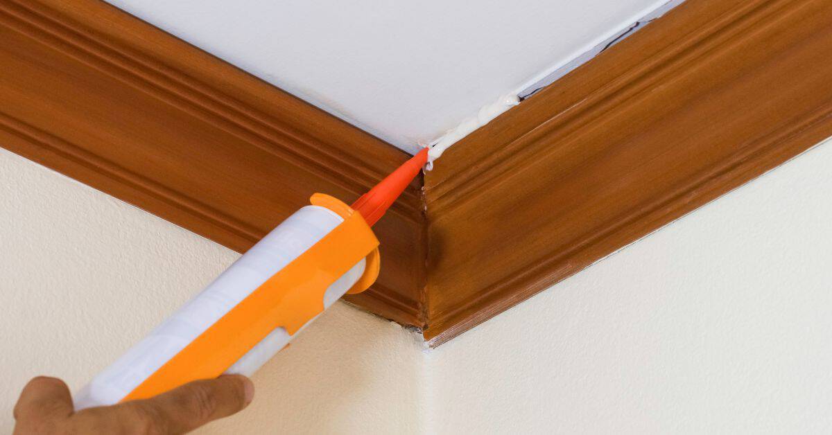
Trim, ceiling, and baseboard strategies
When choosing your trim color, consider two main approaches: contrast or tone-on-tone.
Contrast creates a crisp, defined look. It’s perfect for highlighting architectural details. Think white trim against a dark wall.
Tonal treatment blends walls and trim together, creating a seamless, modern feel. Off-whites or colors close to your wall hue work best here.
Don’t forget about baseboards and ceilings. White is classic but consider painting them the same color as your walls for a cohesive look.
Choosing sheens for durability and appearance
The sheen you choose affects both how your paint looks and how easy it is to maintain. Here’s a quick guide:
Flat has no shine, hides imperfections, but shows dirt easily. Great for low-traffic areas like bedrooms.
Eggshell (low-luster) and Satin (semi-gloss) offer some durability and are easy to clean. Perfect for high-traffic rooms like living rooms and kids’ rooms.
Semi-Gloss is highly durable, reflects light, and resists moisture. Ideal for kitchens, bathrooms, and trim work.
Buying, Color-Matching, and Working with Professionals
When buying, read label details and any millage notes to understand coverage. For color matches from brands, ask how close the match is to the original sample and what lighting the match assumes. Bring your own color references to discussions with pros.
Prepare a clear brief for painters: include room dimensions, surface types, and preferred sheen. Watch for red flags like inconsistent color swatches or vague timelines, and ask about warranty and touch-ups as part of the plan.
How to get accurate color matches and read paint chips
When you’re at the store, don’t rely on memory or quick glances. Take your time comparing swatches to your sampled walls.
Hold them up side by side, in different lights, to see how they change. The right match should look consistent throughout the day.
Ask for a sample pot. Paint a small area on your wall and let it dry. Check it at various times of day. If it’s a good match, ask the retailer to mix your paint based on that sample.
When to hire a pro and how to brief them
Knowing when to hire a painter can save you time and money. If your job involves high ceilings, complex color matching, or large areas, consider hiring a professional.
Before you hire, prepare a brief. Include photos of your space, the colors you’ve chosen (with paint chip numbers), and any specific sheens you want. Also, mention if you need them to provide coverage.
When you get estimates, verify timelines and expectations. Ask about their process, how many coats they’ll apply, and when they can start. Don’t be afraid to ask questions – it’s your project!
Conclusion
Pick a palette and finish that holds up under real life. Safe, durable color choices plus proper testing protect your investment and keep repairs from turning into costly redo jobs.
Start by verifying that your chosen shades work with your lighting and room use: sample in a small area, compare swatches at different times of day, mock up where walls meet trim and furniture, and confirm with a simple, step-by-step check that you’ve got enough contrast, coverage, and finish to meet the space’s needs. Do the testing in the order you would actually paint: light assessment, patch and prime where needed, mix to the right batch, apply a controlled test coat, and observe over a few days for any color shifts or blotching.
Avoid these common mistakes: rushing the test phase or skipping it altogether, choosing color in a store under harsh lighting, and ignoring how trim and stain interact with wall colors. Always work on a small, removable test area first, wear eye and skin protection, ventilate, and clean spills before they set. If you’re unsure about color-minding or matching across rooms, don’t push past a confident test result—safety and accuracy beat speed any day.
If the project runs into stubborn lighting, tricky trim contrasts, or large areas that demand large-scale color accuracy, it makes sense to bring in a pro. When in doubt, confirm the plan with a professional before committing paint, especially for exterior finishes or high-traffic rooms. Stay steady, test thoroughly, and you’ll finish with a look that lasts and a job you can be proud of.
FAQ
How do I pick a color that looks good in my space without guessing?
Start with a neutral you trust and test a few shades in the actual room lighting. Compare swatches next to your trim and furniture to see how they read at different times of day. Always check the paint label for recommended use and finish options.
Should I test colors on large sample boards or in a full mock room?
Use large sample boards on the wall section you’ll paint. It’s the quickest way to see how color interacts with your light and space. If you can, do a small mock room with several color options to compare side by side.
What’s the best way to handle trim when you’re using multiple colors in a space?
Decide one trim color early and use it consistently around the room for a cohesive look. If you want contrast, limit it to a single door or accent trim. Always confirm the finish level works well with your wall colors by checking the manufacturer’s guidance.
How long should I wait after applying a color sample before deciding?
Let the sample dry fully and observe in both daytime and artificial light. If you’re unsure, test a second shade or adjust the finish (matte, satin, gloss) and see which combination you prefer. Follow the label for recommended dry times and recoat intervals.