
Introduction
Choosing welcoming front door paint colors means picking hues and finishes that feel friendly, suit your house, and are practical to test on real surfaces. Start by thinking about how the door looks in different light and how a test patch behaves against nearby trim and siding. You’ll want to test a few options on actual doors or boards and compare them in daylight and shade.
Test first by applying small sample spots and observing for a few days while you open and close the door to see wear and sheen in action. Consider how the color works with your house color, porch, and landscaping, then check product labels and manufacturer instructions for prep and cure times. If in doubt about local rules or finishes, ask at the paint counter or read the label to confirm suitability and durability for exterior use.
Key takeaways
- Live-test color chips on a full door panel under current light
- Apply small samples, then observe after weather changes across a week
- Check accessibility and safety: remove trip hazards around the work area while painting
- Coordinate with existing trim and hardware for cohesive curb appeal
- Use a protective primer where needed and follow label directions
- Document your tests with photos to compare color evolution over time
Table of Contents
- Introduction
- Key takeaways
- Why Front Door Color Matters
- The 10 Welcoming Front Door Paint Colors to Consider
- Choosing a Color for Your Architectural Style
- Coordinate with Exterior Materials and Finishes
- How Light, Weather, and Surroundings Change Color Perception
- Test-First Methods: Samples, Swatches, and Mockups
- Tools and Materials Checklist for Trying and Painting a Door
- Visual Checkpoints and Decision Checklist Before Committing
- Conclusion
- FAQ
Why Front Door Color Matters
Your front door is the first thing guests notice when they approach your home. The color you choose sets a mood before they even step inside. It can signal welcome, warmth, and a sense of style that matches the house’s character.
Color choices influence curb appeal in practical ways, affecting perceived hospitality and even how neighbors see the property. Check your local guidelines and your own neighborhood context to pick a shade that fits without making risky leaps in value claims.
First impressions and curb appeal
The front door is the first thing visitors see. It sets the tone for their entire impression of your home.
A welcoming color can make your home feel inviting, like a warm hug on a cold day. It draws people in, making them want to explore further.
Think about resale value too. A well-chosen front door color can boost curb appeal and make your home more attractive to potential buyers.
Color psychology basics for front doors
Colors have a powerful effect on our emotions. Warm colors like red, orange, and yellow can evoke feelings of happiness and energy. Cool colors like blue, green, and purple are often associated with calmness and tranquility.
For a welcoming front door, consider warm colors or cool colors with warm undertones. These can create a sense of hospitality and make visitors feel at ease.
But remember, it’s not just about the color itself. The shade and tone also matter. A dark blue might feel moody, while a light blue could feel fresh and airy.
The 10 Welcoming Front Door Paint Colors to Consider
Deep red offers classic warmth that feels inviting and bold at the same time. Navy blue reads as stable and inviting, with a refined edge. Forest green brings a natural, calming presence that blends with outdoor surroundings.
Soft teal reads fresh and friendly, a lighter option with character. Sunny yellow acts as a cheerful accent that catches the eye without overpowering. Warm terracotta or coral adds earthy modernity that pairs well with many exteriors. Charcoal gray provides sophisticated contrast that still reads approachable. Eggcream or soft off-white offers subtle warmth with versatility. Warm taupe or beige stays neutral and approachable, a safe favorite. Black with a warm undertone remains bold yet refined when used thoughtfully.
How to pair each color with common exteriors
The key to a welcoming front door is harmony with your home’s exterior. Here’s how:
Deep red pairs well with cream or white siding, or warm-toned brick.
Navy blue complements light-colored siding and trim, or dark stone facades.
Forest green works great with earthy tones like beige or taupe siding, or natural stone.
Colors to avoid if you want ‘welcoming’
Avoid these colors for a welcoming feel:
- Bright white: Can look sterile and unwelcoming.
- Dark purple: May convey sadness or mourning in some cultures.
- Black (without warm undertones): Too harsh, can feel intimidating.
- Neon colors: Too bold and distracting for a welcoming entrance.
- Muted greens: Can evoke feelings of decay or neglect.
Instead, opt for warm, inviting hues that complement your home’s exterior.
Choosing a Color for Your Architectural Style
Think about the era and character of your home when picking a color. Victorian styles often suit richer, more formal hues, while Craftsman homes pair well with earthy, grounded tones. Modern designs frequently benefit from clean contrast or a contemporary twist on traditional colors.
Decide when to use period-appropriate shades versus modern contrasts by testing on small areas and considering how the overall massing looks. If in doubt, check manufacturer instructions and local design guidelines before committing to a high-visibility choice.
Traditional and historic homes
When dealing with traditional or historic homes, it’s crucial to respect the original architectural style. Stick to period-appropriate colors for a historically accurate look.
For Victorian homes: Deep reds, hunter greens, and dark blues were popular in the late 19th century. Consider a rich, warm black or deep gray for a modern twist without clashing.
For Craftsman-style homes: Earthy tones like warm browns, greens, and reds work well. A bold, dark door can add a striking contrast to the natural woodwork and stone accents common in these homes.
Modern and minimalist homes
Modern and minimalist homes often feature clean lines and simple forms. The front door color should reinforce this aesthetic while still welcoming visitors.
Bold, high-contrast choices: Consider a bright red or deep black for a striking statement that complements the home’s sleek design. These colors can create a strong focal point without sacrificing warmth.
Muted tones: For a more subtle approach, opt for muted shades of gray, beige, or even a soft pastel. These colors blend seamlessly with modern exteriors while maintaining a welcoming feel.
Coordinate with Exterior Materials and Finishes
Evaluate how siding, brick, stone, roofing, and trim interact with the door color. A door should complement the dominant exterior surface and not compete with it. Consider the visual weight each material brings to the entry as you choose a hue.
Test color samples next to different materials under natural light to see how the hues balance. Verify any color restrictions on trim or accent pieces with product labels or your installer’s guidance before painting.
Warm vs. cool material undertones
Material choices can make your door color pop or clash. Understand their undertones to pick a harmonizing hue.
- Warm undertones: Siding, brick, or stone with orange, red, or yellow hues.
Use warm colors like reds, oranges, and yellows on your door.
Avoid cool blues and greens. - Cool undertones: Materials with blue, green, or gray hues.
Choose cool colors such as blues, greens, and grays for your door.
Avoid warm colors that might clash.
Metallics and hardware considerations
Matching door hardware finishes to your color choice creates a cohesive look. Here’s how:
Brass: Warm, golden tones. Pair with warm door colors like reds, oranges, and yellows.
Black: Neutral, versatile finish. Works well with both warm and cool door colors.
Nickel: Cool, silvery tone. Best suited for cool door colors such as blues, greens, and grays.

How Light, Weather, and Surroundings Change Color Perception
Time of day and weather dramatically alter how a door color reads. A shade may look warmer in morning sun and cooler in shade. Seasonal foliage and surrounding tones also shift perceived color intensity.
On-site testing is essential: view swatches in daylight, shade, and evening lighting. Confirm with product data sheets or manufacturer instructions how the color behaves with UV exposure and finishes.
Daytime, evening, and artificial light effects
The same paint color can look completely different under various lighting conditions. Here’s what to watch for:
Morning sunlight brings out warm tones. Midday sun makes colors appear brighter and more vibrant. Evening light softens hues, making them seem muted.
Artificial lighting also plays a role. Porch lights with yellow or orange tints can make your door look warmer than it actually is. Test your color choice at different times of day and under various artificial lights to see how it behaves.
Weather, moisture, and reflective surfaces
Moisture can darken or dull a color. On rainy days, your door might look different than it does on a sunny day.
Snow can brighten colors, making them appear more vibrant. But be aware that snow can also disguise subtle hues, making them seem washed out.
Reflective surfaces like windows or glossy finishes can intensify a color’s appearance. Consider this when choosing a paint for your door, especially if it’s near reflective surfaces.
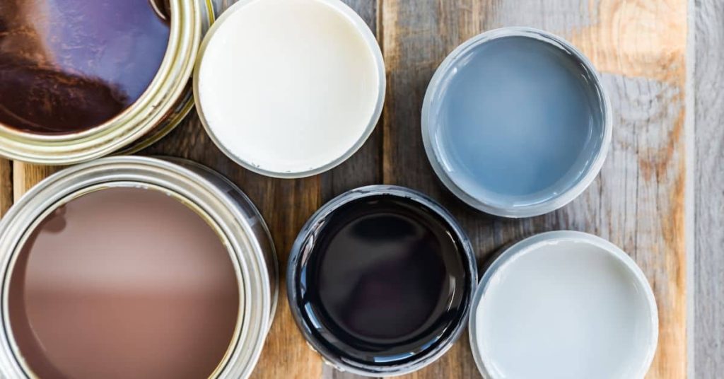
Test-First Methods: Samples, Swatches, and Mockups
Start with small sample patches on the door or a test board to observe reflectivity and undertone. Place swatches near hardware, trim, and adjacent surfaces for context. Allow a day or two of viewing in different light before moving to the next step.
Create a full-size mockup on a section of the door or a removable panel to see how it reads from the street. Note any shifts in hue and saturation and check the label for recoat times and topcoat recommendations.
Applying paint samples vs. peel-and-stick swatches
When testing front door colors, you’ve got two main options: painting samples or using peel-and-stick swatches. Both have their pros and cons.
Painted Samples: These give you the most accurate representation of how the color will look once applied. They show you exactly how the paint will interact with your door’s material and texture. However, they’re more time-consuming to apply and can be messier.
Peel-and-Stick Swatches: These are quick and easy to apply. They let you see the color in a snap. But they don’t show you how the paint will look once it’s actually applied. The adhesive can also leave residue behind when removed.
Digital mockups and when to trust them
Before you break out the paint, you might want to test colors digitally. This can save you time and effort. But remember, these aren’t always 100% accurate.
Use digital mockups as a rough guide. They’re great for narrowing down your options or getting an idea of how a color might look in different lighting conditions. But they won’t show you how the color will interact with your door’s material or texture. For that, you’ll still need to test physical samples.
Trust digital mockups most when you’re trying to coordinate colors with other elements on your home’s exterior. They can help you see how a front door color might work with your siding, trim, or roof. But always double-check with physical samples before making your final decision.
Tools and Materials Checklist for Trying and Painting a Door
Gather sample paints, a suitable primer, sandpaper, and clean rags. Have brushes or rollers, painter’s tape, and drop cloths ready for clean sits and quick touch-ups. Include safety basics like gloves and eye protection as you prep.
Stock simple testing materials like small boards or cardboard for swatches, plus a plan to rotate colors and record observations. Always verify label directions and local rules before applying a finish to your door surfaces.
Choosing finish (sheen) and why it matters
Before you start painting, decide on the sheen for your door. It affects durability, cleaning, and how color looks.
- Matte: Good for hiding imperfections, but hard to clean.
- Satin: Balance between durability and subtle sheen. Easy to clean.
- Semi-gloss: Most durable, shows imperfections, easy to clean.
- High-gloss: Very durable, reflects light, shows every imperfection.
Quick rule: For high-traffic doors, choose semi-gloss or higher. For hiding imperfections, matte is best.
Prep materials and safety gear
Before you start painting, prep your door and gather safety gear.
- Cleaning: Remove dirt with mild soap and water. Let dry.
- Sanding: Lightly sand for better paint adhesion. Wipe off dust.
- Caulking: Fill gaps with paintable caulk. Let dry.
- Drop cloth: Protect your floor from drips and spills.
- Tape: Apply painter’s tape to protect trim and walls.
- Gloves: Protect your hands from paint and chemicals.
- Eye protection: Wear safety glasses or goggles to protect your eyes.
- Ventilation: Open windows or use a fan for proper ventilation.
Quick rule: Always wear protective gear and ensure good ventilation when painting.
Visual Checkpoints and Decision Checklist Before Committing
Do multiple lighting checks along different times of day to confirm the look. Get a second opinion from a neighbor or HOA if required, and mock up hardware finishes to see how hardware color affects the overall impression. View both from street level and up close before finalizing.
Keep a simple log of impressions and any refinements you plan to make. Revisit product labels or manufacturer instructions to confirm compatibility with your door material and any protective topcoats you intend to use.
Accessibility and visibility considerations
Before you start painting, consider how your new door color will affect accessibility and visibility for all visitors.
- Contrast with surroundings: Ensure the door stands out against its backdrop. Too much contrast can be jarring, too little makes it disappear.
- Visibility at night: Test how well the color shows up in low light. You might need to add exterior lighting.
- Emergency response: Firefighters and paramedics need to see your door quickly. A bright, contrasting color helps.
- Visual impairments: Consider guests with visual impairments. A high-contrast color can help them navigate.
- Reflective surfaces nearby: Check if the color reflects too much light from windows or other surfaces, causing glare.
- Color perception issues: Some people have color perception problems. Test your chosen color with different lighting to ensure it’s clear to everyone.
- Halloween and holidays: Consider how your door will look during special occasions when you might want it to blend in more.
- Safety features: Ensure any safety features like a peephole or doorbell camera are still visible after painting.
Quick rule: Always test your chosen color at different times of day and night before committing.
HOA, neighborhood, and local regulations
Before you start painting, check if there are any rules or guidelines you need to follow.
- Homeowner Association (HOA): If you live in an HOA community, they might have color restrictions. Check your CC&Rs and contact your HOA board for approval.
- Neighborhood covenants: Your neighborhood might have rules about exterior paint colors. Check with your neighbors or the homeowners’ association.
- Local ordinances: Some cities have laws about door colors, especially in historic districts. Check with your local government.
- Building codes: Ensure your chosen color complies with any building codes in your area.
- Documentation: When asking for approvals, bring pictures of your home and the paint samples you’re considering.
- Timeline for approval: HOA and neighborhood approval processes can take time. Start early to avoid delays.
- Fines and penalties: If you don’t follow the rules, you could face fines or be forced to repaint.
- Community harmony: Consider how your chosen color will fit in with your neighbors’ homes.
Quick rule: Always get approval before painting if required by your HOA or local laws.
Conclusion
Color choice matters for safety, durability, and curb appeal, and a well-tested plan will keep you from costly mistakes. Keep the focus on practical testing and proper prep so the result stays looking good through weather and use.
Start by sizing up your house style and exterior materials, pick two or three candidate colors from the options, test with samples on a small, inconspicuous area and in different lights, compare them with trim and hardware, work with swatches and mockups to preview the look, then do proper surface prep and follow with a small test coat before committing to a full finish, masking and protecting nearby surfaces as you go, and finally plan the final coat after the test area has cured.
Avoid these mistakes: skipping or rushing surface prep and primer, not testing in full daylight or over several days, ignoring weather and moisture concerns, and skipping safety measures like stable ladders, eye protection, and proper ventilation. If the door is warped, has rot, or you’re unsure about the coating system, don’t push through—sparks and misses here cost more later—call in a pro. If you handle it step by step, you’ll end with a door that looks welcoming and stays durable for years.
FAQ
How do I test colors without starting a full repaint right away?
Use small samples on a hidden portion of the door or inexpensive boards to compare in direct light. Check at different times of day and in shade. Always follow the paint label for recoat times and instructions.
What paint finish holds up best on exterior doors?
Look for a durable exterior finish labeled for doors or trim. Satin or semi-gloss is common for easy cleaning and good durability. Verify with the manufacturer instructions and local weather considerations.
How should I prep the door before painting?
Clean the surface and remove loose paint. Sand until the surface is dull and smooth, then wipe clean. Follow safety and product instructions for sanding dust and surface priming if needed.
How can I tell if a color will clash with trim or the house itself?
Compare swatches next to trim and siding in the same light. If in doubt, test on a board that matches a nearby area and note how it reads at different times of day. Check manufacturer guidance for color matching tips and any local rules.